The Basic and Essential Concepts of Rendering Form
The Basic and Essential Concepts of Rendering Form

Greetings Everyone!,
In this post I’ll be discussing the principles of describing form, how light behaves, and how to go about interpreting what we see in the efforts creating the illusion of volume in three dimensional space.
Surprisingly enough, in firmly understanding these relatively simple concepts, a small amount of visual information can convincingly go a long way.
So in this lesson I thought it would be best to use my own example of what we called “the sphere project” while I was studying at The Aristides Atelier.
With this project we learned how to turn form and in using my own experience I thought it would be best in that I could easily narrate what I was thinking and how to go about constructively accomplishing this goal.
First off what you’re going to need is a sphere ( roughly 4 or 5 inches in diameter) for reference. One of those round Christmas tree decorations spray painted white are ideal.
No matter what it is, remember that it has to be smooth and spray painted a flat white. No gloss. When you set it up all you have to do is point the hook part away from you so that it is out of sight.
You’ll then of course need a shadow box. A shadow box is basically a large box that creates an environment that is independent of any random or adverse light sources. A shadow box keeps the lights, values, and shadows consistent throughout the completion of the project. It doesn’t matter what it is made of as long as it’s large enough for the light source and that it is sturdy. It is also best if the “box” where to be spray painted a flat gray, say a value 6 on the value scale.
And of course you’ll need a light source for the sphere. A goose neck lamp works well for this. The temperature of the light doesn’t really matter at this point as we’re only dealing with value right now.
When you’re adjusting your light source, you’re going to want to think it about it in terms of it coming from a 45 degree angle on its side and 45 degrees inwards towards you. If you’re off a few degrees it’s not the end of the world, but remember that it would be wise to uphold this as a standard ideal to strive after.
This concept of lighting is commonly known as “Traditional Lighting” or “Rembrandt Lighting”. Lighting it from the opposite side (where the light reads from right to left) is what as known as “Sinister Lighting”. This is also acceptable.
You also want to be aware of the intensity of the light source. In an abstract manner, light is essentially the predominant subject in all great works of art. If there is not enough light, forms and shapes become flattened. If there is too much light, things obviously are washed out and there’s no midtones and shadows. What you’re wanting to look for here is a wide range of values. Strong shadows and strong lights.
(Along time ago there were many artists who believed that like reading, writing, and understanding language, light was best depicted, appreciated, and understood as reading from left to right. While psychologically/emotionally I feel like it might have some merit, at the same time there have been many great painters later on that proved the antithesis of that concept to have worked just as well.)
For the drawing materials, besides for of course an easel and a drawing board, the paper I recommend is Strathmore’s #500 (NOT the gray toned pack) and Nitram Charcoal (A box of the hard grade and one of the soft grade.
One’s blue and one’s green the last time I checked). You gotta love Nitram. It is easily the best stuff there is out there. There are a few other brands of willow and vine that are decent, but compressed charcoal is something you’re gonna want to avoid for this exercise. While both sides of the paper are acceptable, I recommend using the back as you’ll have an easier time not battling the weave of the paper.
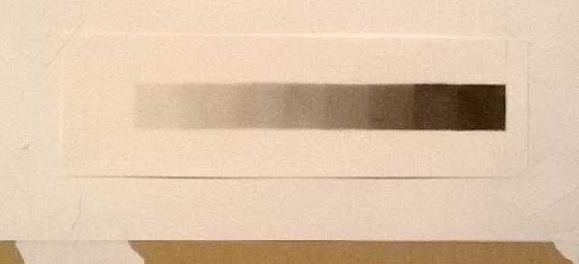
(Before I began setting up the sphere, I first created a value strip in charcoal consisting of the standard 9 values. This will serve as a guide in simplifying, rendering, and compressing values. I'd actually recommend doing a couple of these before beginning. Believe it or not, they're kinda fun!)
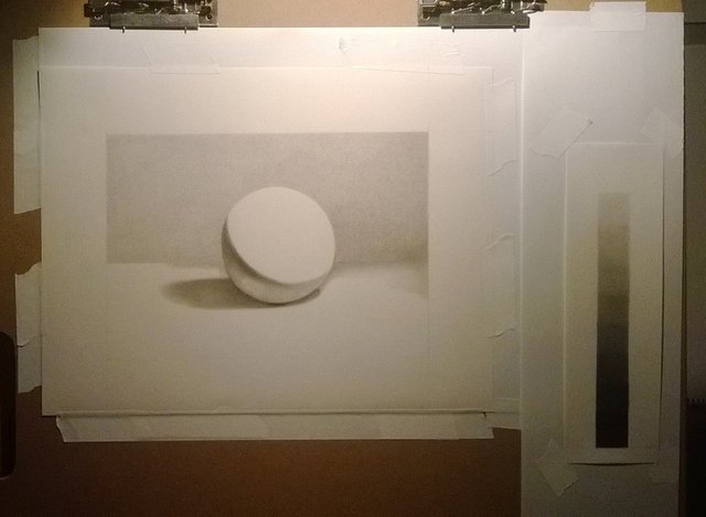
Of course from observation, I began to draw the armature (wire drawing) of the sphere, core shadow, ground plane, and cast shadow. For the sphere itself, you can use something as simple as a coffee cup. It doesn’t have to be exact, although I’d avoid the extremes. I wouldn’t want you to be working on a giant sphere and the one you’re referencing to be small, or vice versa.
I then began to mass in the core shadow and background at the same time with a false tone. The main reason as to why I chose to do the background at the same time is because it helped to alleviate some of the issues when working on a white surface. When one stares at the white paper, the pupils have a tendency to constrict which makes it much harder to judge values accurately.
I also chose to keep the ground plane as close to eye level as possible. Doing this alleviates potential perspective issues in the future. Keep in mind that this nifty little trick will save you from many headaches when attempting to draw ellipses and other man made objects. I would’ve brought down the ground plane even further, but at the same time I wanted to preserve the aesthetically pleasing shape of the cast shadow. I then began to lightly mass in the cast shadow. Cast shadows are wonderful in that they attach the object to the ground plane. They give weight and solidity.
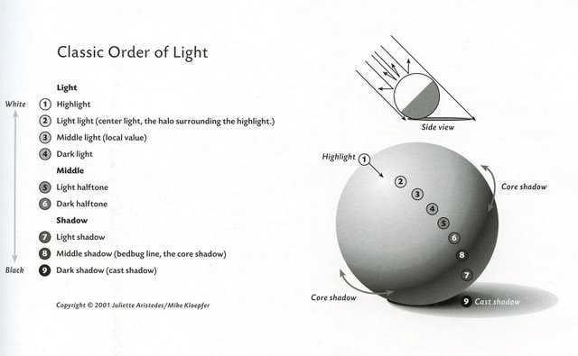
This image above I believe shows an excellent and simplistic idealization in how form and value should be perceived and exercised. Theoretically, there are many many more gradations in value, but remember that simplification is key here. By simplifying or reducing the amount of information to a value scale such as this, allows for a more believable description of form.
In the next step I chose a spot on the terminator line (as you can see in the lower left of the sphere) and began to aesthetically embellish it by increasing its value. At this current stage of the exercise I believe it is important to point out that you want to be mindful of the elusive value of the reflected light. It has a tendency to appear lighter than it really is. As the form turning progresses and you have a greater range of comparison, the greater perspective you’ll have in the value’s continuity.
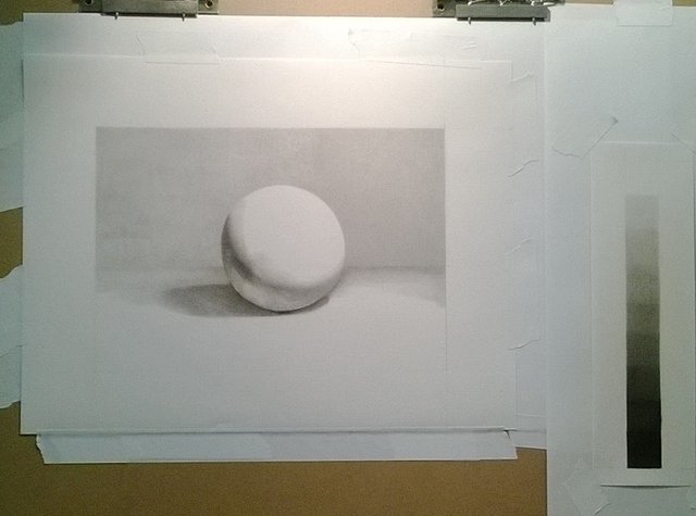
Now that I have emphasized the value of the terminator line, I began to turn my darkest of lights ACROSS the form and into the light. This is of the utmost importance! I do realize that for beginners that it takes quite a mental shift to think in this way, but it is imperative in that you understand the difference between turning across the form and along the form.
Many beginners try to get away with attempting to move along the core shadow and all it does is create a bunch of unwanted bands. This is what you absolutely want to avoid. Remember to ALWAYS move ACROSS the form, feeling its roundness and giving it a sense of volume. Believe me, it’ll pay off in the end.
Now that you’ve initially rendered all the way into the light, once again go back to the core shadow right next to where you were before and repeat the process. In a nutshell you’ll basically be doing this until the sphere is fully turned. Take special note though as there eventually comes a moment where one realizes that the speed in which the gradation of value changes depending on where you start on the sphere. It is also important to refrain from creating a uniformly clean cut core shadow shape. Take special notice in the subtle nuances and shifts in lost and found edges. Keep in mind that sharp edges come forward and soft edges recede.
The strange thing about turning form is that it not only takes great patience and focus, but requires strength and dedication in its method until one can actually see its accumulative payoff.
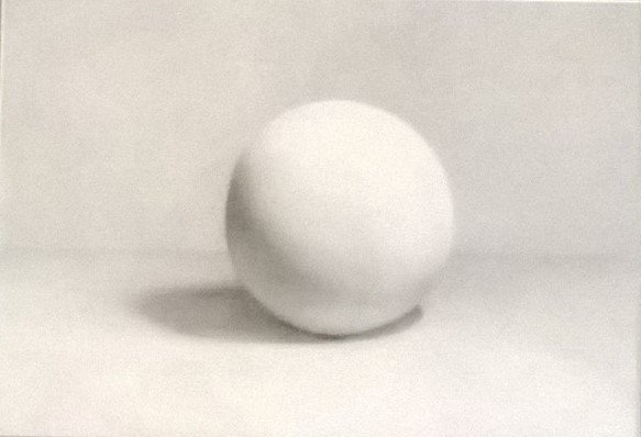
..And once again here is the finished product!
After finishing the sphere I then began to work on the foreground and cast shadow. The wonderful thing about rendering cast shadows is that they're not quite treated the same way as core shadows. They're fun in a way where you have a little more room in maneuvering them. Here I ended up extending its penumbra (the shadows outer edge) to give it a more aesthetically pleasing look.
Even though that this part is optional, there is something about it that attracts the eye.
Well I hope it was a pleasure reading this post as much as it was for me writing it.
Please feel free to let me know what you think?
ǝɹǝɥ sɐʍ ɹoʇɐɹnƆ pɐW ǝɥ┴
@themadcurator Thank you!!
Very nice render tutorial ! The text explains very well, and I love the accompanying illustrations <3
@veryspider Thank you! :) I'm glad you enjoyed it. I remember back when I was working on this and honestly I have to say that this was one of the most important lessons I learned during my time spent there.
This post was shared in the Curation Collective Discord community for curators, and upvoted and resteemed by the @c-squared community account after manual review.
@c-squared runs a community witness. Please consider using one of your witness votes on us here