How to use watercolors (easy guide)
Good afternoon steemit, I just finished up this drawing and guide for you guys.
This sketchbook has really cheap thin paper in it, almost like printing paper, so don't worry if you don't have the best supplies. Especially if you're just starting out.
Watercolors are great because you can add pigment to a drawing quickly, this drawing took an hour or 2 after the sketch.
Supplies: any quality watercolor, I used cheap watercolor brushes which are like pretty packaged pens with watercolors, great for fun and sketching.
And some type of paper, the thicker and harder the paper the better.
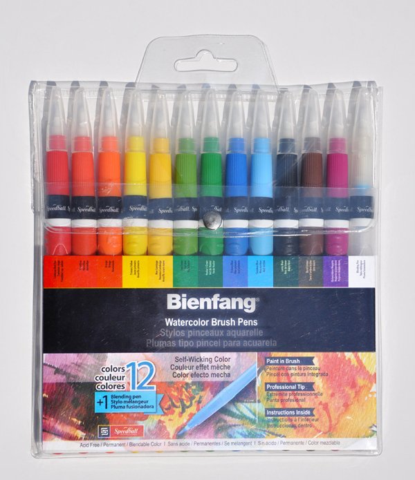
[http://www.rainbowresource.com/product/Bienfang+Watercolor+Brush+Pen+-+Assorted+13+Pack/053685/1feb62c7492232bc5658e9cc?subject=16&category=10428]
These are the exact watercolors I used

This is the sketch I'm watercoloring, I also did a small sketchbook painting based off this image that you can see here -[https://steemit.com/art/@gavicrane/how-i-made-this-piece-sketchbook-15th-page]
First I begin by erasing a good amount of the drawing and outlining it with my watercolor brush very carefully.

Now I'm blocking in dark and light values to separate them, depending on the complexity of your reference photo, this rendering will be the hardest stage.

Here I've gone pretty dark with my darks because watercolor dries lighter than it looks wet
Remember if you're using pigment colors, you'll have to cover the brush in pigment for the values and water it down for the highlights.

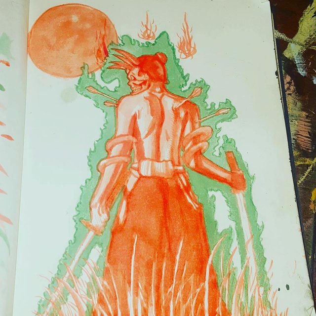
I could've stopped at the first level of shading, but I'm going to start going a few shades darker because my plan for the piece is to have a darker aura around the character and that will lighten his value (darkness) so by darkening it now I'm basically just predicting that issue because I've ran into it before.

Here u can see that I've darkened everything a fair amount, except the highlighted areas which need to stay light to represent light. I've decided not to add any color to the sword because the red outline while trick our eyes into thinking it has a slight red hue, which is a better effect than trying to make something so thin look like metal

This is the aura I was talking about. I'm beginning to use a watercolor to outline an aura, Green is the opposite of red so it'll make from a nice contrast, keep this in mind when picking colors.

Here I've also outlined the body in the color of the Aura so the watercolor doesn't bleed into the figure when I fill the aura, this will also just help guide your hand and eyes when you fill it in later

and now I've filled in the aura and added a moon to fill the space, I also took better photo with a lot of lighting to show the colors and value scales

Goodluck guys, follow and upvote if you liked it, and stay tuned for more daily guides
I like the shading and that color of orange!
I like this orange too, one of my favorite colors, it comes off as reder because the flash on my phone is so cold
Thanks!
I like to take a look my art @yanik