Hello Steemians
This is my first entry into the "Design the Logo For @surfermarly's New Charity Project" Challenge by @surfermarly
The link to the contest is shown below:
https://steemit.com/creativity/@surfermarly/who-wants-to-design-the-logo-for-my-new-charity-project-on-steemit-giving-away-usd150-sbd-to-the-winning-graphic-designer-s
I have participated in the "Create A Logo For @surfermarly's Blog" Challenge before and I really enjoyed so I knew that I had to participant in @surfermarly's new Logo Design Challenge. And this time it is for a great cause.
In @surfermarly's post, she explains that:
'Dreams of the Ocean' @dreamsoftheocean is steemit's first charity project dedicated to support kids in need through watersports activities.
Hence, I designed my logo based on that. Hope that you like it.
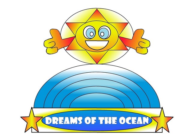
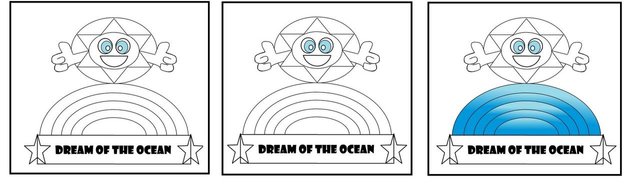
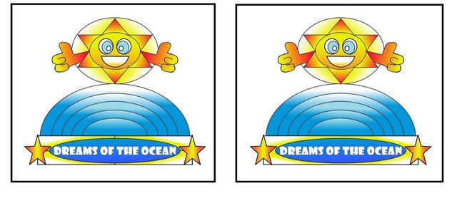
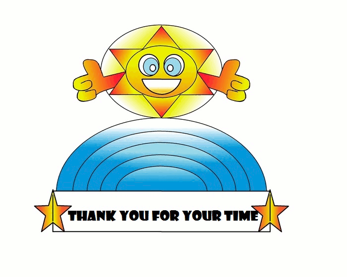
'Dreams of the Ocean' LOGO
 I will explain more about the design below
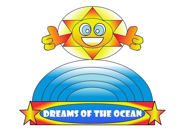
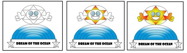
Here are some variations of the logo

Here is an animated gif of the drawing process

EXPLANATION OF DESIGN
Since this is a logo design for a charity project that is dedicated to support kids in need through watersports activities, I felt that the following items need to be in the logo design
- Ocean -> This is about watersports activities so water/ocean is required
- Sun -> Sun represents transparency and trust and care
- Star -> Star represents hope and efficiency
- Circle/round shapes -> round shapes can also represent efficiency as there are not corners (if that makes sense)
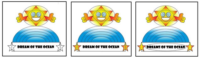
Then I combine the important items in the logo design, but I also put them in the logo design to reinforce the qualities that @surfermarly wants in the logo which is "transparency, efficiency, trust and care".
How so?
I draw the "Ocean" in a way such that it looks like a rainbow. Children are generally very happy when they see a rainbow. In addition, a rainbow generally occurs after rain and the sun comes out again. Hence, the rainbow can symbolise transparency, hope and trust.
I make the "Sun" look very friendly with a big smile and friendly eyes, and holding thumbs up - these are generally symbols of transparency, trust and care. You can also see that the sun shines through the "Ocean" again reinforces the idea of transparency
As mentioned before, round shapes represent efficiency and I try to use round shapes for the font of 'Dreams of the Ocean'. I also reinforce the words by making it shine with the yellow contrast, again reinforcing the transparency and trust and hope concept.
Stars are generally hopeful shapes to include and I include it next to the words, implying that Dreams will come true.
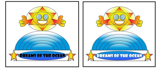
That is in essence the meaning of the logo, and I do feel that more items can be added to improve the logo so maybe I will work on this logo more a bit later.
Design Process
For logo designs, I prefer to do quick sketches of what I perceive the logo to look like first
I drew the quick designs in pen, this is the brainstorm session

Then I use the software 'Paint'
Previously, I would have sketched a sample of the logo and then edited the drawing. However, since @surfermarly may need to enlarge the logo, I thought that it may be more appropriate to perform the whole logo design process on computer.
Starting off with a blank sheet, and then I put in the basic shapes for the logo
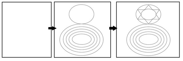
Now I start editing the basic shapes
The shape of the sun is complete, and it needs to be colored in
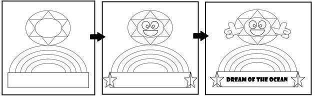
I start coloring in the Ocean
This is where I color in the sun. I want to reinforce the transparency quality so I make it look like the sun is shining brightly.
The sun is done for now, and now I focus on the words "Dreams of the Ocean"
I now edit the words to make it also relevant to the theme
These are the final steps of fine tuning the logo
And this is it
Hope that you like it
I really enjoyed the design process.
What paint software did you use? Unsure how to fade in/out the colours as you have in what I've seen.
@kiokizz, just the normal 'Paint' software. I used it to create the basic shapes of the logo. For the fade in/out colors, that was performed in 'GIMP'. Thanks and have a great day!
Thanks, I'll have to have a look at GIMP sometime.
Cool, it is a very useful software. There is still a lot for me to learn though. Best of luck
:) Thanks
Congratulations @apprentice001! You have completed some achievement on Steemit and have been rewarded with new badge(s) :
Click on any badge to view your own Board of Honor on SteemitBoard.
For more information about SteemitBoard, click here
If you no longer want to receive notifications, reply to this comment with the word
STOP