Good Day Steemians
This is my another entry into the "Design the Logo For @surfermarly's New Charity Project" Challenge by @surfermarly
The link to the contest is shown below:
https://steemit.com/creativity/@surfermarly/who-wants-to-design-the-logo-for-my-new-charity-project-on-steemit-giving-away-usd150-sbd-to-the-winning-graphic-designer-s
In @surfermarly's post, she explains that:
'Dreams of the Ocean' @dreamsoftheocean is steemit's first charity project dedicated to support kids in need through watersports activities.
@surfermarly responded that color gradients would generally not work in a logo as it would be very pixelated when used in different formats for different purposes.
Hence, I removed the color gradient from my logo design and changes the structure a bit
'Dreams of the Ocean' LOGO - color gradient removed
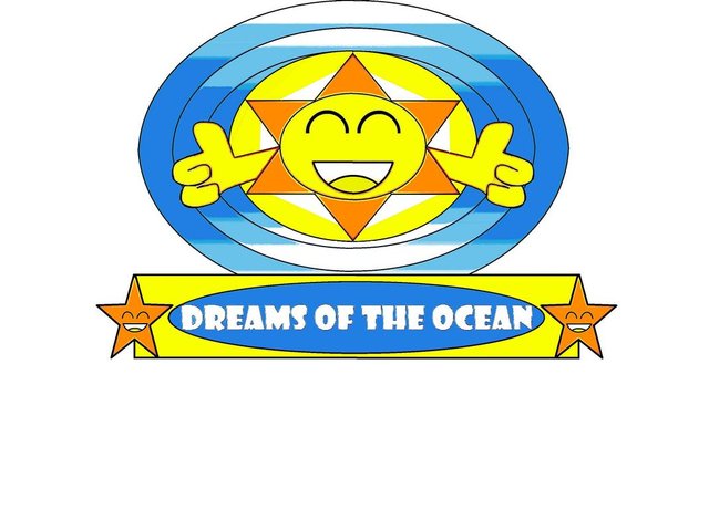
BRIEF EXPLANATION OF DESIGN
Since this is a logo design for a charity project that is dedicated to support kids in need through water sports activities, I felt that the following items need to be in the logo design
- Ocean -> This is about watersports activities so water/ocean is required
- Sun -> Sun represents transparency and trust and care
- Star -> Star represents hope and efficiency
- Circle/round shapes -> round shapes can also represent efficiency as there are not corners (if that makes sense)
Removal of color gradient
My previous design looked like this
After removing color gradients and changing the structure slightly, it now looks like this
It is interesting to learn about the practical aspects of creating a logo.
Thanks for your time and have a great day!