My Art in the Making - Painting an Epic Waterfall Part 3 - Water Detail
Hi there,
I'd love to show you the process of how I painted an epic waterfall scene of The Kimberley in Western Australia. Due to the length of my article, I've cut it into 4 parts.... Enjoy!
Today I have Part 3 for you which is all about painting WATER and WATERFALLS.
If you want to check out Part 1 and 2, check the links below.
https://steemit.com/painting/@andrew.tischler/my-art-in-the-making-painting-an-epic-waterfall
https://steemit.com/art/@andrew.tischler/my-art-in-the-making-painting-an-epic-waterfall-part-2
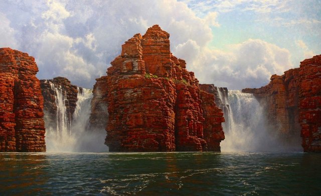
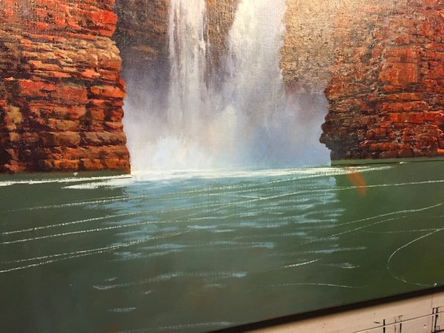
Finished Painting
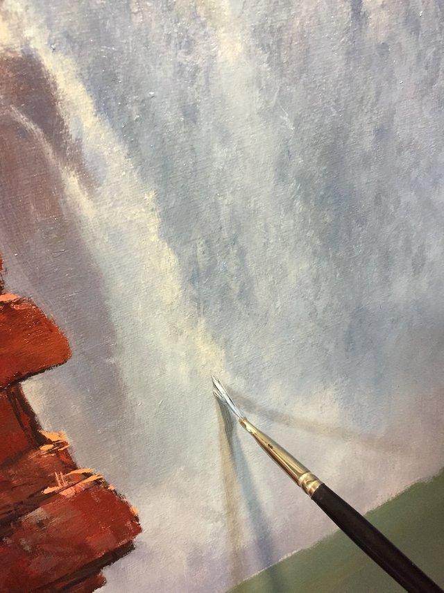
Waterfalls
Painting a high contrast scenario by increasing the distance between tones is a great way of communicating light. Sometimes however, there are areas that may require a little more of a delicate approach than just a straight high-key contrast: like the waterfalls in this painting. After blocking in my painting I have a relatively neutral waterfall “base”.
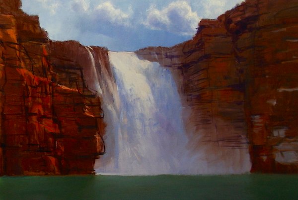
I don’t want a dark colour here equivalent to my deepest shadow, or a highlight of brilliant sun. Though the blocked-in waterfall may look white in areas, it’s far from it. The shade is indicated only slightly. From here I make “adjustments” by dropping the tone, or increasing it selectively with little brush marks. Sometimes I feel like a sculptor as I manipulate the surface with bits of tone.
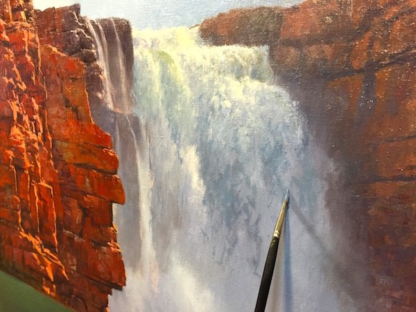
Subtlety is key here. I want to preserve tone in both directions, light and dark, so I have to go easy. I only have a few stops on that scale to play with. It was early on in my career that I realized I had to save my tonal best for last. White is as far as we can go so I want to preserve it in this case and save it for the brightest highlights.
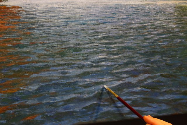
Painting Water
There are many different types of water, in terms of painting. Each type will require a different set of techniques to translate it onto the canvas. We must be sensitive to the conditions in play in every scenario, in order to replicate it accurately. A direct 1 to 1 reflection may have occurred at some point in this scene, in reality, but I wanted to paint it with a bit more movement. This added the consideration, and complication of perspective. Here’s how I did it.
First I started with my neutral Base colour. This was a green using my trusty combo of three blues: Ultramarine, Cobalt and Cobalt Teal, Yellow Oxide and Burnt Sienna, and also adding plenty of Titanium White to the mix.
At this stage, I need to start thinking of the type of pattern to overlay. I lay in some lines that vanish into the distance. This will form the framework in which to overlay a “diamond” pattern.
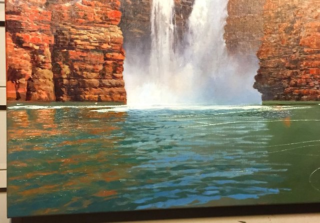
Naturally these lines will recede into the distance as long as the lines converge on the horizon. Okay, so now at this point I need to work out the colours involved. Well, there is a simple law that I have appropriated into painting terms: “as above, so below”. It simply means that whatever is above the water’s surface will be translated directly downwards into the water itself, in a vertical fashion.
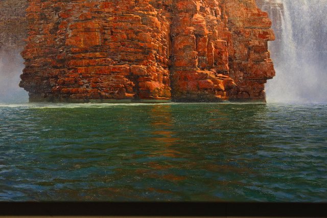
Here is a photo of the highlight are of the rocks and it’s corresponding reflection in the water. Notice how one occurs above the other? This verticality helps drive the illusion. A single wrong step too far left or right may result in the illusion dissolving.
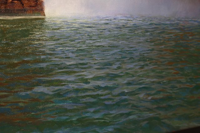
Similar to the clouds, this type of water lends itself to a wet-in-wet approach. I try not to tie myself down with a rule in this case of “brown, then blue, then green, then red….and repeat”. No, rather, I make sure I have all of these premixed colours on the palette ready to go. Then it’s a matter of paying close attention to shape. There is however a handful of general rules I adhere to.
The water is like a rolling mirror, and at each phase of the curve in this mirror will reflect the equal opposite image:
I am focusing on three main aspects. One is where there is little reflection of anything and the true colour of the water (Pea Green Soup) shows through. Another aspect if the reflection of the mass of the cliff and waterfalls, and then the reflection of the sky. If I get this pattern correct, it should begin to resemble an open body of water.
Next we will look at Achieving Depth and Introducing Atmosphere
You can follow me if you enjoyed my article and thank you for reading!
Unbelievably!!!
Thank you!
Holy wow. Those cliff sides are amazing. The rocks look so real. this looks like a picture rather than a painting. keep up the good work!
thanks dude!
Really great tutorial. I have painted several watercolour water scenes, and am always looking for tips. Am soon trying acrylic lake painting.
Thank you katdvine, yes try acrylic or even better oils!
look forward to your painting posts.
Master-class work and the water is pluckin.
Great tips I would have never even thought of. The painting looks so real!!! Thank you for sharing.
Your welcome... hope some tips help you out with your paintings.
Great work! Both my parents are painters, so stuff like this is all over the house, lol.
That was a great article. Very impressive. You will be whale discovered before long !!