My Art in the Making - Painting an Epic Waterfall
Hi there
I'd love to show you the process of how I painted an epic waterfall scene of The Kimberley in Western Australia. Due to the length of my article, I've cut it into 3 parts. Enjoy!
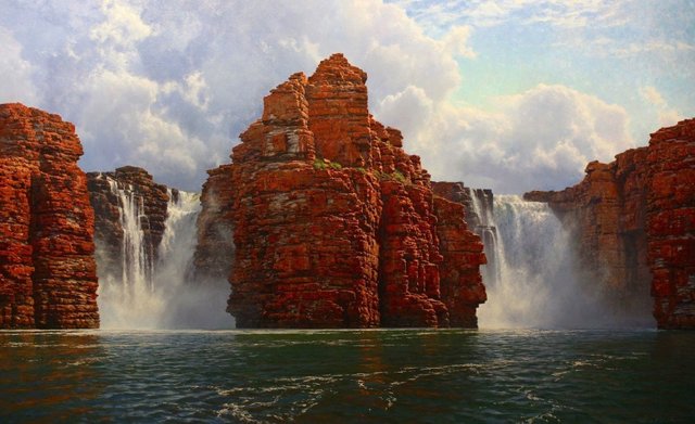
The Subject:
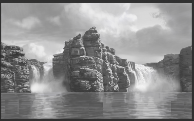
Monumental red cliffs of weathered Kimberley Sandstone rise from green and teal water below. Twin falls tumble down the cliffs either side of a thin rock precipice that juts out into the river below.
The Kimberley region of Western Australia has many well know and recognizable icons. It is a vast and virtually untouched expanse of pristine wilderness situated in the Northern reaches of Western Australia. There is something special about this part of the world that captivates me as an artist. There is such a wealth of subject matter, and virtually everywhere you turn is an opportunity for another painting. The flora is unique and the geology: dramatic.
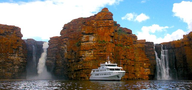
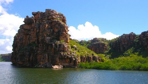
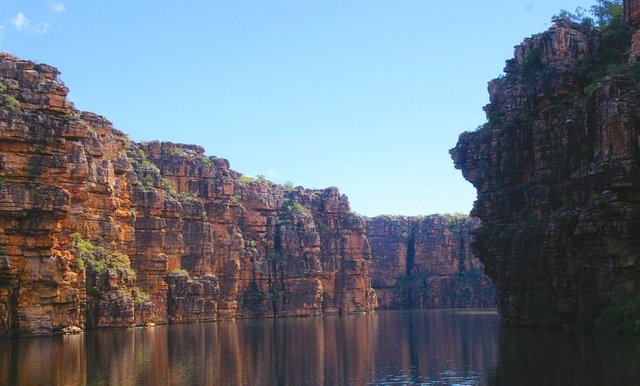
Here are the reference photos I took while on board my artist in residency through The Kimberley.
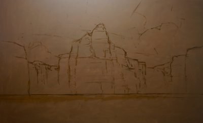
Armed with sound references I began to sketch out the scene again. I started with pencil and paper, and then moved onto a digital composition.
In order to get the drawing transferred to the canvas accurately, I ensure that my drawing is to scale. I have already selected the stretcher, so now I just need to make sure that everything is in proportion. This is a vital consideration, otherwise the image will distort as I transfer it. It is a tool. As long as the same channel of mind to hand is used, what difference does it make whether it is a computer or a pencil? I am the originator of the image, and as such at no time am I manipulating photographs. Rather, I use an imaging program to draw the scene from scratch. What the imaging program allows for is a layering of tones quickly, using different brushes and points built into the program.
What I desired was a solid design, fast. Drawing digitally had drastically cut down on the initial stages and has allowed me to spend more focused energy on painting. I was anxious to get into the painting as quickly as possible. The idea had taken hold and I couldn’t wait to start! Armed now with my drawing I began at once!
This painting had posed many challenges, one of them being the scale. I am painting on a Belgian Linen Stretcher at 78x48 inches. I enjoy working on Belgian Linen as it has a coarse tooth that readily accepts heavy layers of paint. As this is such a large painting, I choose a rough weave. I prefer not to work on a stark white surface as I feel it leaches the life and soul out of the painting. I pre-prime my stretcher with Burnt Umber Mixed with Liquin, and a small out of Pure Gum Turpentine to thin the mixture. Once this layer is dry I am ready to go.
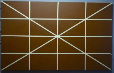
I divided my compositional design via its centerlines. I drew a line from corner to corner, top and bottom, and then found the vertical centre along with the horizontal. This formed what appeared to be crosshairs in the picture. Rather than having a grid, which is commonly used, I have a series of triangles. Similarly I divide the canvas, this time with thin masking tape stretched tight.
Sketching it out onto the canvas.
Step Two – Blocking in the zones
With a painting at this scale it helps to get the information down as quickly as possible. That way, you can gauge the effectiveness of your design, and get to any necessary changes immediately. I use a cheap 2-inch bristle brush for my Blocking in.
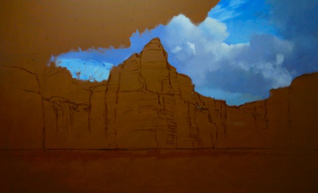
Starting with the areas furthest from the viewer, and working my way forward allows me to achieve a sense of colour harmony and coordination, by adding more saturated notes as I bring the scene forward.
Naturally, the sky is the furthest element away from the viewer and as such this is where I apply the first notes of colour. There is a contrast between this and the Burnt Umber background right away. I am using plenty of opaque paint, thinned with Liquin. My initial Sky colours are Ultramarine Blue, Cobalt Blue and Cobalt Teal.
In the Shadow areas of the storm clouds I have introduce some purple and violet notes. Using Dioxazine Violet mixed with Ultramarine Blue, and plenty of white I am able to create a deep shade reminiscent of the shadows formed by heavy clouds. In the upper reaches as the tones begin to shift and lighten I start to add more Quinacridone magenta. These violet hues must be balanced with plenty of blues used in the sky to avoid them getting out of hand too quickly. They can be very saturated and “hot”.
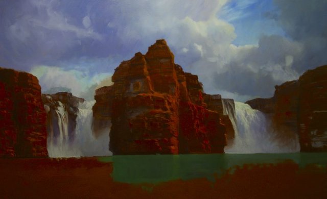
Moving onto my rock zones I am careful not to add any details. For the rocks I mix Burnt Umber with Ultramarine. Right away I add Cadmium Red, and Yellow Oxide in areas to start to establish the intense colour of this Kimberley sandstone.
There are also areas of the cliff that have fallen away to reveal fresh material, perhaps not as stained as the adjacent rock. I love the fact that this adds another element of interest to an already involved and engaging scene. These new areas of rock reflect more sky colours and take on a cool violet tone.
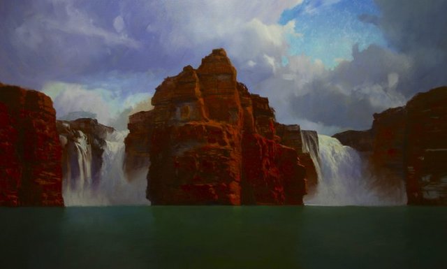
My Highlight areas are comprised of the same combinations of colours, but this time, adding Titanium white to the mix. To avoid the highlight areas becoming too de-saturated as a result of adding white, I balance it and intensify the colour with more Cadmium Red, and Cadmium Yellow Deep. A little goes a long way!
The waterfalls are relatively simple in terms of their colour profile. I need to focus on the light direction, which will be indicated by the way the shadows cut across their faces. The shadows are similar to the deep shadow in the cloud, Titanium White, Ultramarine Blue, Cobalt Blue and Quinacridone magenta.
In areas where I may need a bit more tonal depth, I add Burnt Umber, making sure to balance it with Ultramarine Blue so that it does not appear too brown. The Highlight zones are Titanium white, with my Trio of Blues: Ultramarine, Cobalt , and Cobalt Teal. Obviously here, I mix in much more white but I am careful not to have it too bright. I want to be able to continue to push this highlight ever higher, so in order to keep my tonal options open through out the process I am sure to subdue it here.
As the water requires a multitude of layers, I paint it as a straight flat colour: Cobalt Blue, Cobalt Teal, Yellow Oxide, Burnt Umber and White. I want a flat zone of colour here to act as the base colour that will show through between ripples. More on that later!!!
Part 2, coming your way shortly.
Great job, you know your craft hehe.
Upvoted!
Cheers dude, appreciate it.
Dude, I didn't know you were on here as well!! I follow you on facebook and get your emails!! :) Following, resteeming , upvoted~!!
Just joined last week and it's good to be here!
Thanks for the resteem .....
following you now!
Thanks a ton! You're one of the art guys I look at for constant inspiration! Your skills are top notch, and your dedication to your craft is unparalleled.... Thanks for all you do!
Holy jesus christ. Are your hands made of gold that you create these things? _
It looks a-ma-zing!
Ha, thank you. Just a whole a lot time practicing !
Well. You're doing a wonderful job! You got a new follower!
The painting is great, but I really appreciate the explanation of the process! Upvoted and resteemed!
Thank you, I really appreciate the vote and the resteem......
Truly remarkable. Very cool for you to detail the process like you did.
Cheers!
Talent mixed with practice and a love for your subject - I appreciate how even though you share the "mechanical" (technical) aspects of preparing your painting, it never detracts from the magic...and your writing makes this read like a thriller (What next? How will he do the waterfalls? Aha!). Really enjoyed these two reads and am following you for more roller coaster painting experiences. 🙃🤗🤗
Nicely done. Looks unreal when viewed as a painting
This is outstanding! Would love to see more!