We Draw The Letters Contest: M

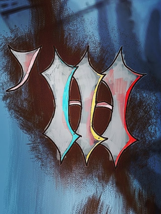
My drawing of the letter M as my submission to the contest of @ran.koree. I drew a simple shape that resembles old scripts which is the inspiration for this piece. The look is about rough lines and paints on a wall. Old style script meets urban graffiti kind of thing.
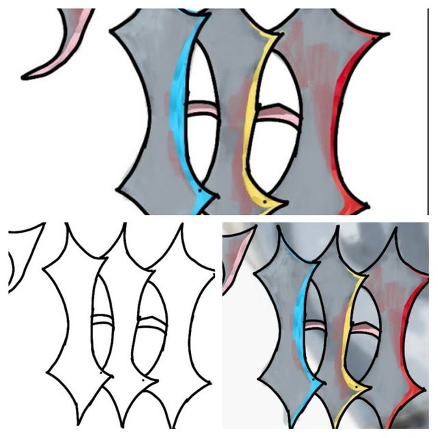
Here is a collage I made showing photos of the process.

These are just pointy vertical shapes tied together to look like the letter M. I then used bright colors to outline each one of them and leaving the lines unfinished. Maybe the graffiti artist ran out of time and didn't complete it 😂This is the quickest and easiest I had done so far. Hope you like the thought process and final look of my design.
If you want to join, here I included the link to the contest
https://steemit.com/contest/@ran.koree/we-draw-the-letters-m-contest
Thank you
Ally
Nice the way you used the colors .... they look great on the whole design ..... good work