LANDSCAPE ART USING POLY ART AND FLAT DESIGN
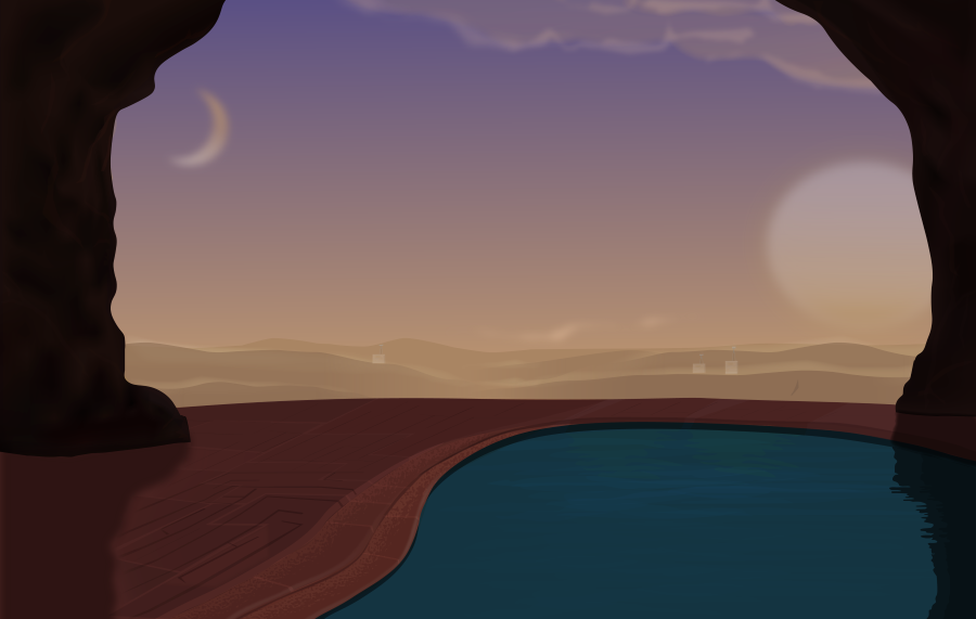
Hello guys, I just finished another illustration based on the landscape theme I've been doing. Lately I've been studying concept art and how it can be used to create worlds and tell stories, I decided to build on one of my previous illustration of the Space colony Landscape.
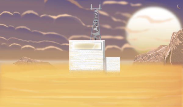
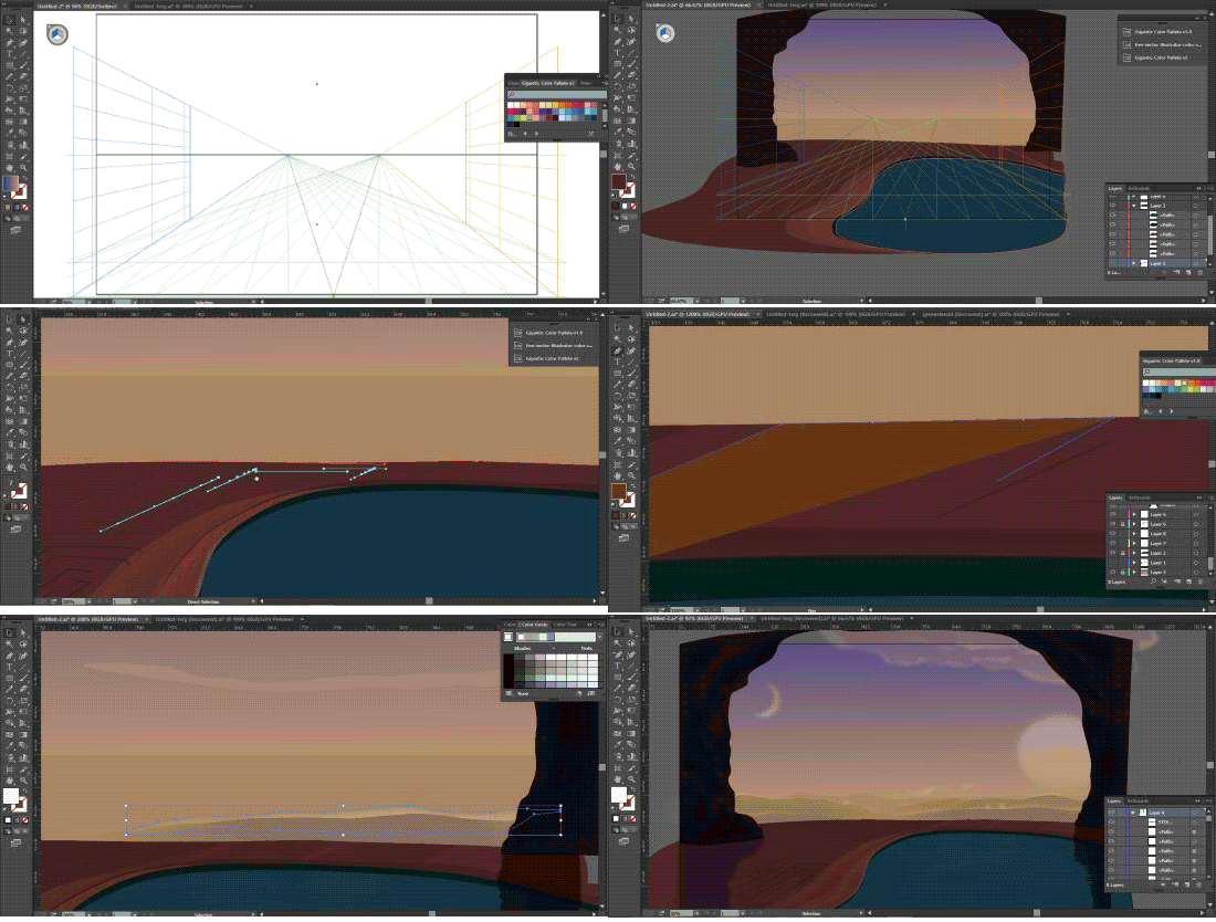
I believe I've made some improvements based on my methods, I decided to use a cooler color temperature on the environment. I also observed that I was so dependent on flat 2d design methods so I adopted a more traditional art method of using my perspective tool as a guideline to illustrate.
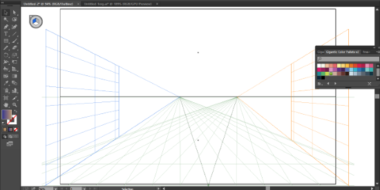
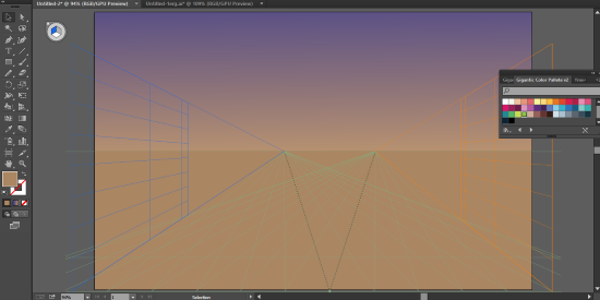
I also noticed that I use to many polygons when using the low poly art method, using to many polygons can either make or break an illustration, on the downside it could cluster the drawing and make the final work looking blurry.
In this episode I choose to use minimal polygons to achieve a more crisp and clear illustration.
SOFTWARE: ADOBE ILLUSTRATOR CC 2015
METHODS
I mostly used low poly art method in this illustration all of the vectors are made by irregular polygons of different colors placed on top of each other.
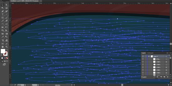
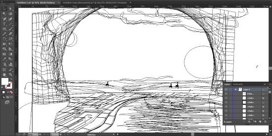
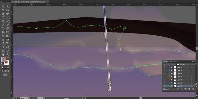
I also used gradient and transparency tool for the weather objects like the clouds and the breeze on the hilltops.
GIF VIDEO PROCESS
Thanks for visiting my blog :-)

Join these awesome communities


#dynamicsteemians powered by @thundercurator @dynamicgreentk
You have a minor misspelling in the following sentence:
It should be achieve instead of acheive.Thanks :-)
Good job, you've been added to the @ARTzone voting list! :D
Thanks man :-)
Great landscape! I also think that it is better than the previous illustration of the Space colony Landscape.
Thanks for enjoying my work :-)
This is a nice piece of art. I still can’t grasp the technique to draw just from illustrators straight up. Have to manually draw it before putting on the board.
I also use to sketch at first, it was when I learned about poly art that I started drawing straight up into illustrator. although I only know how to do landscape yet. I haven't advanced to character design with poly art. thanks for enjoying my work :-)
It takes time to train ;) keep it up!
You have nicely captured all aspects of your design, well done.
Thanks for the compliment :-)
Your reworked illustration has more depth than the original, and a better color relationship. Using the perspective grid was a good idea. I also appreciate how you made sure the "moon" is lit from the proper angle by the "sun". Thanks for sharing! :)
Thanks for enjoying my work. 😊
These are great, I would never have the patience to create something as detailed as this.
#thealliance
Thanks for enjoying my work @coff33a. I appreciate
What a great way to build a world for a piece of art. Really inspiring.
I think most of the fun in making art is playing with the process and creating the atmosphere and world that your paintings dwell in.
Thanks for your kind words. am glad you enjoyed it :-)