CAVE (part 2)- FLAT COLOR DESIGN + LOW POLY ART TUTORIAL
Hello friends. It's another day for some art illustration, from the previous episode, I made some improvements to the stone walls and water texture.
Low poly art to me is so interesting because if you wanna add extra details all you need to do is just make some more polygons with color temperatures and gradients and add to the design.
There is much more difference in this illustration compared to yesterdays episode.
I was able to add some more details to the boring grey walls, today, am also going to be sharing some quick tutorials on how to make your poly art illustration stand out.
One of my goals is to branch into animation from this illustrations. I already saved this format in raw vector polygon in individual pieces, to animate in 2D will just be to move the pieces around and change the colors.
First, I want to improve on landscape and character design, I will also be adding characters to this illustration later on. am thinking a figure peeking into the cave.
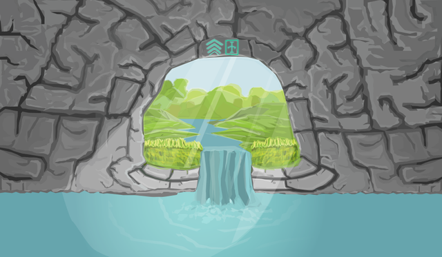
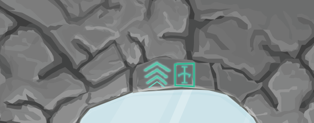
About this illustration, I was aiming at making a man-made cave for storing water. I wanted to add some character-feeling to the cave that's why I included that writing.
The writing is actually based on an ancient writing in my country. from the nsibidi people of southeastern Nigeria. Fun fact, this same writing was used in the black panther movie, its the second spoken language in the fictional Wakanda.
The translation of the writing is "Water bank".
PROCESS GIF VIDEO (PART 1)
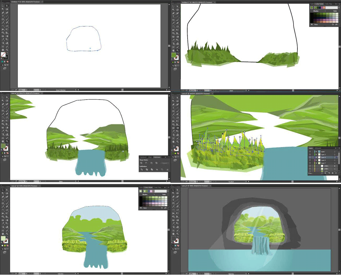
PROCESS GIF VIDEO (PART 2)
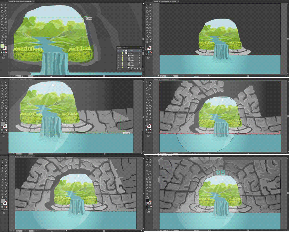
LESSONS FROM POLY ART
Poly art is just like creating your own digital pixels, the more details you want, the more polygons you have to add to it.
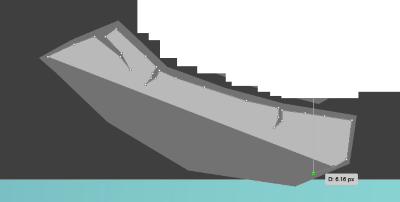
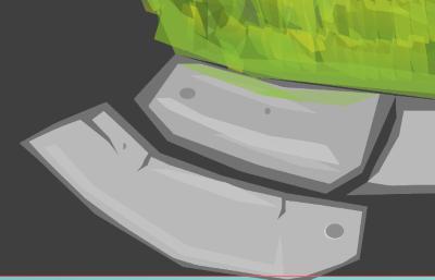
I will be using the wall example to illustrate how you can add extra details to your illustrations. there are some things to note when adding details to your illustrations.
Shadows
Base color
Light
Highlights
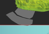
If you want to add some extra details then you can apply some color gradients and transparency to your polygon base color layered on each other.
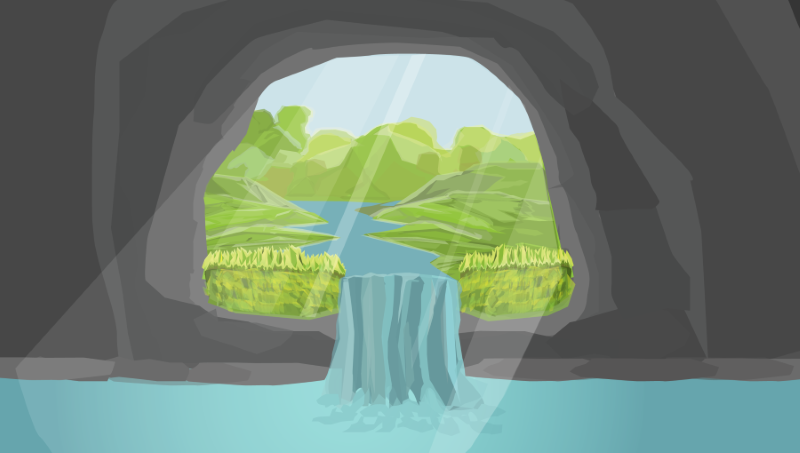
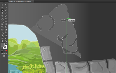
From the screenshot image above you can see the raw previous format. It consists of just the black shadow and base color for now.
Now I'm adding Light to the base color. Next step is to add highlights to the light.
As you approach from shadows to highlights. your color pick should be getting lighter and if you want you can also add transparency as you go up the ladder of adding details.
The same process is repeated until you get your desired illustration.
Doing poly art can become tidious especially when you are repeating the same steps over and over but as an artist it should be worth your time when you get your finished product.
Thanks for passing by guys, have a nice day.
Previous illustration
ALIEN LANSCAPE + TUTORIAL ON HOW TO DRAW PLANETARY BODIES


Congratulations! This post has been upvoted from the communal account, @minnowsupport, by abmakko from the Minnow Support Project. It's a witness project run by aggroed, ausbitbank, teamsteem, theprophet0, someguy123, neoxian, followbtcnews, and netuoso. The goal is to help Steemit grow by supporting Minnows. Please find us at the Peace, Abundance, and Liberty Network (PALnet) Discord Channel. It's a completely public and open space to all members of the Steemit community who voluntarily choose to be there.
If you would like to delegate to the Minnow Support Project you can do so by clicking on the following links: 50SP, 100SP, 250SP, 500SP, 1000SP, 5000SP.
Be sure to leave at least 50SP undelegated on your account.
Thanks for using #artzone tag! Artzone can give just one upvote per day!
Adding more details makes it more appealing to look at. It's beautiful! I'm going to try this one when I have my own graphic tablet.
Thanks for passing by friend :-) A graphic tablet will be very convenient for you. Although I do not also own a graphic tablet. you can work with what you have for now, creativity awaits you. I'm also trying to buy a graphic tablet. It could save me the time.
Nice piece of artistry there. I loved how you explained it. Way beyond my skills though :)
Thanks, am glad you enjoyed it.
great improvement there. I struggle a lot with those details in shadows, and texture.
Also, is that photoshop you're using?
Hello friend, I use adobe illustrator. I prefer it to photoshop for flat color designs, Hope I've been able to show some light in regards to shadows and texture. thanks for passing by :-)
yes, it was helpful to see the process you have at drawing
Very impressive. Great tutorial and great art.
Looks like a painting at first glance.
Very impressed the the highlighting on the rocks.
Darryl (@dadview) resides in Canada.
He is an active member of The Alliance
Check out my Latest Blog
Wow. thanks for the kind words. I guess it's because of the irregular and random polygons I used, maybe they were able to mimic little brush strokes.
Neato!! You should check out @jillustrations if you haven't yet!
Thanks. I will, have a nice day :-)