TFDSRE - Moving averages in Golden Ratio Proportions (#3)
Miracle of golden ratio
Golden ratio was intuitively discovered by ancient people as a most present proportion which make things pretty. It was intensively used in ancient art (Acropolis in Athens). Many nature things grow in golden ratio proportions and prices on financial analysis charts also propagate themselves in golden ratio proportions.
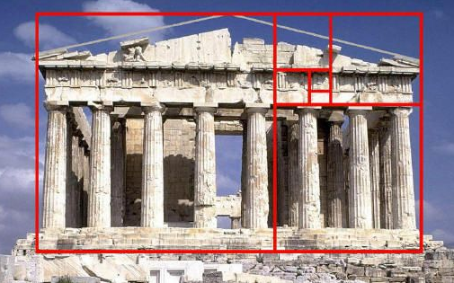
Figure 1. Temple on Acropolis in Athens was build regarding to golden ratio proportions.
In TA it's already known that prices on charts move in golden ratio proportions. Elliot wave principle theory (1) use this proportions to estimate the heights of impulsive waves in 1-5 motive patterns abc corrective patterns. So analysts draw Fibonacci levels on charts to estimate different trading points. They also connect significant dips and heights of price to form support and resistance lines on which price tend to reverse direction and make more picks. If price break through the lines this is called breakouts.
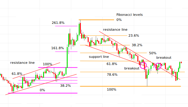
Figure 2. Fibonacci levels, support and resistance lines and breakouts.
When I play around with mathematical number theory and study some properties of number series I found that if we set up simple moving averages in Fibonacci or Lucas numbers as denominators of average, we get very interesting visualization of price on chart.
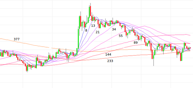
Figure 3. Moving averages set on chart in Fibonacci proportions.
Moving averages act as equipotential levels on which price tend to experience resistance. It need some momentum to break through and if there is to few momentum this equipotential lines act as resistance lines. This is known in TA for a long time already. This equipotential lines can act as support lines also and stop price movement on certain levels. This lines can be interpreted similarly as isohypses on topographical charts, but this representation is bidirectional in sense, that price tend to return to the average price. More recent periods is taken into average calculation more energy price need to return to the average from upper or lower side of the average line.
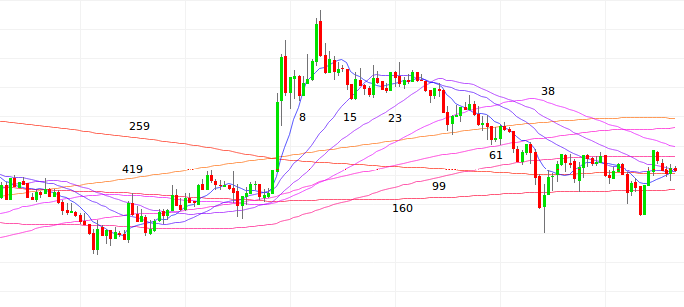
Figure 4. Moving averages set on chart in Lucas numbers proportions packed less dence together.
We can use different sets of Lucas numbers to draw moving averages on chart with lines more or less dense packed together to achieve better visualization.
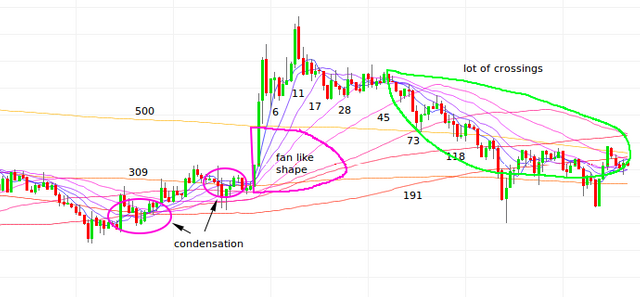
Figure 5. Some patterns can be found on charts with equipotential moving average lines.
In chart we can recognize some interesting patterns. A condensation of lines can be sign of momentum exhaustion and price in this situations suddenly start to rice upwards (uptrend). When this strong move start lines are diverted into a fan like shape. If Lines start to intensively cross each other above the price this is a sign of downtrend formation.
If price is high above most long term average line we have strong trend in up or down direction.
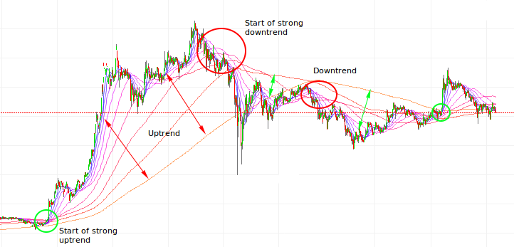
Figure 6. Great visualization of important trading points and trends.
And the bottom line of all this is that this Fibonacci proportion moving averages lines as equipotential support/resistance levels is very useful and intuitive approach to technical analysis of price charts. More I use this technique less I watch MACD and RSI indicators because all information can be visually deducted from chart alone already. Every day I discover another detail another pattern telling me more and more about sentiment on the market and price movements in the future.
So my dear Steemians in the next articles from this series I will discuss use of this charts with combination with some popular indicators in wide use.
Remarks and sources:
1.Wikipedia article Elliot wave principle explain use of impulse waves in TA
Image sources: pixabay.com, investing.com
Disclaimer: If you use my ideas and analyses in your investment ventures, you take all responsibility and consequences about your actions.
And as always upvote this post and previous ones, if it have some value,follow me, if you think this content is great and I promise that it will be more interesting stuff in the future.

good job @tombort , very didactic
Hope It will help all of us to be better Crypters (citizens of crypto world) and Steemians and to reach our goals.
I like the way you put this together in very fundamental fashion. It is a very detailed way of explaining moving average trading etc.. I like this post.. I read it in its entirety. I forget the term for having a ton of moving averages on the the chart say 10 or more, but there is a term for that..
Maybe is isn't my invention, but fuck the inventions. I have never seen this and for me it's turn out very visualistic, easy to see things. Must refine the technique yet!
Agreed.... upvoted and resteemed
Thanks! We are always in line always on position!
Good friend
Good luck
Cool bananas!
Way over my head but I like it.
I think one of simplest trading strategies.