An International Spotlight : A Look At Pre-Modern Maps And How The World Was Divided
I co-wrote this spotlight with my boyfriend, Victor Lucas. He graduated in December 2015 from American University with a BA in International Studies. He had a regional focus on Asia and a specialty in Environmental Sustainability and Global Health. He also studied abroad at National Chengchi University in Taiwan. I just completed my degree requirements at American University in July with a BA in International Studies. I had a regional focus on Latin America and a specialty in Global Inequality and Development. I studied abroad at University of Auckland in New Zealand and at Universidad Adolfo Ibanez in Chile.
An International Spotlight : A Look At Pre-Modern Maps And How The World Was Divided
Yesterday we wrote a post titled "An International Spotlight : How Maps Formed The Modern Centralized State System". We discussed how cartography had an enormous influence on the formation of the modern state system. If you're interested, you can read it here.
More importantly, we promised to make a post going more in depth into the kinds of maps that preceded the switch to Ptolemaic maps (those using latitude and longitude for orientation as a global coordinate system). So...here they are!
The Different Types of Pre-Ptolemaic Maps
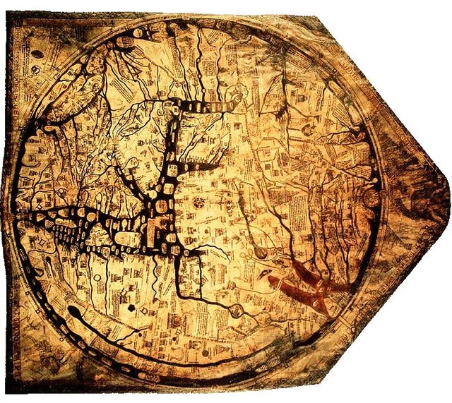
Mappae Mundi refers to any maps that were made during the European Middle Ages (400-1450), and comes from the Latin words mappa and mundus (respectively meaning towel/napkin and world), as they were usually originally painted on cloth and then transferred over to animal skin or paper. The most famous example, the Hereford Mappa Mundi was painted on a calf skin. They take a variety of forms. (Source)
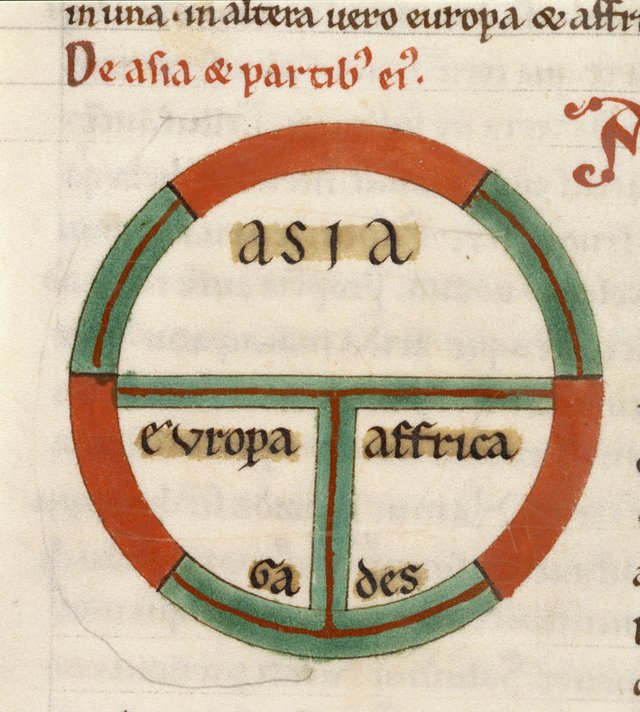
a) T-O Maps
These were some of the earliest maps and are called T-O maps because they look like a T inside of an O. These maps divide the earth into the general conception of the world that most Medieval Europeans generally had: the three land masses of Africa, Asia, and Europe. The upright of the "T", separating Europe and Africa, represents the Mediterranean Sea. The crossbar separating Europe and Africa from Asia represents (for Europe) the Black Sea, the Don River, and the Sea of Azov, and (for Africa) the Red Sea. (Source)
Interesting Side Note: Medieval maps were frequently oriented towards the East because the Sun rises in the East, and it was believed that the Garden of Eden was lost somewhere at the farthest eastern point of the globe.
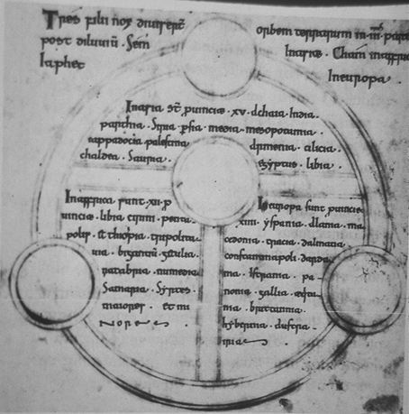
b) List Maps
These maps are quite similar to T-O maps in their shape (with a T inside of an O), but differ in that they simply list characteristics of different lands. These maps make little to no effort to place their descriptions geographically relative to one another. A description of Venice might lie right next to a description of China on such a map. (Source)
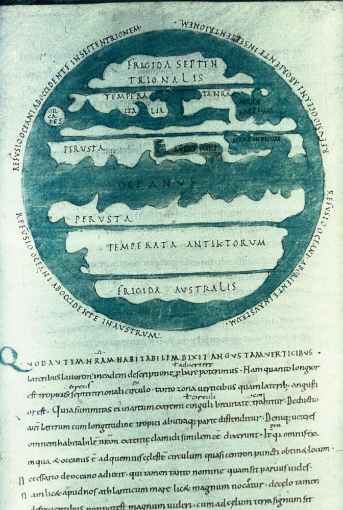
c) Zonal Maps
Zonal maps depicted the world in terms of a series of climate zones. Many Europeans believed at the time that the world was split into three main climate zones: a frozen climate zone at the poles, an unbearably hot one near the equator, and a wonderful and habitable climate just in between them. Zonal maps limited all of the known planet to the northern mild zone (between the north pole and the equator). This was because, until at least the 13th century, most Europeans believed it was impossible to pass through this central hot zone without dying.
(Source)

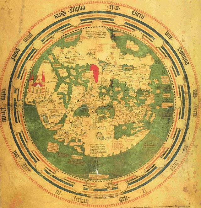
d) "Complex" or "Detailed" Maps
These are the beautiful maps we generally think of when we think of Medieval maps. The Hereford map shown above is one such map. Frequently, these maps were adaptations of the T-O maps, simply showing the same shape of the world (Africa and Europe at the bottom and Asia at the top) but with far greater detail, frequently also detailing historical events or places of religious importance. They also frequently depicted details from different time periods overlaid upon one another (like where a famous battle had occurred 500 years earlier right next to a modern kingdom). (Source)
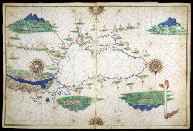
e) Portolan Charts
The term "Portolan Chart" stems from the Italian word portolano, meaning pilot book. These maps were, as the name would suggest, books used by captains in order to find the routes between different ports. As opposed to the previously mentioned maps, these maps were far more geographically accurate (although they usually showed little to no detail of what happened beyond the ocean/coast line). The purpose of these maps was to help captains be able to consistently sail from one point to another by showing accurate angles, relative scale, and well-detailed coastline. Source
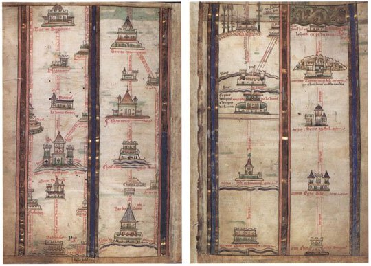
f) Itinerary Maps
These maps, like portolan charts, were different from most other early maps because they were intended to help a traveler get from one point to another. However, this did not mean that they were geographically accurate. In fact, they frequently showed little to no actual outline of the geography. Instead, they would simply create a list of places and instructions on how to get between them. Source
Conclusion
Outlined above are the types of maps that were generally made before the advent of Ptolemaic maps. As you can see, many of them have little to no relation to the maps of today. Frequently, they served no geographic purpose, but were rather used as a method of depicting the current world view, including religious, political, and historical concepts of the time. Sometimes they were just decoration!
Another fascinating post. I really enjoyed the images too. The Hereford Mappa Mundi is beautiful.
I never realised there were so many different types.
I suppose the intinerary maps are like the ones you get when you go to tourist locations like DisneyWorld.
I've never heard of that before. It's so weird although not more weird than thinking you would fall off the edge of a flat earth.
Anyway thanks for educating us with this series. This is really fantastic work and I suspect it took both of you a very long time to put it together.
@anwenbaumeister Thanks for sharing your great post and knowledge! Loved learning about old maps over the years and am sure many others will enjoy this post as well! :)
A great history lesson. Thanks for posting.
Thank you for sharing these maps and information. The way maps have evolved and changed is quite interesting. The Walsperger Mappa Mundi is my favorite of the post. Always great info from your posts!
This is really interesting! Your page is gold, it is full of interesting articles! I know my girlfriend would love this post! Keep up with the great work @anwenbaumeister!
Here be dragons!
Great post, I love old maps. One day, when I am rich, I will have a collection of old maps, just like the ones you posted. Fascinating.
me follow you and upvote
if you can back upvote my blog ?
https://steemit.com/photography/@zein/the-beach-where-i-live-original-work
Great post. I have a fascination with maps. These are beautiful and the history behind them is intriguing . Thank you for sharing.
wow this is so interesting. amazing content !
I would love to see the map that was used by the Portuguese and the Spanish to divide the world in half in the Treaty of Tordesillas. This treaty was authenticated in my hometown of Setúbal, Portugal. The world is still today suffering from the results of colonialism. :(