Semiotic Analysis of advertisement (Print)
1. Reaction towards ad
My first impression of the ad, it’s purely ad of expenses watches for men with high income.
Yes, it looks like the partially boring ad but the wilderness landscape keeps grab my attention.
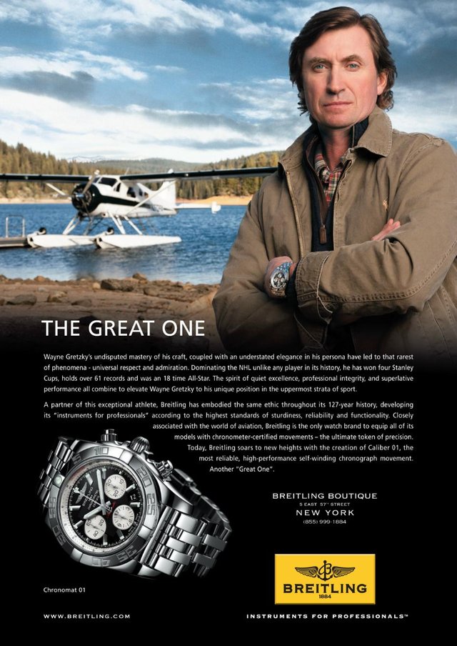
Yes, it does grab my attention; the ad is a wilderness landscape featuring a very serious-looking Wayne Gretzky from the waist up. The all-time hockey great is standing stoically in the top right corner with his arms crossed.
2. Message
Syntagmatically, this ad portrays as a very specific type of person. It is not clear without prior knowledge that Gretzky is a hockey player; it is clear that he is very wealthy, likely comes from old money and lives at the top of the socioeconomic scale. It is also suggested that he is a trained pilot who likely also knows his way around a boat because the plane is amphibious. A private plane, what you need next is a Breitling Watch. Wear it with pride and let everyone else know how awesome you are.
The message of an ad in every aspect, the language that is used to describe the ad is very detailed and allows the reader to get a true sense of the ad. Words and phrases such as, “sun poke through thin clouds”, “illuminating”, “pale blue” and “crystal clear”, allow the reader to picture the ad without actually seeing it; although there is a picture of it within the post.
The benefit is that anyone who is the best at their craft deserves the best watch, which is a Breitling. In reality, though, it is a statement piece few can afford.
3. Target audience
The audience for an ad like this is male, likely over age 40 and certainly bringing home at least a six-figure salary and more likely a seven-figure salary. They could be retired. Most members of the audience are likely Caucasian, but income is the common denominator here and not race.
4. Focus
The praise focuses on first the hockey player and then the timepiece. Most of it is puffery, such as Gretzky having “universal respect and admiration” and the christening of the watch as “the ultimate token of precision,”
In the background directly to Gretzky’s right sits a single-engine aeroplane parked on a private lake dock. The scene is vacant of any people except for Gretzky. Rolling mountains covered in evergreen trees surround the lake and the water is crystal clear. In the pale blue sky, rays from the sun poke through thin clouds, revealing the entire scene. The whole setting is very serene; it is quite inviting to readers like me
Gretzky seemingly owns the plane and has flown it to this lake by himself. In the text of the ad, it says that Breitling is “closely associated with the world of aviation.” Wayne Gretzky serves as a pilot with some serious star power.
5. Flow
The hierarchical flow for this ad is when we look at the visual in this ad; it’s including the large sky and thick border around the text, serving as a sign indicating an upper-class audience. A thousand dollar watch is a luxury, and print ads for luxury items always have plenty of blank space. The Breitling logo is another sign. The anchor and rope represent sailing or yachting and the wings represent flying a plane, two exclusive hobbies of only the most financially comfortable among us. Paradigmatically, Gretzky, his entrepreneur-casual clothes, his expensive watch, his aeroplane, the Breitling logo, and the property itself are all signs of the prestige and exclusivity of owning a yacht or private plane. The empty space also symbolizes wealth while the setting conveys an entrepreneurial spirit.
For me, it is a good flow because the message can be delivered successfully and it is effective for this campaign ad.
The concept and flow of the ad is the address for the Breitling boutique in New York City, a phone number and the company logo. The slogan “instruments for professionals” borders the bottom of the logo, which consists of an anchor and rope forming a letter “B” with a wing on each side. The word “Breitling” is below the winged logo, with the year 1884 under that. This is presumably the year Breitling was founded.
Yes, it is relevant because the concept is appropriate and can be seen obviously as it simple to understand.
6. TOV
The Tone of Voice of the ad; it seems to be communicating, “If you have the money, why even waste time considering anything less than Breitling?” the text, serving as a sign indicating an upper-class audience.
Is the Art Direction done according to the intended T.O.V. of the brand?
It symbolizes wealth while the setting conveys an entrepreneurial spirit.
Yes, it’s appropriate because the viewers can come to understand why the ad is portrayed the way it is, and even why Wayne Gretzky has positioned the way he is in the ad. It allows viewers to understand the messages images are meant to reveal in texts and provides insight for readers to analyze the texts that they view on a daily basis.
7. Idea
This is an average idea by using expenses elements like plane, wilderness landscape features etc
I think this is a not a big idea because, in my opinion, it’s completely branding for the company.
Let’s look at some possible combinations:
a) Straight copy + straight image = expected idea
b) Straight copy + bent image = unexpected idea
c) Bent copy + straight image = unexpected idea
d) Bent copy + bent image = unexpected/unclear idea
- Art direction execution
Yes, the art direction supports the idea, every aspect of the Breitling ad from the aeroplane and landscape all the way to the clothing and empty space used by the advertisers, no aspect was left untouched.
The typography is too small. When it has been placed at the bottom right beside the logo it is one of the reasons why people will notice the tagline. Otherwise, people would not notice it because of the size
In my point of view, this ad has influences of symmetrical layout because of the composition from the top right corner with his arms crossed. He is dressed like a cowboy or frontiersman, with a flannel shirt and a casual jacket, and is sporting a rather large watch on his left wrist. The watch is presumably a Breitling Chronomat 01, the same watch that is pictured opposite Gretzky in the bottom-left corner of the ad.
The graphics in this ad is high-quality, and the logo has been placed in the correct way. Yes, the image can cause an emotional feeling of most dependable, high performance, self-winding, chronograph movement, another great one.
Yes, at the bottom of the ad is the address for the Breitling boutique in New York City, a phone number and the company logo. The slogan “instruments for professionals” borders the bottom of the logo, which consists of an anchor and rope forming a letter “B” with a wing on each side. The word “Breitling” is below the winged logo, with the year 1884 under that. This is presumably the year Breitling was founded
Print media is appropriate for this ad. In my views luxury item always used print media as advertising means for instance like Hugo Boss, Gucci et
Strengths
- Allows for heavy copy messages
- Long shelf life
- Receptive Audience
- Tangible
Weaknesses
Not intrusive – There is no control as to how a person reads or views a magazine or newspaper. They may flip by your ad without even seeing it.
Appreciated, you have made a big analysis. You deserve an upvote buddy!
Thanks Mate
This post received upvote from @tipU :) | Voting service | For investors.
You got a 4.30% upvote from @dailyupvotes courtesy of @zomboy!
You got a 2.99% upvote from @emperorofnaps courtesy of @zomboy!
Want to promote your posts too? Send 0.05+ SBD or STEEM to @emperorofnaps to receive a share of a full upvote every 2.4 hours...Then go relax and take a nap!