Enter A Glossy Web: Book Cover Illustration Step-by-Step
Enter a Glossy Web by McKenna Ruebush has been on the shelves for a few weeks, and has been one of my favorite illustration projects to date. The story is a quirky adventure for the 9-12 year old set, featuring an 11-year-old girl named George with bright red hair. This story includes skeletons, dragons, and traveling to new world via regular puddles and on flying doors. Needless to say, this is not the type of assignment one passes up.
If you've followed my previous posts, you know I like to try out a bunch of options before going to final. For an assignment like this with a major publisher, the expected number of reasonably polished sketches is probably about three. Sometimes I offer more if I can't nail down the top contenders. While reading this story, I started seeing it in an Art Nouveau/Art Deco style, and opted to carry that concept into the sketches. The book also has many interior illustrations (which I'll highlight in a future post) so finding an overall feel right away helped me to start connecting the images moving forward.
These are the sketches I sent to the wonderful Christy Ottaviano and team at Henry Holt:
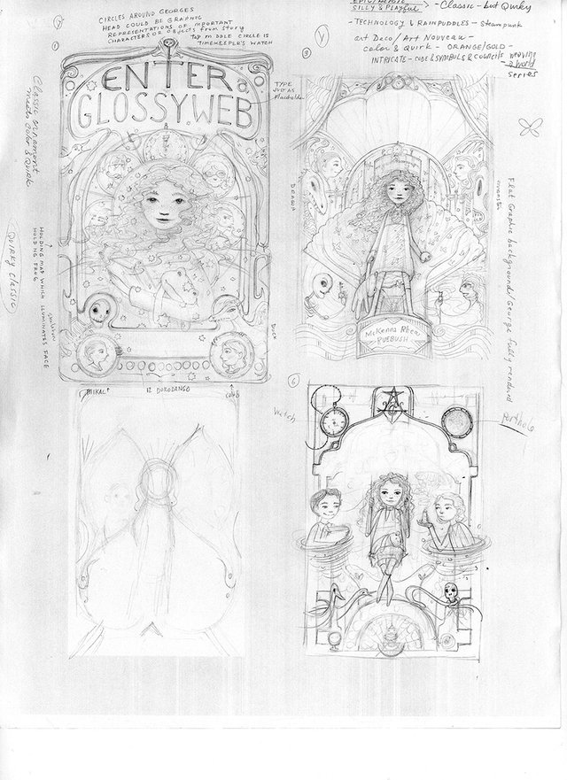
If you've seen Art Deco work you might recognize the geometric design elements in these drawings. If you are familiar with Art Nouveau, you may notice the influence in the elaborate stained-glass feel or the stylized hair and circular patterns.
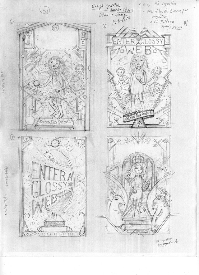
I was pleasantly surprised when the team opted for one of the least polished but most dynamic options. There were a few requested changes to my first drawing, (including highlighting the main character instead of the skeleton) but after some tinkering we had a final sketch.
I used to dislike taking the time for color studies in my work, but I enjoy this process now and realize that hashing out color in several ways can really make a piece better. It also saves me tons of time when I go to final, and ensures there will be no surprises for (or major changes from) the client.
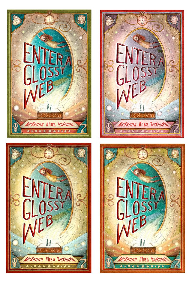
In this case it was actually my fourth study that was selected by the client. And now I couldn't image it any other way.
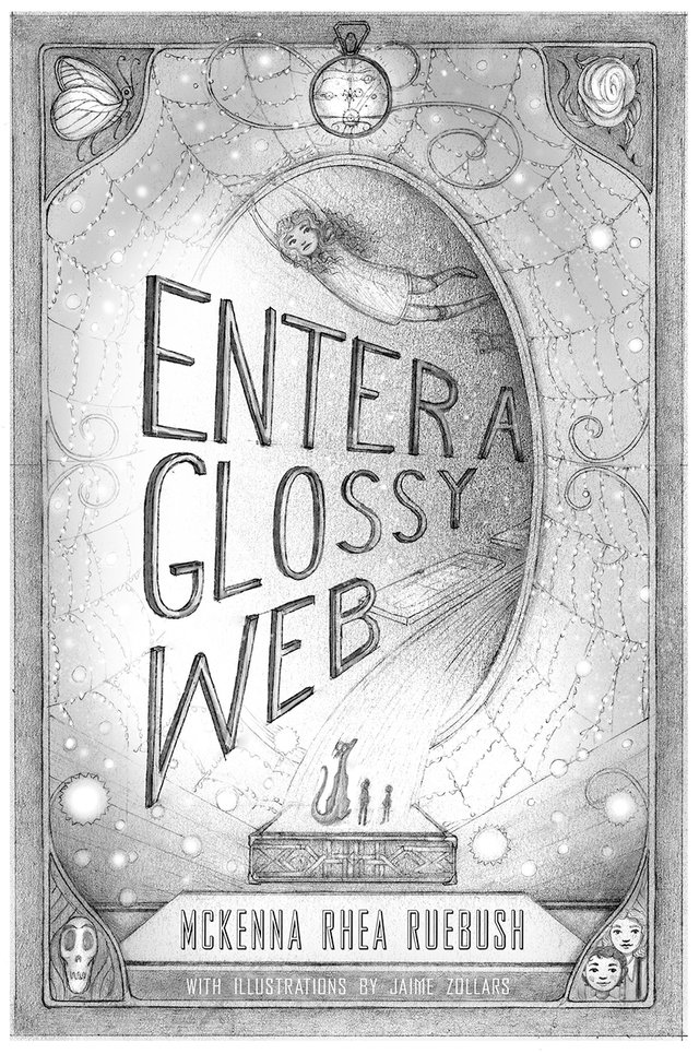
Next, I take the final sketch to my light table and start drawing the final pieces. I imagined this image combining graphic (hard) elements with rendered (soft) elements. I guessed that the best way to achieve this would be to draw some pieces in ink and others with pencil. Then I would combine the two in Photoshop. While drawing separations for digital layering is not new to me, the concept of mixing ink and pencil in one piece was a hopeful experiment.
Here are some of the drawings that would be layered to fit together in the final image:
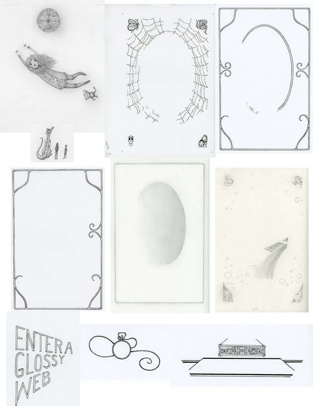
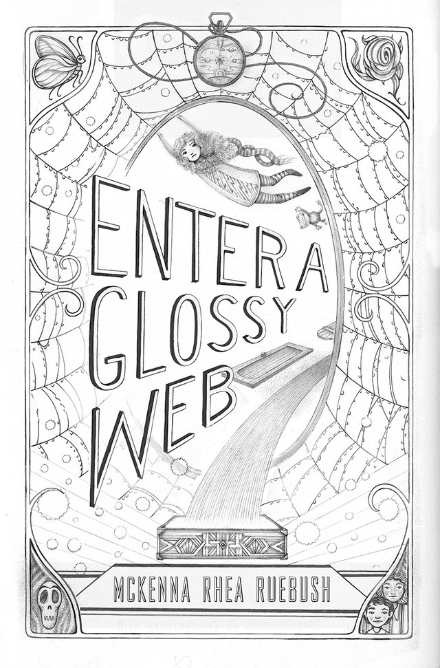
When layered together and placed, the image looks like a more refined version of the approved final sketch.
Once I have the major drawn components sorted out, I add base color to the background and middle ground to make sure the overall colors stay true to the chosen color study.
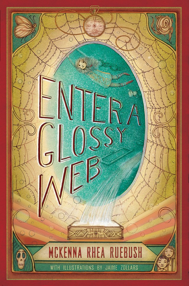
Next, I add more detail and color in the foreground elements. This often takes longer than it would seem to get right.
Once everything looks "right" with regards to color and value, it is time for the fun part. I add the "glow" and the sparkle to the stars. I add highlights where warranted, and I sometimes pump up the saturation and contrast overall so that the image is more likely to stand out on a shelf and be noticed.
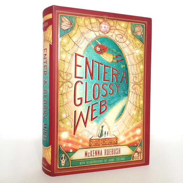
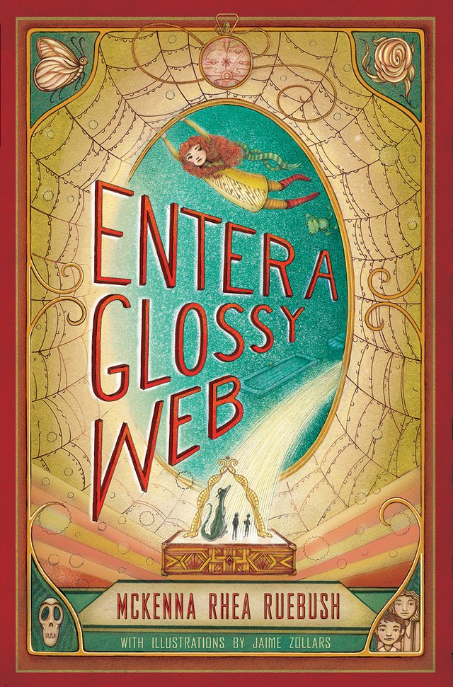
The above is the final image, now printed on the cover and in stores! If you like quirky adventure stories, I highly recommend this one. There are two more books in this series, and I look forward to starting the next cover soon.
Thanks for reading! Feel free to reply if you have any questions about my process. I'll share the interior illustrations here soon.
Images © 2016 by Jaime Zollars
This post has been linked to from another place on Steem.
Learn more about and upvote to support linkback bot v0.5. Flag this comment if you don't want the bot to continue posting linkbacks for your posts.
Built by @ontofractal
Very cool, maybe you will be interested in my work
yes, will check it out! Thanks :)
Beautiful illustrations! My favorite is the №1 & 2. It is an insidious but cute dragon in the picture №3
HI! Thanks so much :) I thought my favorite was the first one as well when I turned these in, but the one they chose quickly grew on me and I look forward to matching it to the next two in some way, but still make each their own...
I'm giddy to see your process! So this is how you do it, @storyseeker. Phenomenal post.
Thanks :) I'm a fan of your process posts as well! This cover in particular was a hodgepodge of uncertainly up until the very end, but I'm happy with the result. I was pretty sure it just wasn't going to work through much of the process. I think that's what happens when you tweak your process every time you make something new.
Such an exiting book cover! Makes me want to read the book :D
Thanks @camilla ! That's great news. If you want to read the book it means I've accomplished my goal ;)
I love seeing your process and how you come to the finished illustration(s) which is always stunning. Great work!
Thanks - I really enjoy seeing the mystery behind the posts of others as well :)
Seeing this process.., is like watching creativity as it progresses. Really makes you appreciate the the finished product (which is killer btw!).
Thanks! I don't think I had any clue as to what really happens in the process of making book covers until I started making them. This is a big year for me and covers too - so there will be more posts when I have time to compile them...
Stunning work, @storyseeker! Designing book covers is way more difficult than it looks. I tried with my first few published books and quickly learned to outsource to the experts!