How to draw perfect support and resistance using the top-down analysis
One of the most important aspects of trading the crypto market is using technical analysis which involved drawing the support and resistance zone as well as drawing trend lines. In my previous class, I discussed details about a trendline and how it can be drawn for both uptrend and downtrend movement.
Today we are going to be looking at a perfect way to draw support and horizontal zones in the market using the top-down analysis method i.e. starting from a higher timeframe down to a lower timeframe.
As we all know, there are many reasons why we need to look at a higher timeframe for more accuracy in our prediction, without looking at the higher timeframe, we may be kicked out of the market before we know it because there are key levels that the market may respect which we may not notice while using the smaller time frame.
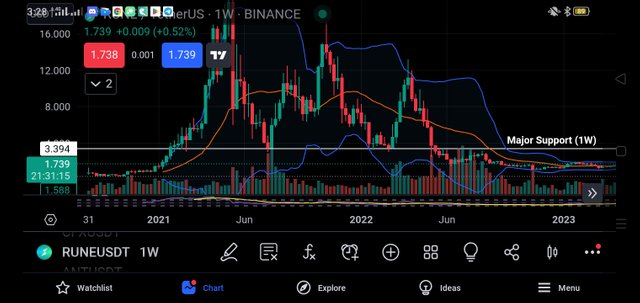
So to draw perfect support and resistance lines, the recommendation is that you check from a one-week time frame which gives you details of the levels which the market respects as far as the past week is concerned. This will give you a clear picture of some notable areas which the market will always respect.
Having this area in that big picture, you can draw your support or resistance lines on that point. It is also important to know that in drawing either support or resistance lines you will need to use the horizontal line tools. For those that use trading view for their analysis all these tools are always made available.
Using the horizontal line gives you more accurate results anytime you draw the support or resistance zone. Alternatively, you can use the rectangle shape to do that but I prefer the use of a horizontal line. Now why do we need a top-down analysis to draw these zones?
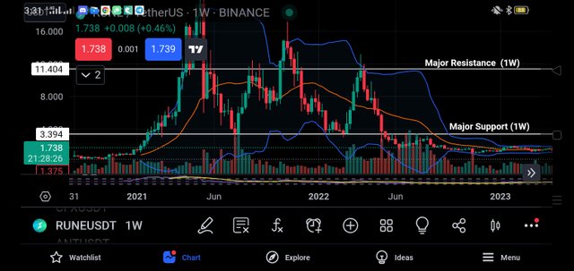
If you are a technical analyst, you will notice that in the lower timeframe, there are more levels of support and resistance which can be termed as fake because it is due to noise in the chart that we see them. If you want to last long in the trade, you need major support and resistance level because those are the key level that the market always respects.
A good example is a trade in which the weekly timeframe shows a very strong resistance whereas the 1H chart, shows that the market will go upward. So as a trader, instead of longing the market, you better short the market because the trend won't last much longer as it is close to the zone of major resistance level.
The market will move up a bit and then reverse in the opposite direction fur to that strong support and resistance zone present in the weekly timeframe. So that keeps you longer in the market and you can also make a profit easily because you understand the market movement using the top-down analysis.
From the above charts, we have seen how price is respected in those major zones. If you need to concentrate and plan trend reversal, then those zones must be taken into consideration. More also for more accuracy, you may want to increase the timeframe to stay longer in the market. I hope this is clear when it comes to drawing a perfect support and resistance line.
Disclaimer: This post is made as an education and not investment advice. Digital asset prices are subject to change. All forms of crypto investment have a high risk. I am not a financial advisor, before jumping to any conclusions in this matter please do your research and consult a financial advisor.
Upvoted! Thank you for supporting witness @jswit.
Support and resistance plays a huge role in determining the next movement of a coin
I got to know a very important thing from you today. Thanks for sharing such a nice post.
This is a nice post teaching how to draw support and resistance.
Thanks for sharing with us 😊👍
This is a great content of your How to draw perfect support and resistance using the top-down analysis.