How I Saved My Colleague's Freelance Illustration
Hi Everybody !
(All the images are my own creation and so I own the rights of them)
It's important to mention that this actually happened few months ago.
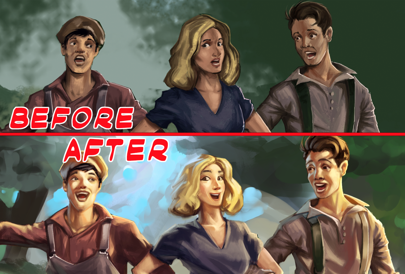
My colleague actually got waaaay better since then and probably now he would solve it like a piece of cake (I never understood this metaphor).
He took this job from a company which name I can't say and for a project hat I can't talk too much neither. I will just say that it was for a movie.
.jpg)
But luckily enough, we just started talking each other back then through Facebook (yes, we haven't met IRL yet with my buddy) and he could ask me for a hand. I was looking for some work back then when I just got started into the freelance world, so everything came right on time.
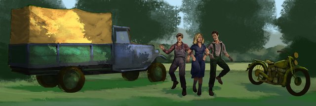
At the beginning I wanted to help him to achieve the goal by himself. But then the block out came and it was really hard for him to go any further. So I proposed to him to take it from that point, and finish it.
It was a lot of fun I must say, since the base was pretty solid and the colors were suggested. I modified a little bit the mood and atmosphere but not the palette itself. He did a great job with that.
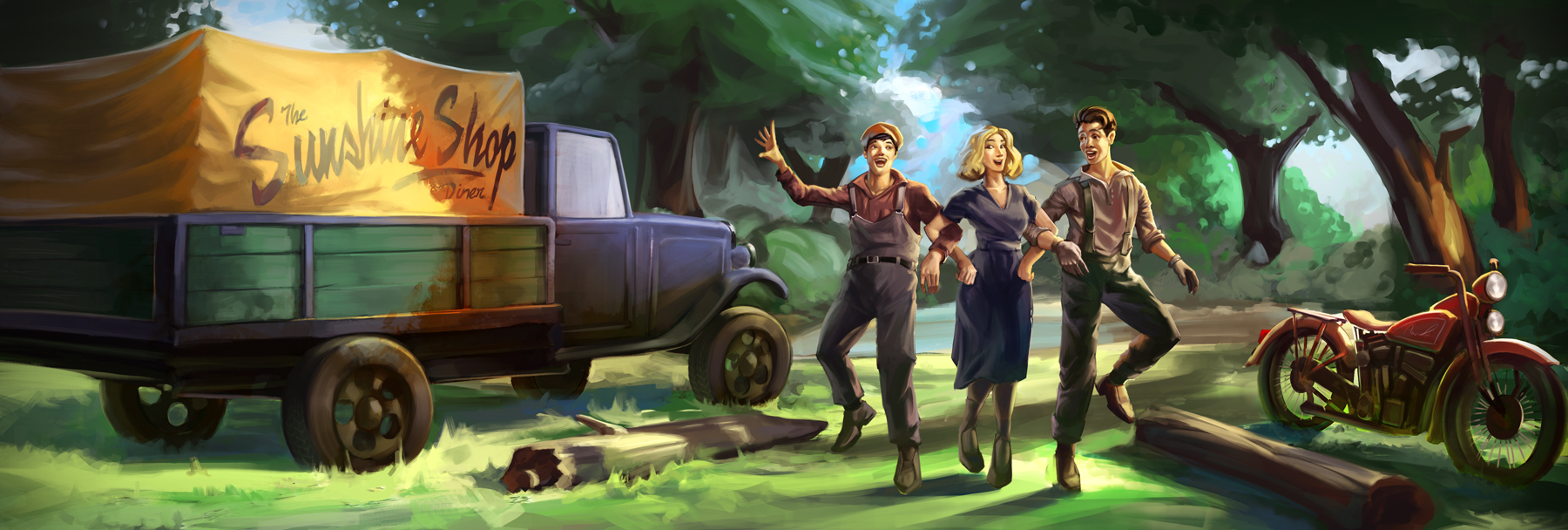
Let's start with the first problem... Composition
Even tho' the idea was well presented, there was not enough elements for properly express the focal point. Nor enough contrast to show them off just rightly.
So the first step was to fix that little issue: elements of composition. I added many more assets in direction straight to the focal point to add more interest to it and mark it as the main point of interest in the whole scene. Not to say that all these elements would also greatly enrich the scene and the storytelling behind it.
Also the horizontal lines behind the vertical characters help to pop them up onto the scene. An element that is subtly presented in the whole scene for pumping assets up (characters included) is the warmth.

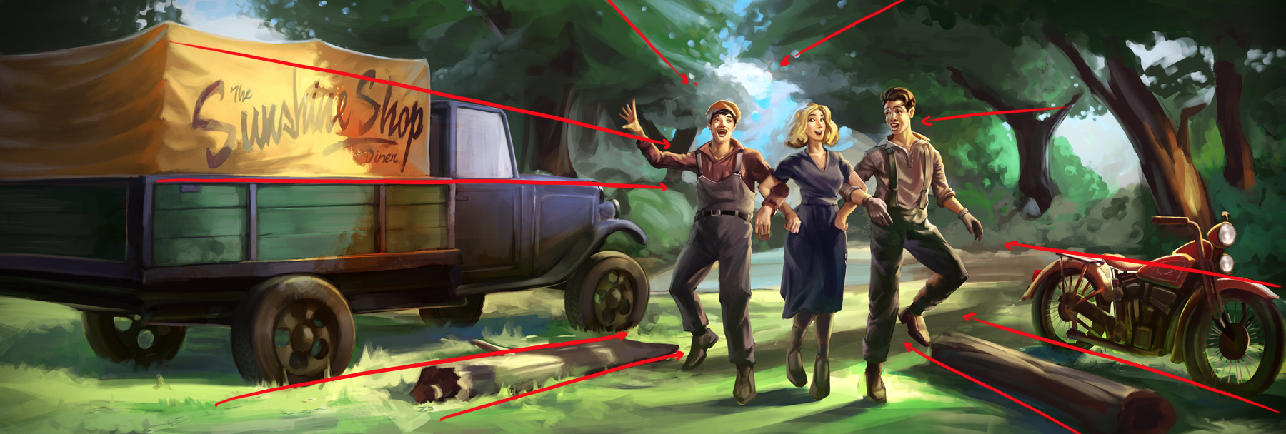
...Warm colors of course. Such as the red motorbike, the super warm orange optical effect as transition between the shadow and light on the cargo of the truck, and mainly onto the skin tones of the characters' faces.
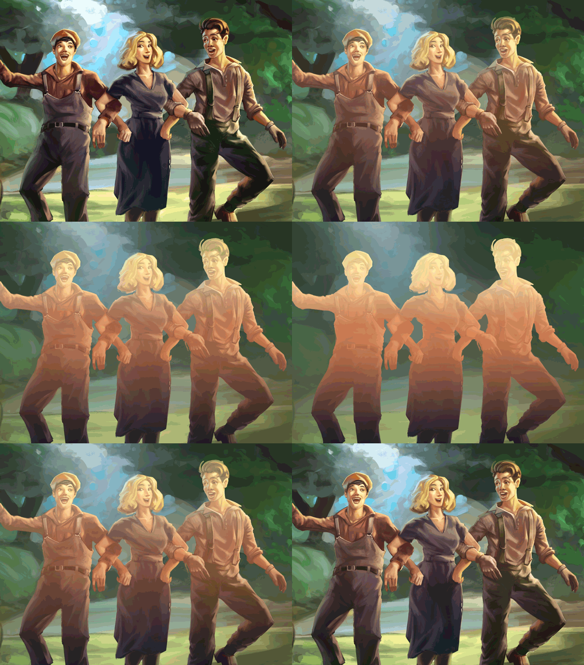
I used here a dramatic light warm on their faces to pop up them even more, leaving the rest of their bodies in cold virtual-shadows so that would generate the contrast that we are looking for.
Theres also one more thing: if you see the background behind the characters, while the characters go from warm light to cold shadow (from top to bottom) the background goes from cold shadow to warm light in the same order. This is another element of composition that makes a big magic when it comes to contrast.
Beautiful work, can you let me know where I can learn Adobe illustrator and Photoshop? Other than the Youtube stuff. I really want to be a designer, not for the bucks, just for my soul!
Catch me on discord =)
wow great finished or well refinished pictures
You really know how to make things pop in the art.
nice post
Thanks, I'm starting to draw and this will be very helpful
Did you also make the characters slightly bigger? I often have trouble with drawing more than one person with the background, but this is really helpful! I'll try to implement your tips in the next illustration. Thank you :)
Actually I do! There is one post where I uploaded a character design (Hagrid from Harry Potter's universe) where I place many different creatures over the main character.
If you have any doubt or question please let me know.
Really good job thnx for this ,follow, upvote ,resteem
great work.....
upvoted
great work. you are talented
you did a great job with the illustrations ,Spot on Doc!!
Do you want to hear my story about how I saved my Pilot friend from a fatal incident?
That's really nice. What are you using for the drawing?