YouTube’s redesign is official, and there’s a dark mode
From Ars Technica
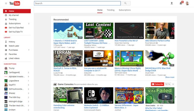
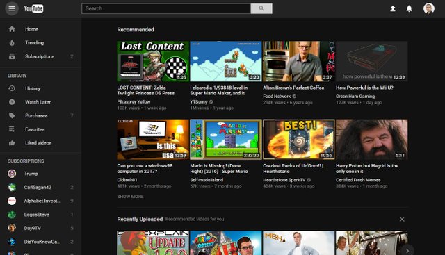
YouTube has a new look, with the desktop site getting a "Material Design" revamp today. The design has slowly been leaking out in A/B testing, but today the company is making it official.https://arstechnica.com/gadgets/2017/05/youtubes-desktop-site-gets-a-material-design-makeover-asks-for-feedback/YouTube says the new design aims for a "simple, consistent, and beautiful" look. Most of YouTube's box-heavy card design has been erased, instead going with a simple white background, the usual grid of thumbnails, and more white space. YouTube makes use of Material Design's trademark shadowing, with a pinned search bar at the top of the screen. It's not a drastic change until you turn on the new "dark mode," which replaces all the white UI with something easier on the eyes. The dark mode switch lives in the new profile menu, which you can access by clicking on your profile picture in the top right.
Material Design was introduced three years ago in Android 5.0 and is meant to be a unifying design style for all of Google. Seeing it finally come to YouTube is nice, but it is still missing from flagship products like Gmail and Google Calendar, which were both last redesigned in 2011.
The design isn't automatically rolling out to everyone yet. Users can opt-in to a "preview" of the design over at youtube.com/new, and it's easy to revert back to the old design if you don't like it. YouTube is soliciting feedback on the new design before a wider rollout; it suggests you leave feedback via the link on the account menu.
YouTube's new interface is built on Google's Polymer framework, a JavaScript library for creating Web components with a focus on creating Material Design-style apps on the Web. With the Polymer base up and running, YouTube says it will have "quicker feature development from here on out." It cites the dark theme as the first of these Polymer-enabled features and ends with saying, "This is only the beginning—you can look forward to more powerful new features coming soon!"
Follow @contentjunkie to stay up to date on more great posts like this one.

I don't care what bells and whistles Youtube has in store if they can't treat the content creators with respect and give them their just rewards I am looking for any media platform that will honor the artists. Being an artist is a struggle so this kind of treatment can't pay me off with amazing designs and awe inspiring power tools. Even though it is very tempting. Thanks for the post and letting me rant. POWER TO THE ARTISTS!
Is there a button for changing it to dark mode? I'm not finding it.
EDIT:
Nevermind. I think I have the answer from your post:
Are you on youtube.com/new ?
I'm there now...still haven't found any way to change it to the dark setting.
Click on your icon in the top right in the new site.
Look for Dark Theme.
Turn it on.
Awesome. It worked!
Thanks :)
This post has been ranked within the top 50 most undervalued posts in the first half of May 03. We estimate that this post is undervalued by $3.50 as compared to a scenario in which every voter had an equal say.
See the full rankings and details in The Daily Tribune: May 03 - Part I. You can also read about some of our methodology, data analysis and technical details in our initial post.
If you are the author and would prefer not to receive these comments, simply reply "Stop" to this comment.