How to make a good looking PowerPoint Presentation [Part 2]
How to make a good looking PowerPoint Presentation [2]
This issue is about the first steps. So which design you should choose
and how you can create a nice background.
Step 1
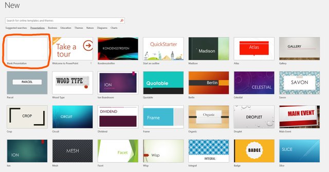
First, we have to choose a design. I always prefer
the completely empty one because there we have no guidelines.
Step 2
Next, we decide on the background we want to take.
Here I show you a few ways to configure the background.
The first example shows a gradient fill
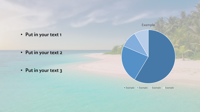
In the second example, a landscape is the background. Here I would always add a filter in form of a shape
You can also put different shapes in the background
That's it for now and soon the next issue will be released


Who likes to create presentations in general? Are there such people? When my bosses at work tell me to create another presentation, it annoys me. For many years I tried to create presentations myself but they always turned out badly. Now I ask to write my powerpoint presentation to the experts at essayshark.com and it is the best decision I have ever made.