What we see on the world map or the Mercator projection.
In connection with the theories of a flat earth would like to make a clarification on the maps of the world.
From the time when the Earth was recognized as a round ( although it is rather an ellipse, irregular shape) there is a problem transferring the images of the continents from the globe onto a plane.
In the 16th century, the solution to this problem was proposed by Gerardus Mercator. And we still use the so-called "Mercator projection".
What is the essence.
I'll try to explain as simple as possible. Take transparent our planet, inside turn on a light bulb and wrap it with tracing paper in the form of a cylinder. Shadows from the continents close to the equator we will be able to circle almost the same as on the globe, and shade those that are closer to the poles will be naturally more.
And so the size of countries different from the one we see on a flat map.
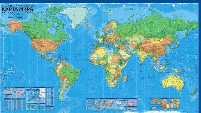
And now some interesting facts. For example, the area of Greenland is 2 130 800 km2 and the area of Australia is 7 692 024 km2 . That is, Greenland is three times less than Australia, and now look at the map...
The area of Alaska is 1 717 854 km2 and the area of India is 3 287 263 km2. India is almost two times more than Alaska, and more Greenland too. And what we see on the map?
The area of Brazil is 8 511 965 km2, the area of Canada is 9 984 670 km2, and according to the map, the difference is almost twice. By the way China 9 596 960 km2, and the map is almost equal to Brazil and Australia.
Well, the most interesting.
The area of the Russian Federation is 17 191 125 km2. If you look at the map of the world, Russia is clearly more than the whole of Africa.
Look what is the area of Africa. See 30 221 532 km2 .
That is Africa is almost two times more.
I hope the flat Earth theorists consider these points.