Top 7 free Abstract Backgrounds for Wordpress Designers and how to Choose the right
Are you a Wordpress designer looking to spice up your websites? You're in luck! Today, we're diving into the world of abstract backgrounds that can take your designs from boring to breathtaking. Let's explore the top 7 abstract backgrounds that will make your Wordpress sites pop!
1. Colorful Fluid Art Wallpaper
Imagine a swirl of vibrant colors dancing across your screen. That's what you get with fluid art backgrounds! These eye-catching designs are perfect for creative websites or portfolios. The flowing shapes and bold hues can make any content stand out.
Pro tip: Pair fluid art backgrounds with simple, clean text to avoid overwhelming your visitors.
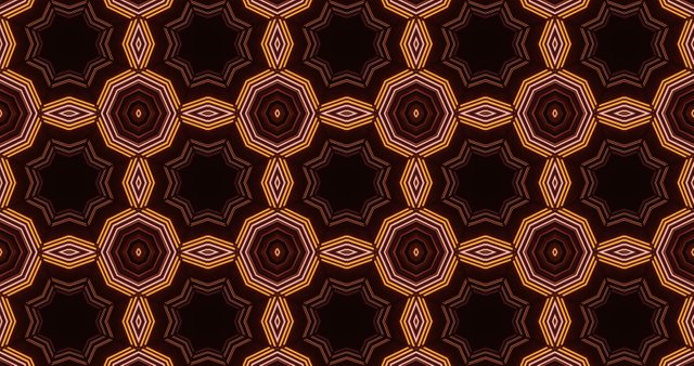
2. Geometric Kaleidoscope Patterns
Kaleidoscope patterns are like magic for your eyes! These symmetrical designs create a hypnotic effect that can keep visitors engaged. They work great for tech or science-related websites, adding a touch of complexity and intrigue.
Fun fact: Kaleidoscopes were invented in 1816 by Sir David Brewster, a Scottish physicist.
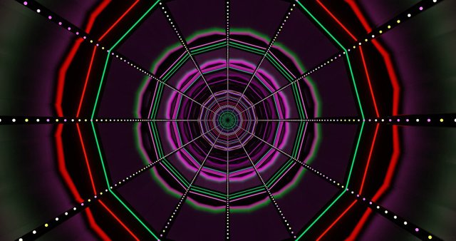
3. Neon Light Tunnels
Want to transport your visitors to a futuristic world? Neon light tunnel backgrounds are the way to go! These glowing, geometric patterns create depth and movement, perfect for tech startups or gaming websites.
Design tip: Use neon colors sparingly in your text to complement the background without clashing.
4. Pastel Gradient Waves
Soft, flowing waves in pastel colors can create a calming effect on your website. These backgrounds are perfect for wellness blogs, meditation apps, or any site that wants to convey a sense of peace and tranquility.
Color psychology: Pastel blues and purples are associated with calmness and creativity.
5. Dynamic Color Splashes
Bring your website to life with explosive color splashes! These dynamic backgrounds add energy and excitement to any design. They're perfect for art portfolios, event websites, or any brand that wants to show off its fun side.
Accessibility note: Make sure your text contrasts well with the colorful background for easy reading.
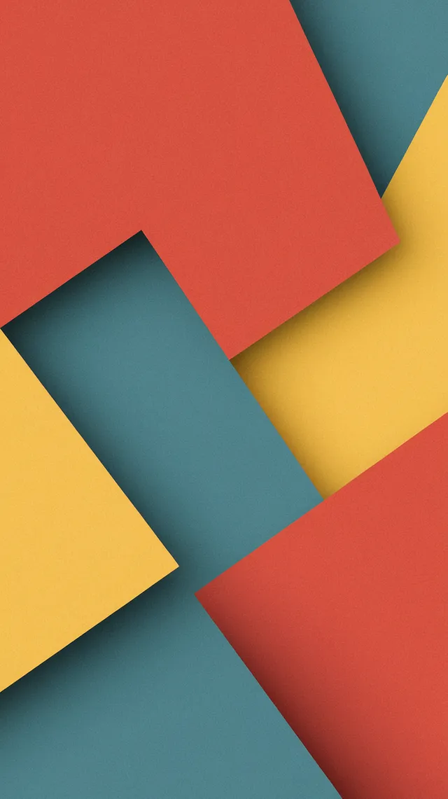
6. Minimalist Geometric Shapes
Sometimes, less is more. Minimalist geometric shapes create a clean, modern look that's perfect for corporate websites or design agencies. These backgrounds add interest without overwhelming your content.
Layout tip: Align your content with the geometric shapes for a cohesive design.
7. Abstract Nature Patterns
Bring a touch of nature to your abstract designs with leaf patterns or flowing water textures. These backgrounds work well for eco-friendly brands, nature blogs, or anyone wanting to add an organic feel to their site.
Branding idea: Use colors from your logo in the abstract nature pattern for a cohesive look.
Why Use Abstract Backgrounds?
Now that we've seen some awesome abstract backgrounds, let's talk about why they're so great for Wordpress designers:
- Versatility: Abstract backgrounds can fit almost any type of website with the right colors and style.
- Uniqueness: They help your site stand out from the crowd of generic stock photos.
- Emotion: Abstract designs can evoke feelings and set the mood for your site.
- Focus: When used correctly, they draw attention to your content without distracting from it.
- Brand identity: Custom abstract backgrounds can become part of your brand's visual identity.
How to Choose the Right Abstract Background
Picking the perfect abstract background isn't just about what looks cool. Here are some tips to help you choose:
- Consider your audience: What will appeal to the people visiting your site?
- Think about your content: Will the background make your text and images hard to see?
- Match your brand: Choose colors and styles that fit your brand's personality.
- Test on different devices: Make sure your background looks good on phones, tablets, and computers.
- Keep it simple: Sometimes a subtle background is more effective than a busy one.
Design Ideas for Different Website Types
Let's look at how different types of websites can use abstract backgrounds:
| Website Type | Abstract Background Idea | Why It Works |
|---|---|---|
| Tech Startup | Neon geometric patterns | Futuristic and innovative feel |
| Yoga Studio | Pastel gradient waves | Calming and serene atmosphere |
| Graphic Designer | Dynamic color splashes | Showcases creativity and energy |
| Law Firm | Minimalist shapes in blue | Professional and trustworthy look |
| Eco-friendly Brand | Abstract leaf patterns | Connects with nature theme |
Tips for Using Abstract Backgrounds in Wordpress
Ready to add an abstract background to your Wordpress site? Here are some handy tips:
- Use a page builder: Tools like Elementor or Divi make it easy to add custom backgrounds.
- Optimize your images: Compress your background images so they don't slow down your site.
- Consider parallax effects: Make your background move as visitors scroll for a cool effect.
- Add overlay text: Use contrasting text colors that stand out against your background.
- Be mobile-friendly: Make sure your background looks good on smaller screens too.
Creating Your Own Abstract Backgrounds
Feeling creative? You can make your own abstract backgrounds! Here are some simple ways to get started:
- Use online tools: Websites like Canva offer easy-to-use design tools.
- Experiment with gradients: Play with color combinations in your design software.
- Try photo manipulation: Take a regular photo and add filters or effects to make it abstract.
- Explore AI art: Tools like DALL-E or Midjourney can generate unique abstract designs.
Remember, practice makes perfect! Don't be afraid to experiment and have fun with your designs.
Conclusion: Make Your Wordpress Site Stand Out
Abstract backgrounds are a powerful tool for Wordpress designers. They can transform a boring website into a visual masterpiece. Whether you choose fluid art, geometric patterns, or minimalist shapes, the right abstract background can take your design to the next level.
Ready to dive deeper into the world of stock images? Check out our guide to using stock images effectively for more tips and tricks.
Remember, the key to great design is balance. Use these abstract backgrounds wisely, and your Wordpress sites will be sure to impress!
Infographic: Choosing the Perfect Abstract Background
Here's a quick guide to help you pick the right abstract background for your Wordpress site:
[Abstract Background Selection Guide]
|
|--- Consider Your Brand
|    |--- Playful & Creative: Color Splashes or Fluid Art
|    |--- Professional & Modern: Minimalist Shapes or Geometric Patterns
|    |--- Calm & Serene: Pastel Gradients or Nature-Inspired Abstracts
|
|--- Think About Your Content
|    |--- Text-Heavy: Choose Subtle Backgrounds
|    |--- Image-Focused: Bolder Abstracts Can Work
|
|--- Check Technical Aspects
|    |--- File Size: Optimize for Fast Loading
|    |--- Responsiveness: Looks Good on All Devices
|    |--- Contrast: Ensures Readability
|
|--- Test and Adjust
|    |--- Get Feedback
|    |--- Try Different Options
|    |--- Fine-Tune Colors and Opacity
With these tips in mind, you're ready to create stunning Wordpress designs with abstract backgrounds. Happy designing!


