Symbiont{s} | Steem Brand Guidelines
Greetings,
The community is growing and getting more active, not only on Steem but also on other social media platforms, which demonstrates a huge dedication to reach a bigger audience and promote Steem in the best possible way.
To complement the efforts of the community, we really would like to provide more information to people who are actively doing their best to promote Steem. This post aims to solve a few issues that we have seen when people were trying to provide tutorials to the Community and potentials leads. However, they used the wrong logo and an inappropriate font, which lead the whole effort to have an opposite effect despite the honest intention of the authors/initiators.
This topic in itself is certainly not a big deal, but we think it is always better to stick to clear quality standards when trying to present Steem to the world. Furthermore, we highly advise and encourage large stakeholders, Steem representatives, POs, and Steem enthusiasts to follow the Steem brand guidelines presented below. This is of course not a call to stop from being imaginative and create new things, new arts, and designs for the community to use. Instead, everyone should take it as an inspiration to always provide very high content when promoting Steem. Because the work that we, as a community, present to the world will surely be seen, to some extent, as a reflection of the community and Steem.
We have also noticed that some exchanges are still using the old Steem logo. This may sound trivial, but in reality, potential investors may see it as an indicator of the health of the token. It also shows whether there is a team/community behind Steem or not because generally, projects/tokens are considered dead when development stops.
So without further ado, below is an exact copy of the Steem Brand guidelines as provided by Steemit Inc. under an open-source license.
Logo
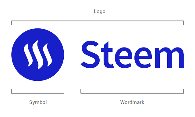
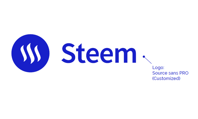
The Steem logo consists of the Steem symbol and a custom wordmark.
It is important to notice that the wordmark can not stand on its own without the symbol. As the symbol is the most recognizable part of the Steem brand.
Space
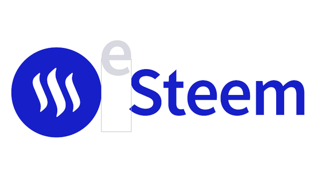
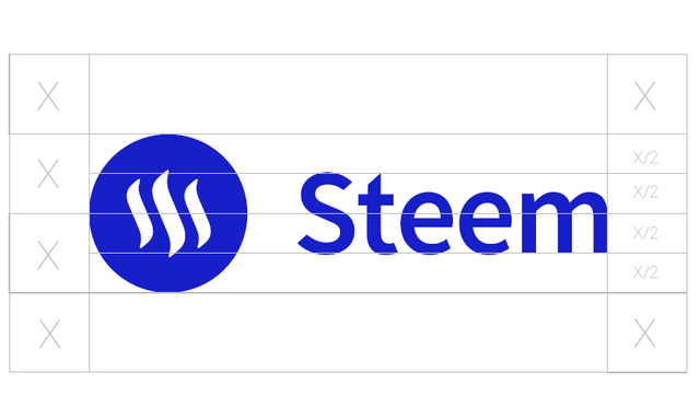
Spacing the wordmark and symbol is easy just align the “e” between the symbol and the body of the “S” in the wordmark.
Wordmark size & Exclusion Zone
Creating room for the Steem logo to be clearly visible is important.
Just divide the logo in half and use that metric X to define the clear space for the logo. The wordmark should always be proportional to the symbol.
Treatments
There are different treatments of the steem logo. Depending on the designs the Steem logo needs to fit in to.


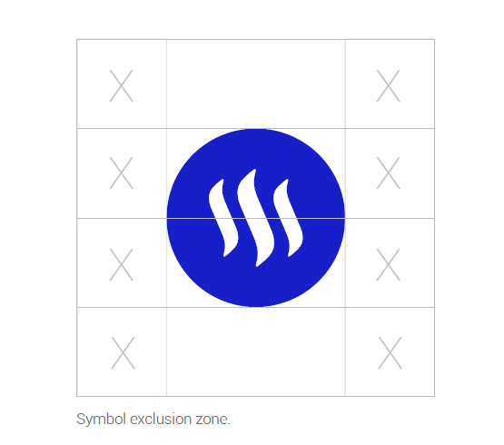
Symbol
The Steem symbol is used to represent the currency STEEM. Use the same guidelines as with the logo.


Usage Guidelines
Design advice on how to make your designs look Steem-related.
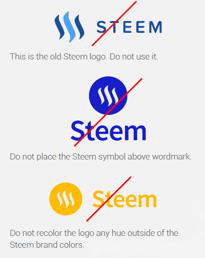
Please do not edit, modify, distort, rotate, or recolor the logo in ways that are not specified in this guideline.
Don't:
DO:
- Use brand fonts;
- Select a solid version of logo if the background is too busy for gradient version;
- Use the dark logo on light backgrounds;
- Use the white logo on dark backgrounds.
Additional Don’ts:
- Use wordmark without the symbol;
- Rotate the logo;
- Transform, stretch, or squeeze;
- Manipulate objects in the logo;
- Redraw elements in the logo;
- Use an outdated color scheme;
- Adjust the opacity of elements in the logo;
- Recolor different element in the logo;
- Outline logo;
- Overlap graphics on top of the logo;
- Use logo shape as a mask on images;
- Manipulate spacing between letters;
- Make wordmark all caps.
Colors
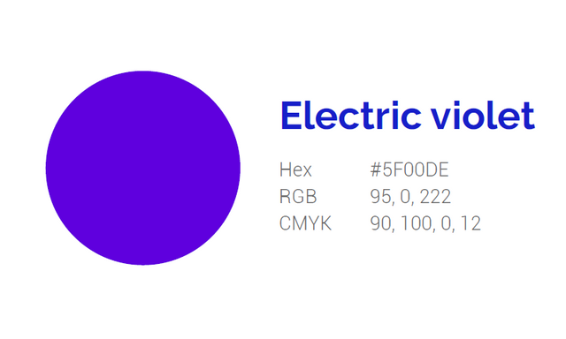
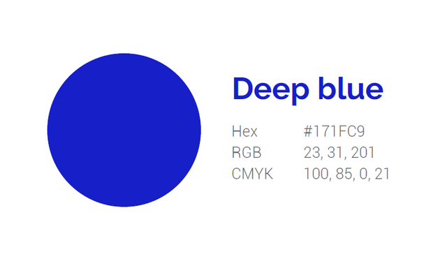
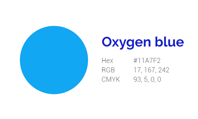
Steem's main color scheme is light with strong, bold colors. These colors are used to emphasize elements in the design.
 |
 |
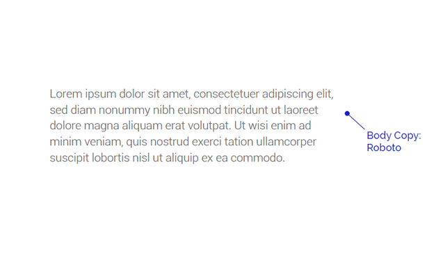
Fonts (Open-Source)
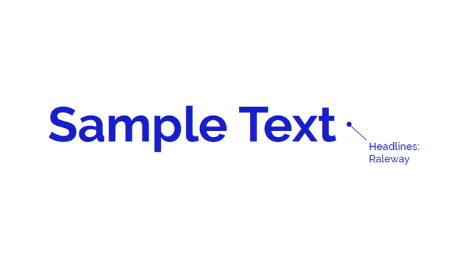
Steem is an open platform and so are the font choices.
All fonts are available for free on Google fonts.
Steem on,
The Symbionts Team,
References
1. Steemit Inc. Steem Brand Guidelines. V 2.0, (https://steem.com/brand), last accessed on July 8, 2020.
2. Direct link of the full package: Steem Brand Guidelines.

Thank you for this reminder @symbionts. I'm guilty of using wrong logo haha. Will follow this logo now onward. Thanks for the extra care on this 🤗