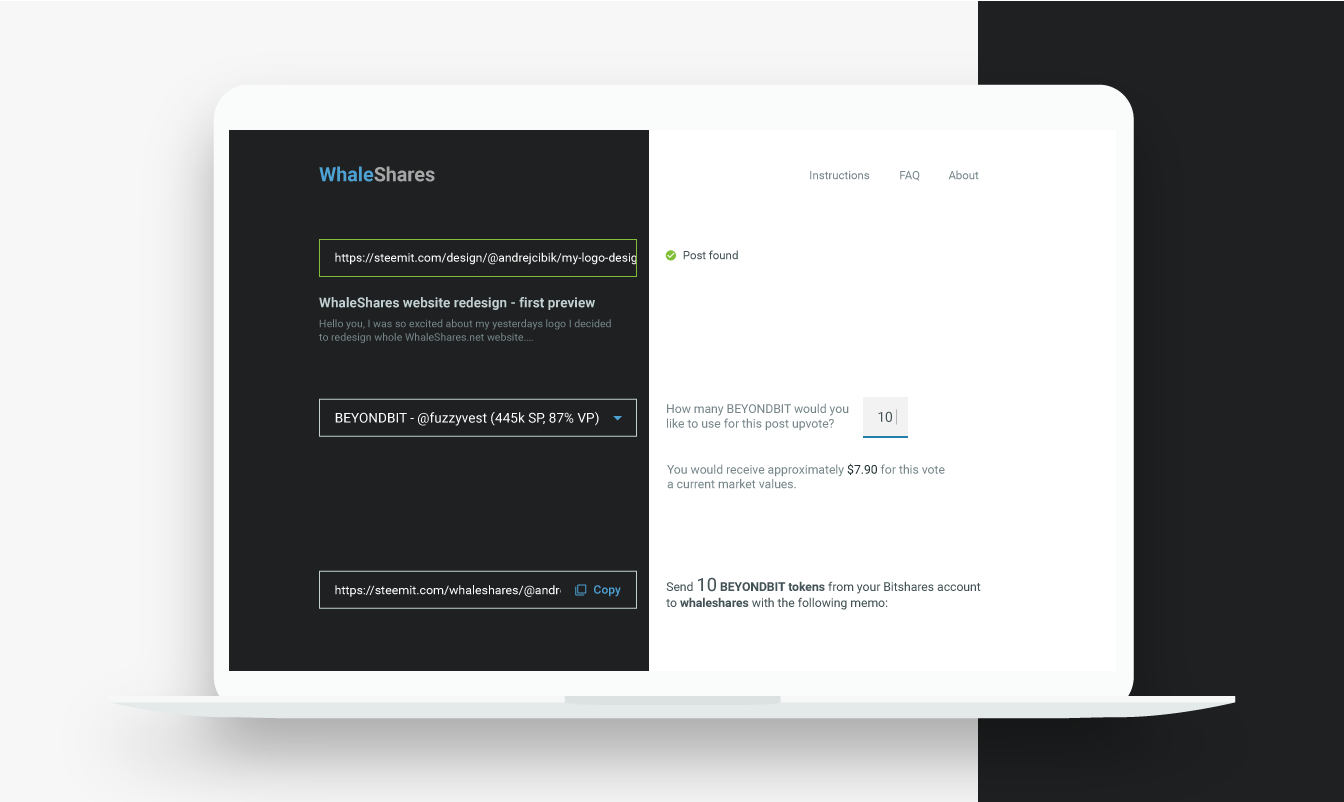
💻 My web design - WhaleShares website redesign - interaction and layout
Hello dear friends,
I would like to share with you our latest development of WhaleShares.net website redesign.
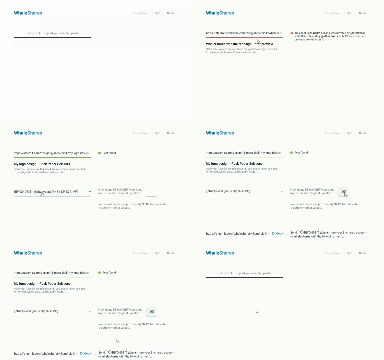
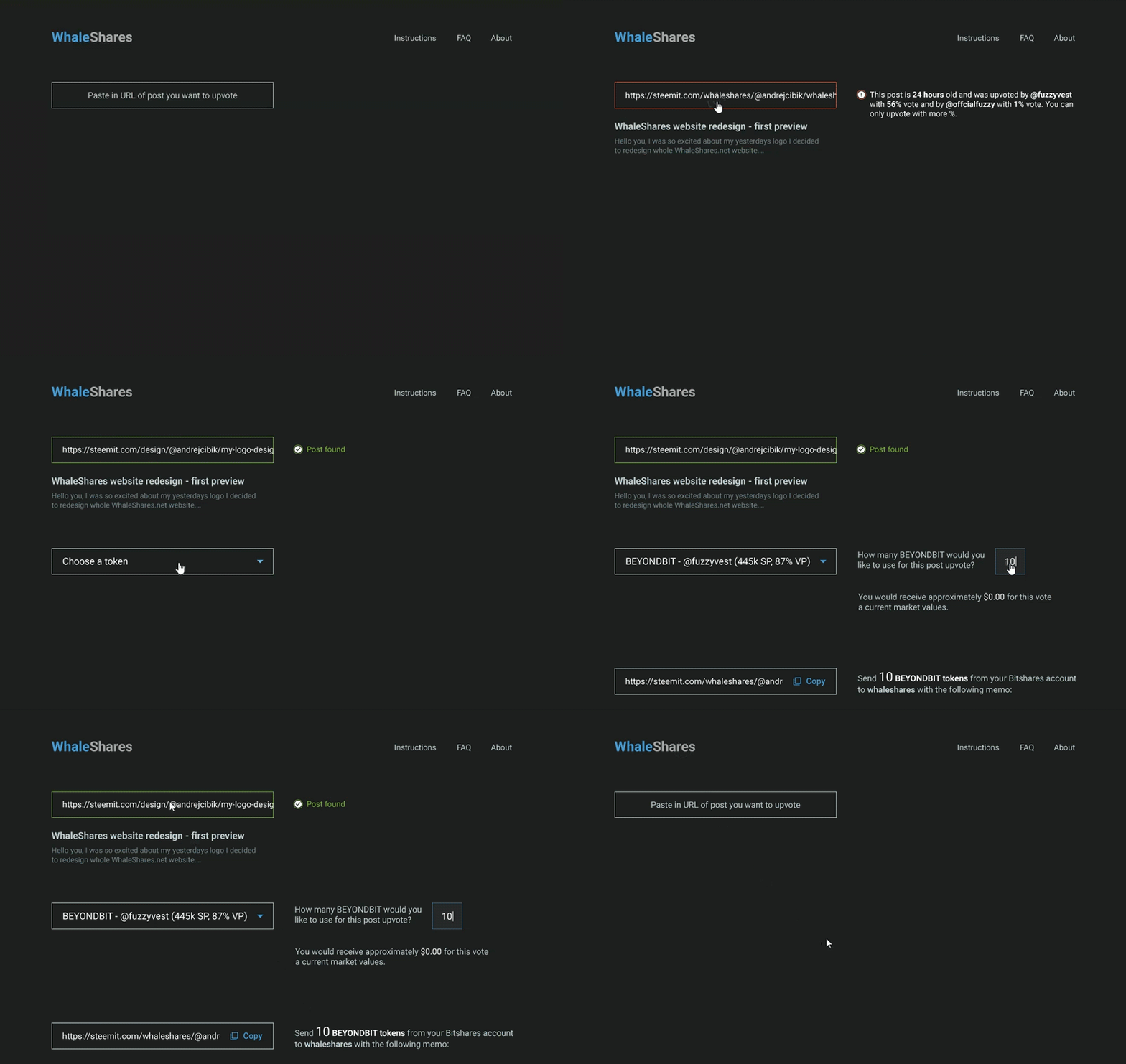
We came up with animated-steps layout. Each step will be smoothly animated. Thanks to this, users will have simple and fast expiriance.
Be sure to try the prototypes yourself!
Dark or light? Tell us in the comments.
Light version

Dark version

Which version do you like more?

Andrej Cibík @andrejcibik
Web design | Web development | Logo design


I like the white version better for some reason! Maybe because I am expecting something complicated, it would be nice that everything is clear.
I know the limitations of Marvel and it sucks that you can't implement animations sorta, but I am looking forward to the actual product!
I couldnt help but notice that the placeholder text of the 'Paste your URL' is centered, but in the rest of your input fields it is left aligned. I would keep this consistent and have it left-aligned aswell :)
I love the way you display the title and first sentence of the post you just want to get upvoted. However, I would consider switching the locations of the 'Post found' and the preview. In the very popular Material Design as well in other Design, an error considering an inputfield is commonly added below the field rather than right next to it.
At the bottom, it is quite weird that you first show the link, and then the description which ends on a :. Since it's the 'conclusion' of your page, you might want to make this more obvious. I am thinking maybe you could just center the whole section with the text on top of the memotext.
I really like the design. It looks very clean and simple. Good luck :D
Thank you very much! I will surely implement some of it.
great job
great job! I dont know which variant I like more.. both great :)
great designs... good job....
upvoted and followed...!!!
I most like dark theme :)
Nice! I like the white version better :)