Because this challenge seems cryptic. Image 2 and 3 are the better photos. But this photo is the least identical. With the name on the opposite side, and the position of the fly in the top right, where the other ones are centered.
Although this photo appears to be the most blurred (although I can't honestly tell) , the little guy has more space to look into the rest of the photo to the left, but I would crop it just a tad more, so that there would be a little more space to the left. It has the best composition of the 4. When there is a person or an animal in the photo, there is more impact when the eyes are looking into some space. So, I am not voting for technical details here, but the pleasing look of the image on a small screen! There is also more balance with the copyright info to the left in my opinion.
Ill vote for this one photo one. While it's not the clearest, nor the best photo. You can clearly see both wings and the signature is on the left. I like underdogs what can I say. Its clearly different from all the others.
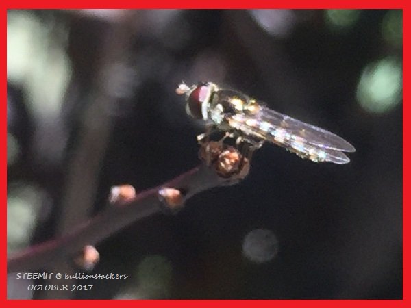
I go for this choice because everything happening on this picture is opposite to the other 3
Because this challenge seems cryptic. Image 2 and 3 are the better photos. But this photo is the least identical. With the name on the opposite side, and the position of the fly in the top right, where the other ones are centered.
I'm going with this one. It looks original and unedited.
Although this photo appears to be the most blurred (although I can't honestly tell) , the little guy has more space to look into the rest of the photo to the left, but I would crop it just a tad more, so that there would be a little more space to the left. It has the best composition of the 4. When there is a person or an animal in the photo, there is more impact when the eyes are looking into some space. So, I am not voting for technical details here, but the pleasing look of the image on a small screen! There is also more balance with the copyright info to the left in my opinion.
It is the most blurred?
Ill vote for this one photo one. While it's not the clearest, nor the best photo. You can clearly see both wings and the signature is on the left. I like underdogs what can I say. Its clearly different from all the others.
I select Photo 1 for mainly two reasons: