HOW TO DESIGN YOUR WEBSITE TO MAKE IT MORE APPEALING
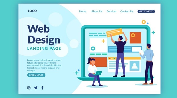
Do you want to make your own website but you are unable to pick design choices to make your website more appealing?
A good web design is very important for your brand identity.
In this blog we will help you to figure out good design choices to make your website more appealing.

Only include elements that are essential and add value to your website

It’s easy to get caught up in adding so many elements to your pages while designing your website. You want your site to be visually pleasing, so you keep adding elements to give it a new level of visual interest.
This will cause your website to become cluttered or overwhelming. The other issue is that if some elements on your site don’t serve a function, your visitors will become confused.
Every component of your website should serve a specific purpose.
Consider a call-to-action (CTA) button that does not redirect to a new tab. People would keep trying to press the button, and they’d be perplexed as to why it didn’t take them anywhere.
Consider what would happen if a top-of-the-funnel blog post on an HVAC website urged users to “Call now.” People are unlikely to click. The CTA would also come across as pushy, negatively affecting the reader’s perception of the business.
Every element on your page should serve a specific purpose. Put something on your site only if it improves the aesthetics of the website. Create usable elements that will improve the site’s user experience.
First and foremost, consider the customer.

When it comes to creating beautiful websites, it’s important to keep the user in mind. Your visitors can interact with your website and learn more about your business. It’s important that you build a platform that caters to their needs.
Consider how to create a template that gives your audience the best experience when you construct your amazing website design. Examine design elements such as the layout, navigation, and visual elements.
When you build for the consumer first, you give them a better website experience. They will stay on your site longer, allowing you to generate more valuable leads for your business.
Select colors that complement your brand.

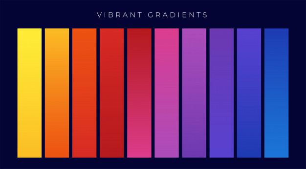
Beautiful websites use colors that complement the company’s identity. When designing your website, you want to make sure that the colors you use are appropriate. People’s perceptions of your brand are influenced by your color choices.
Colors have various connotations. It’s critical that you understand the meaning of various colours and how they affect your audience’s view of your business.
Integrate the brand’s colors into your website if you already have them. Make sure you use the same key colors in all of your marketing materials to maintain brand continuity.
You should limit yourself or three to four colors when choosing colors for your lovely website. A primary color, one to two accent colors, and a font color will be used. You’ll want to use these colors consistently in the same position on any page you make.
Colors can be used in the same position every time. The colors of your CTA buttons and titles should all be the same. Maintain continuity across all of your pages to have a good experience for your visitors.
Add visual elements to your website to make it more appealing.

When users first visit the website, they want to see elements that grab their attention. Beautiful websites have eye-catching visuals that entice visitors to investigate a business. They help to balance the page and break up the text.
Photos, images, and infographics are only a few of the visual elements you can use on your website. As points of engagement, several businesses will use a plethora of images and incorporate videos on a sporadic basis. To assist in the design of your web, you can use a variety of visual elements.
When you use visual elements on your website, they should be relevant to your business. Don’t just add photos to your website for the sake of adding them. Your photos should be meaningful and representative of your company and industry.
You may use pictures of your staff, your workplace, your goods, or people performing your services to illustrate your point. To give your site a more authentic feel, you can use original photographs. Using so many stock images on your website will make it appear stiff and fake.
When it comes to videos on your website, you can share a wealth of content. You may give your audience a tour of your facility, demonstrate a product, or educate them on a particular subject.
Overall, using visual elements contributes to the development of beautiful websites. You will make your site more visually appealing for your audience by incorporating visual elements.
Select the appropriate font.

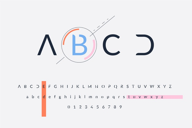
The right colors and visual features aren’t the only things that make a website beautiful. The text on your page also contributes significantly to the aesthetic appeal of your website. Not only does the content matter, but so does the ability of your audience to read it.
Your typography will have an effect on how your visitors connect with your website. Your user would have a negative experience on your site if there are so many competing fonts or fonts that are difficult to read. They won’t be able to read your material, and navigating your pages will be difficult.
Make all elements of your site appealing and simple on the eye if you want to learn how to make an attractive website design. Choose fonts that complement each other and use font types appropriately.
Put your website to the test.

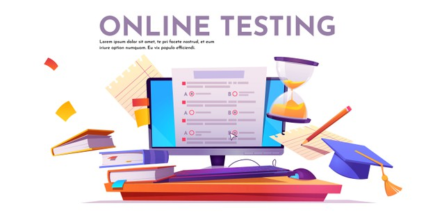
It’s important to test your amazing website design when you’re creating beautiful websites. It’s unlikely that your first concept will be your finest. To see how different elements on your site affect your audience and enhance your site, you’ll need to test them.
You will see how improvements to your site’s elements affect your audience’s experience by testing them. You will check to see if they improve the user experience, do nothing, or worsen it. This gives you a lot of information on how to make your site the best it can be.
Focus on checking individual sections of your website to see if the update affects your site for the best results.
It also doesn’t have to be a significant improvement. Changing the color of a CTA button, for example, can have a significant effect on getting people to click on it. You might make a lot of minor adjustments, but they’ll all have an effect on your visitors’ experience on your web
Putting out the best version of your website is the secret to making beautiful websites. You will work out the best version by continuously checking and improving elements on your platform.
THESE ARE SOME OF THE WAYS YOU CAN DESIGN YOUR WEBSITE TO MAKE IT MORE APPEALING