Create site icons like a pro - Part 1 (For Designers)
So, you want to make pixel icons for your web site, but don’t want to use generic icons that everyone else is using and you don’t know where to start? You are in the right spot!
I am going to explain step by step basics of the whole design process and implementation of your new custom icons to your web site. Tutorial will cover these areas:
1. For Designers (Part 1 of this tutorial)
- Introduction to pixel perfect icon design
- Design process in Adobe Illustrator
- Exporting icons as SVG
2. For Frontend developers (Part 2 of this tutorial)
- Setting up local XAMPP web server
- Setting up production environment with git, nodeJs and Gulp
- Setting up this repository to work
- Publishing your icons as web fonts
- File revving
3. Benefits of using this program (Part 2 of this tutorial)
For Designers
Design of pixel perfect icons in a vector drawing program like Adobe Illustrator can be quite confusing if you haven't done this before. Most of the tutorials on the web are explaining to you how to draw in 1:1 resolutions, but to be honest - if you are using vectors, there is no need for that. More over, it is much better to use process I will describe here.
Introduction to Pixel Perfect Icon Design
Designing pixel perfect font icons is process where you draw vector graphics and then scale it down to desired font size so that all straight lines aren’t displayed with antialiasing. This is important, because you want your icons as clear as they can be and you don’t want site visitors to guess what you had in mind when you designed them.
As icon becomes smaller, importance for pixel perfect design becomes more important because if you don't make them properly, they will appear smudged. We don't want that.
Another important factor is screen density. At the time when I am writing this tutorial, monitors with 72-96 dpi are still dominant in the world and we want to design something that everyone can understand. Even when 150+ dpi monitors (4K and larger) become a dominant world standard, you will be able to use ideas presented in this tutorial to design clear and understandable icons.
Real Life Example
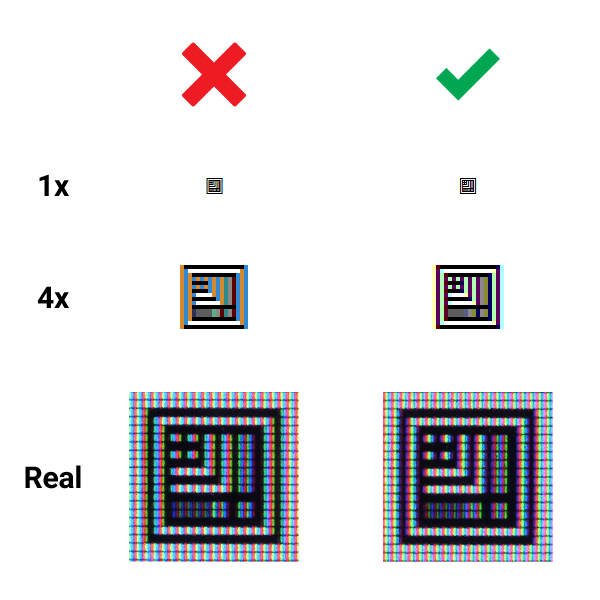
In the image below, you can see how good and bad icons look in their real size, magnified 4x from screenshot and in real life on regular monitor.
There will always be some minor antialiasing on the edges when vector objects are shown on the screen, but we want to bring that down to a minimum.
Design Process In Adobe Illustrator
Before we start to design new icons, we need to figure out their use case – will we use them aligned with regular paragraph text, which has its own set font size, or will we use them in some special cases like in buttons, headlines or perhaps on their own as larger graphics?
As I wrote earlier - as icon becomes smaller, importance for pixel perfect design becomes more important.
Case 1 – 16px Font Size
This is the most common case, since most browsers set 16px as their default font size for paragraph text. Since Adobe Illustrator is program for vector drawing, we don’t need to design icons in 1 to 1 ratio, zoomed in to the max :) Our art board will be much larger.
Here is the math for default art board:
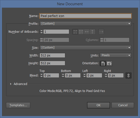
16^2 x 2 = 512 height
Height of 512 is minimum art board size that we will use. Unit is not important in Illustrator, since it is vector drawing program. You can chose whatever you want – pixels, centimeters, points. I will just write it as “unit” when used in vector drawing program.
For this example, we will make icon on a square art board of 512 x 512 units.
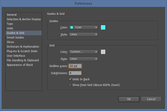
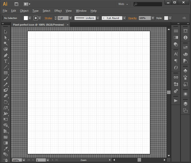
Next step is setting up our grid. We want each grid column to be 1px in finished icon.
512 units height / 16px font size = 32 units grid
Subdivisions are there for better precision and one special usage that I will explain later.
This is the final art board that we will use for our 16px icons.
PLEASE NOTE: We will need to recalculate art board and grid sizes for all different icons sizes.
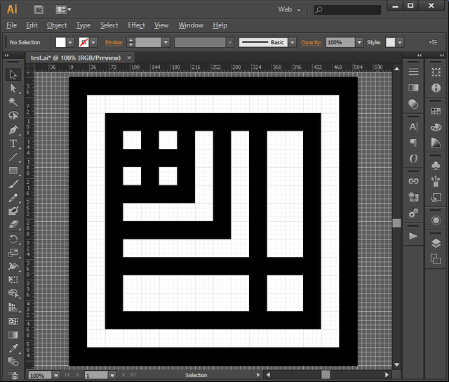
We can now design icons! :) In this prepared example, you will see only test pattern.
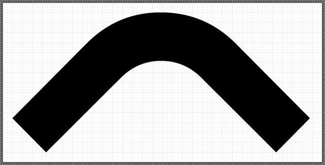
Each line has a width of 32px, which will translate to 1px in 16px icon. Don't be limited by straight lines, you can use curves as well, but in that case use line stroke that is same width as grid. In this case also 32px.
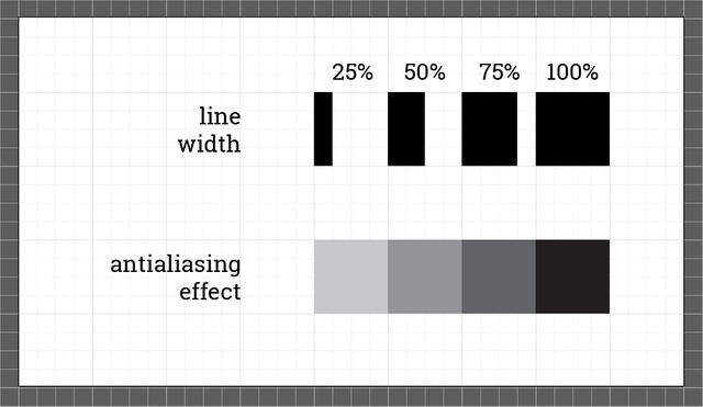
How Can We Use "Flaws" In antialiasing For Our Advantage?
Simple - we can use thinner lines as well, but the effect is quite different. Line that is 50% thinner than grid width will produce effect of 50% transparency in its place. That is nice side effect of antialiasing which we can use for increased creativity, some interesting patterns and simulated transparency.
Case 2 – Non Standard Icon Size
We don't need to create pixel perfect icons that are limited to 16px. We can make any pixel perfect sizes we want and this is how we do it.
Same as before, we need to recalculate art board and grid size so that they can be aligned to new pixel size.
For instance, if our new icon is 24px, art board size would be:
24^2 x 2 = 1152
New grid size would be:
1152 / 24 = 48
Simple. Please note that artboard has to be larger than 512px because we want to maintain fine details in final result.
Case 3 – Wide Icons
It is not a problem to create icons that are much wider than square art board. Just extend the width of an art board, but keep the height the same. Like this one (16px tall icon).
Exporting As SVG
When your design is finished, there are few rules you must follow before you export your icon as SVG:
- Only vectors are included, all raster graphics are discarded. Don’t use raster images!
- Only flat surfaces are included. All strokes must be converted to fills, use Object -> Expand command.
- Only one color is accepted. If you plan to make hollow objects, use Pathfinder -> Exclude command.
- All fonts must be created as outlines
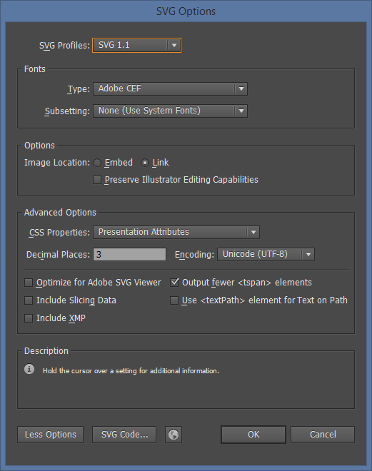
When you finish all those tasks, save file as SVG and your icon is ready to be included in your new icon font.
If you are only designing icons, you can stop reading here. Part that follows is intended for frontend engineers that will use your SVGs as Webfonts in their code. If you want to keep on reading, please do - it's really easy to do all of this even if you are not a developer. I am also a designer ;)
Author
Vladimir Jovanović
web site | Twitter | Facebook | LinkedIn | Steem
