Captivating pulsing wall web animation
The past beats inside me like a second heart. - John Banville
Let's try to make this nice pulsing animation using CSS and a little help of Adobe Illustrator. I really liked this one. It feels like some energy trying to break free, a volcano about to erupt, a word to finally be spoken.
First thing we need to do is create our polygons in Illustrator. So to do this let's use polygon tool under the shapes palette. Draw one element so it looks something like this:
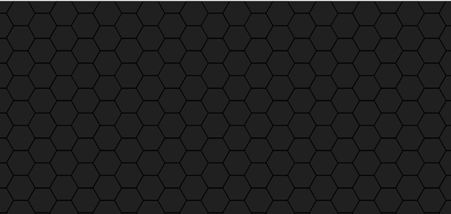
Fill it in with solid dark color. For our example I used #202020 hexadecimal. Now to create the pattern we are after, duplicate the polygon multiple times and structure them next to each other so they form a big picture like the one below.
Now from our big structure we need to slice a rectangle that will give us the desired effect after we repeat it both horizontally and vertically. You can play around with it but it should look similar to this:
Save the file in SVG format.
Awesome, we have our shapes ready. Let's jump into code and bring this piece to life by animating it.
Since it is a small example we will put all our files in the root directory. Here is the structure:
index.html
polygons.svg
style.css
In the index.html file let's add some basic structure
<!doctype html>
<html>
<head>
  <title>Pulsing Animation</title>
  <link rel="stylesheet" href="style.css">
</head>

<body>
  <div class="main-container">
    <div class="polygons">
      <div class="box">

      </div>
    </div>
  </div>
</body>
</html>
We have the polygon container that will stretch across the screen and have our sliced image as a repeating background. Inside of it, in the center of the page, we add a box element which will be the 'heart' of our animation, pulsing energy behind the wall. Let's open up the style.css file and reset default margins and padding:
body {
  padding: 0;
  margin: 0;
}
So if you look in the animation it consists of three layers. Our polygons in the front, pulsing light behind it and a black background far behind. We'll position these 3 elements this way by giving them z-index property: 0 for the closest, -1 for the light and -2 for the main-container with a black background behind. So for the main-container we have:
.main-container {
  min-height: 100vh;
  width: 100%;
  height: 100vh;
  background-color: #000;
  position: relative;
  z-index: -2;
}
For the polygons class we need to set its' background to be our sliced shape image. It repeats horizontally and vertically by default. It also has the default z-index of zero.
.polygons {
  width: 100%;
  height: 100%;
  background-image: url(polygons.svg);
}
Now we have the static background that looks like this:
Final thing that's left is to create the red light animation inside our box element.
.box {
  position: absolute;
  width: 500px;
  height: 500px;
  top: calc(50% - 250px);
  left: calc(50% - 250px);
  display: inline-block;
  z-index: -1;
  border-radius: 50%;
  opacity: 1;
  animation: pulse 30s infinite;
}
Our box is absolutely positioned in the center and we made it round with 50% of border-radius. z-index of -1 pushes it behind the polygons. We added animation property lasting 30s and let's create it right now.
Best way to do it is using keyframes. Basically, we specify how our animation is gonna happen and what properties we want to animate. In our case we want to create radial gradient expanding from the center and and play with opacity.
@keyframes pulse
{
  0%   {opacity: 0.1;   background: radial-gradient(#f06 0%, transparent 65%);}
  50%   {opacity: 1;   background: radial-gradient(#f06 0%, transparent 65%);}
  100% {opacity: 0.1;   background: radial-gradient(#f06 0%, transparent 65%);}
}
You can do it just a couple of time stamps and will be linear, animating single color. Or you can have fun with it and add multiple sections to create the effect of pulsing and vibrating, while changing colors as well. Here's the my solution.
@keyframes pulse
{
  0%   {opacity: 0.1;   background: radial-gradient(#f06 0%, transparent 65%);}
  11%   {opacity: 1;   background: radial-gradient(#f06 0%, transparent 65%);}
  13%   {opacity: 0.4;   background: radial-gradient(#f06 0%, transparent 65%);}
  15%   {opacity: 1;   background: radial-gradient(#f06 0%, transparent 65%);}
  16%   {opacity: 1;   background: radial-gradient(#f06 0%, transparent 65%);}
  25%   {opacity: 0.1;   background: radial-gradient(#f06 0%, transparent 65%);}
  27%   {opacity: 0.1;   background: radial-gradient(#ff5400 0%, transparent 65%);}
  33%   {opacity: 1;   background: radial-gradient(#ff5400 0%, transparent 65%);}
  35%   {opacity: 0.3;   background: radial-gradient(#ff5400 0%, transparent 65%);}
  40%   {opacity: 1;   background: radial-gradient(#ff5400 0%, transparent 65%);}
  41%   {opacity: 1;   background: radial-gradient(#ff5400 0%, transparent 65%);}
  46%   {opacity: 0.1;   background: radial-gradient(#ff5400 0%, transparent 65%);}
  47%   {opacity: 0.1;   background: radial-gradient(#f06 0%, transparent 65%);}
  54%   {opacity: 1;   background: radial-gradient(#f06 0%, transparent 65%);}
  56%   {opacity: 0.5;   background: radial-gradient(#f06 0%, transparent 65%);}
  61%   {opacity: 1;   background: radial-gradient(#f06 0%, transparent 65%);}
  62%   {opacity: 1;   background: radial-gradient(#f06 0%, transparent 65%);}
  70%   {opacity: 0.1;   background: radial-gradient(#f06 0%, transparent 65%);}
  72%   {opacity: 0.1;   background: radial-gradient(#ff5400 0%, transparent 65%);}
  78%  {opacity: 1;   background: radial-gradient(#ff5400 0%, transparent 65%);}
  83%  {opacity: 0.3;   background: radial-gradient(#ff5400 0%, transparent 65%);}
  87%  {opacity: 0.9;   background: radial-gradient(#ff5400 0%, transparent 65%);}
  93%  {opacity: 0.1;   background: radial-gradient(#ff5400 0%, transparent 65%);}
  94%  {opacity: 0.1;   background: radial-gradient(#ff5400 0%, transparent 65%);}
  100% {opacity: 0.1;   background: radial-gradient(#f06 0%, transparent 65%);}
}
And the final result:
Thanks for reading! Stay updated about my future posts by following @alcibiades.


cool!!
Glad you like it!
Great tutorial, very helpful.
Thanks!