Dreaded Floating Eye Monster! My First VTT Token in Gimp
BEAUTY IS IN THE EYES!
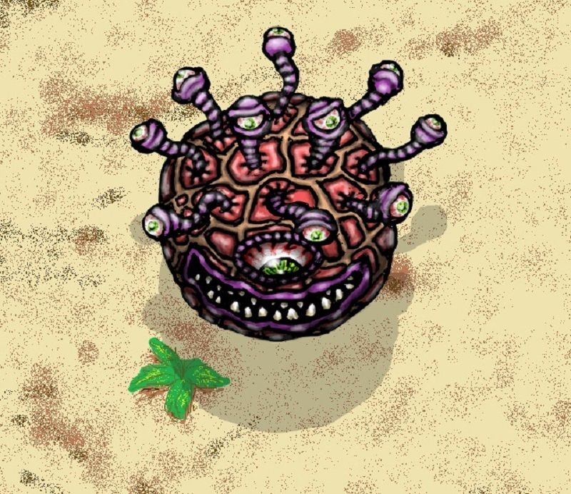
I wanted to start making tokens for VTT apps like Roll20 and I decided to start with something that would be fun to try... an old school style floating eye monster. This is the end result... a transparent background image that can be pasted onto any environment image (like a fantasy dungeon for instance). This image is in low res to limit bandwidth use on Steemit, but I also have it saved in pretty high res for future editing (or if I need it high for print quality).
THE PROCESS
So here's kinda' the steps that got me from beginning to end...
Scan All The Things!
So yeah, I scribbled a quick sketch in pencil and then inked with ubiquitous black ballpoint pen (the cheapest possible available at the grocery store by Bic to stay true to my low budget art refugee lifestyle). I scanned it in at 600dpi but that was probably dumb... something like this doesn't need more than 300dpi scan quality before any actual work is done but... I learn as I go so... yeah!
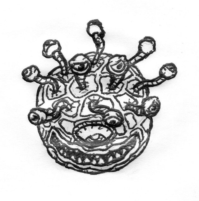
Vectorize That $%!^
Initial scan lookin' pretty sorry but we can always do worse... so I popped it into Inkscape to really take this drawing to new lows. Vectorized the lines (I don't know why, just seems like a thing to do?) and smoothed them out some... using trace bitmap to just boil it down to one color... a shade which happens to match how I like my coffee.

Gimp Will Save Us!
So now its time to repair some of them scratchy scratches that showed up from vectoring... so I important the transparent lines into Gimp (free alternative to Photoshop) and start repairs. The lines start to look a lil' better. One thing I see now in retrospect is I should have put a "softer" edge around the outside lines so it would blend better with and backgrounds rather than ending up looking like a cutout. I'll remember that for next time.
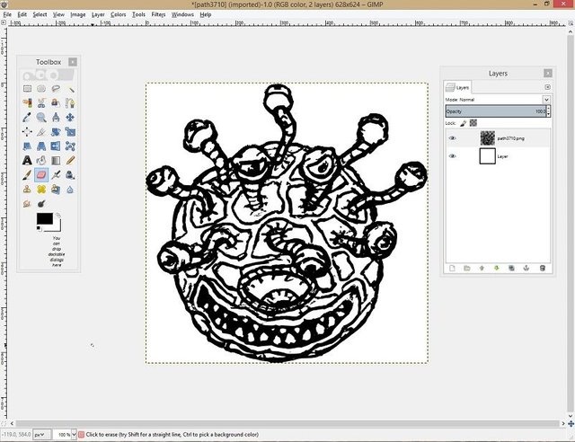
Fly the Colors
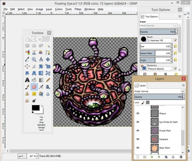
Each color gets its own layer, that's the rules... otherwise, if you try to mix them all into one layer there could be conflict. This is not an analogy for social constructs, it's purely referring to Gimp art projects (or is it?). That said, I ignore my own rules at times, and get lazy... but at least I stick to it for this project. I wanna save all those separate layers before I merge down too because I might want to use a different palette for the lines in the future. I'm new to Gimp so I may find out I'm completely wrong with this approach... we'll see I spose. Needless to say, even with a limited palette, it seems like a lot of layers.
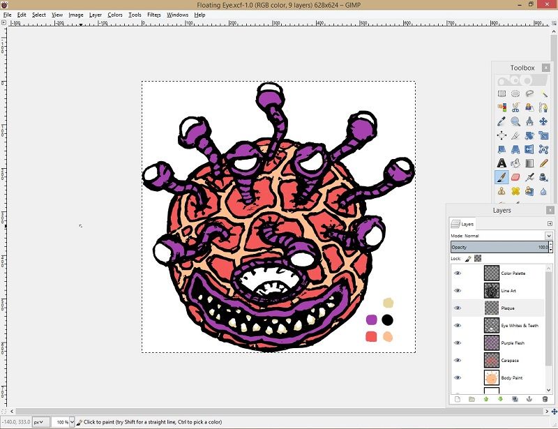
The Future's So Bright...
Gotta apply shading. Really horrible pun, I'm sorry. So I guess the way to do it is do a shade layer with repeated strokes of low opacity black and then another layer above that of low opacity white for highlights? Is that lazy? Bro do you even Photoshop? Clearly the answer is no. Someone super illuminated will reveal the truth to me someday. I was also suddenly inspired to do creepy green eyes... the kind that remind me of B-Movie aliens and old skateboard art. He looks about like he's done.
In the MS Paint, You Can't Remember Your Name...
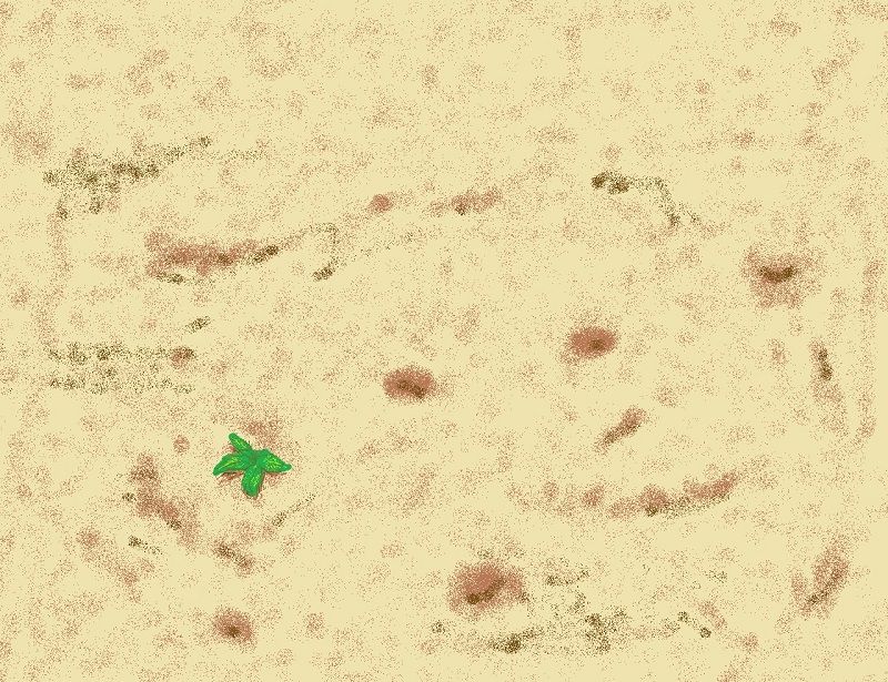
So yeah, I needed a desert background (because monsters like this just don't hang out in shopping malls) to paste this guy into and I couldn't be bothered t re-open Gimp. MS Paint to the rescue... literally 2 minutes to use the spray-paint brush tool. No idea why that plant ended up in there... Freudian psychological mystery?
And Fini?

Ooops, I forgot something... went back into Gimp and added a ground shadow (he's "floating" afterall). Then, pasted him in to his desert hovering over that "happy little ...tree." Though this was my first VTT token done in Gimp, I'm satisfied that it's doable and will be making many more I think. Thanks for following my process and reading! Also...
This is pretty sweet man, It's just oozing that pen and paper dungeon and dragons feel... HELL YES!!
Thanks @gotmeens! My tabletop is stuck in 1989. :D