Making an heatmap using Google Maps API.
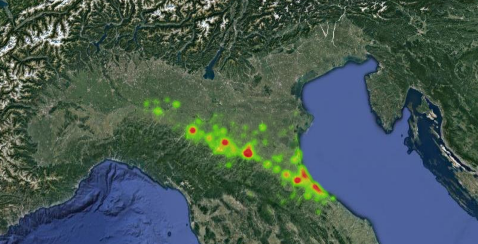
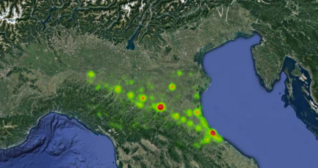
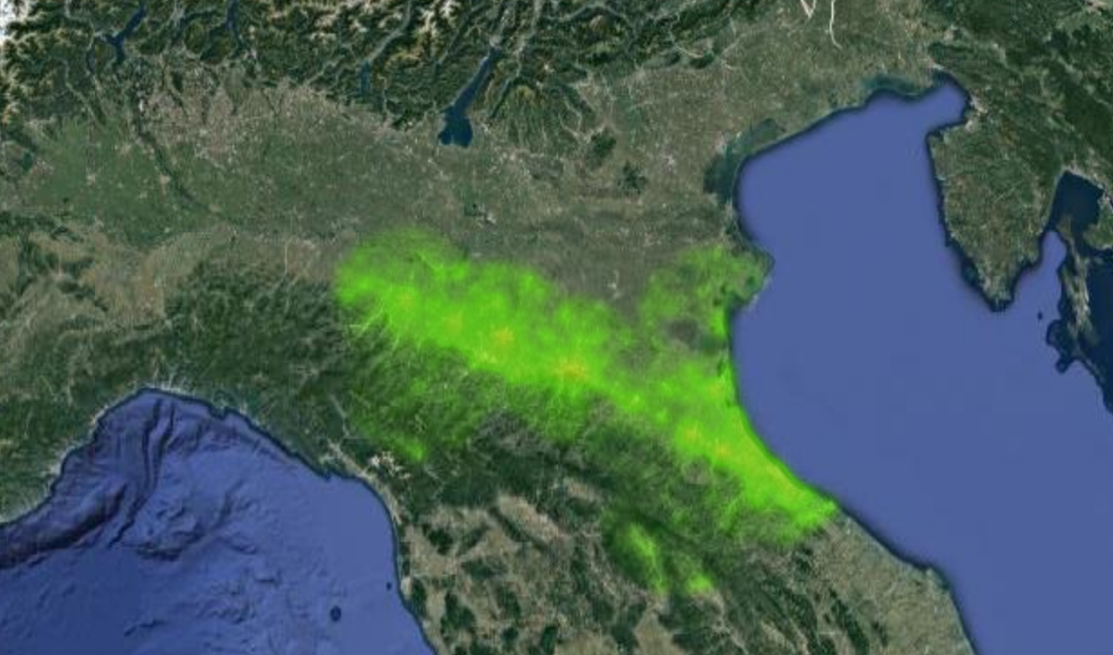
Heat maps are a great way to visualize the density of an observed phenomenon. A heat map shows with a red color the maximum density of the data while with a yellow and green color a decreasing density of the data.
For example the density of Twitter users - or any other social network like Instagram or Flickr- that have been tweeting in a certain moment and at a certain place.
In particular, the heat maps are described at the following link https://developers.google.com/maps/documentation/javascript/examples/layer-heatmap
Have been using it with location data from the three social networks i.e. Twitter, Flickr and Instagram. Aproximately a million data points have been used for each of the heat maps presented below and here are the results.
Heat map from Twitter users data.

Heat map from Flickr users data.

Heat map from Instagram users data.

Another interesting visualization would be to make a dynamic heat map which shows how each of those maps evolves during the 24 h of the day. I will post that in the next post so stay tuned ;-)
Good knowledgeable post ..like this one..
Thanks :-)
Upvote for the effort keep it up! :D
Thanks :-) Here you go !