How to Create Call-to-Action Buttons That Work
If you want your website to bring you more leads and clients, you must focus its design on interactive elements that induce people to take action like call-to-action buttons (CTAs). Designing CTAs is one thing, getting people to click on the CTA is another.
What Is a CTA Button and Why Is It Important?
A call-to-action button (CTA) is an interactional element of your web and mobile interface that has the goal of persuading users to take an action that leads to a conversion, for example, subscription, purchasing, contacting, etc.
The main goals of CTA buttons are lead generation and sales/purchases. If the button is captivating enough to attract the users’ attention, it is good enough to make them click and enter the next stage of the purchasing/subscription process such as filling out a form, ordering a product or signing up for a product/service.
There are lots of characteristics that make a CTA button a successful one. Let’s see which are the most important aspects of call-to-action buttons that work.
Visibility
CTA button must be visible and easy to spot from the moment users land on your page. When it comes to visibility, the crucial component of call-to-action buttons is their color.
Clickability
Most of the buttons that users click online have the following elements:
- Clear Color Contrast
- Distinctive Button
- Surrounding White Space
- Rectangular Shape
- Supportive Border Line
 )
)
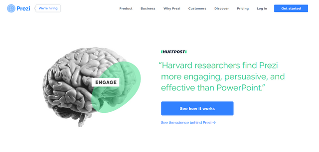
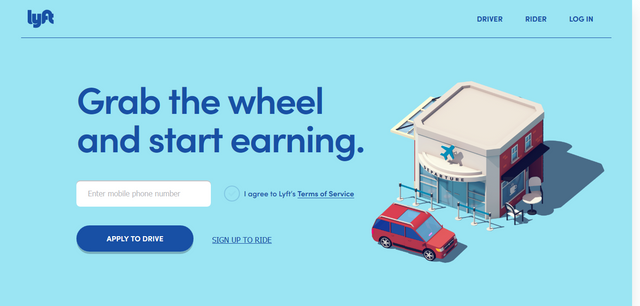
When you design your call-to-action buttons, make sure that you get rid of all the distraction around them and focus on making them clickable. Here are more examples of clickable CTA buttons online:

Positioning
When they land the first time, they don’t inspect everything. Instead, they look for the element that most catches their attention. The most common user scanning patterns are the “F” and “Z” pattern.
The “F” scanning pattern is most common for users that scan through blogs and news site content. The visitor first scans the screen in a horizontal line and then moves down the page to scan another horizontal line. At the end of the scanning process, the user does a straight line downwards by scanning paragraphs and opening sentences/keywords.
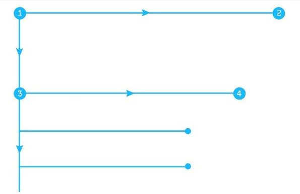
The “Z” scanning pattern occurs when the users land on pages that are not that filled with content, such as landing pages. Again, the user first scans the top of the page horizontally starting from the left corner, then goes to the right corner diagonally finishing on the bottom left corner and at the bottom right corner in the end.
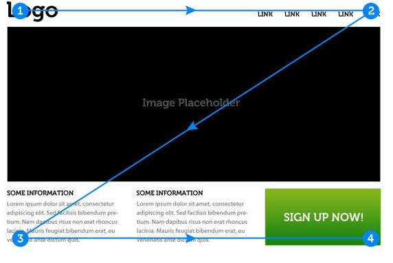
What these patterns allow you, as a designer, is to place the CTA buttons in places that get the most attention from your target users.
Another useful tactic for call-to-action buttons positioning is placing the button “Above the fold” or at the center of your web layout if the area is not too packed with other elements.
Copywriting
When you offer a clickable CTA button, you have to offer convincing copy about why users should click in the first place. You have to outline the benefits that you offer to your online visitors. If people are not convinced, they will not click at all, it is as simple as that.

Microcopy is another concept that you want to consider if you want to build call-to-action buttons that work. This is the tiny text that is a hint for what the users get if they click on the button.
Conclusion
To conclude, the power of call-to-action buttons should not be taken lightly. It is the crucial element that can help you bring more leads into your sales funnel.
Creating them doesn’t have to be a complex process. Keep in mind your users’ problems and the solutions that can make the buttons stand out by applying the rules above. Put the basics into practice and increase your conversion rate now!