Logo For PageNote
Design process links:
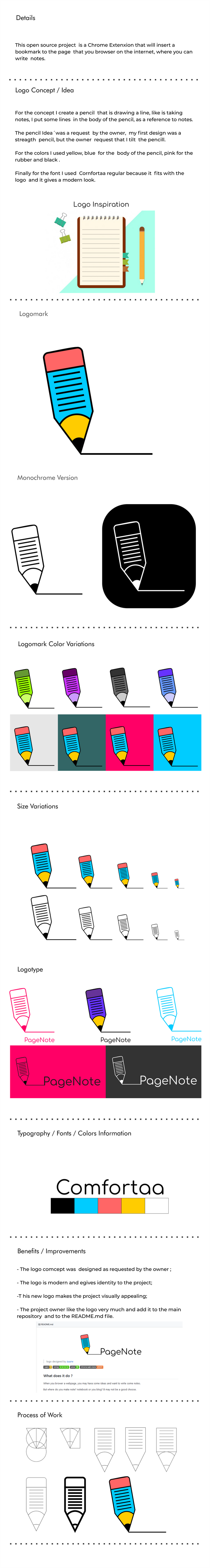
THE DESIGN
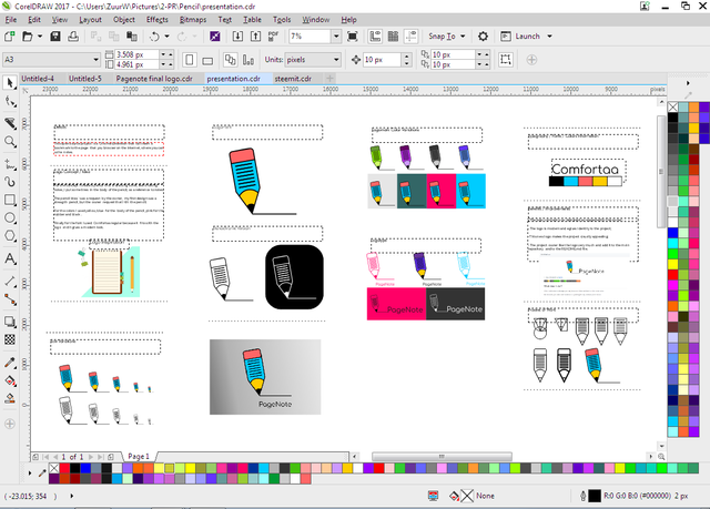
Tools I used
- CorelDRAW_Graphics_Suite_2017_19.0.0.328 (logo design)

This work is licensed under a Creative Commons Attribution 4.0 International License
This work is licensed under a Creative Commons Attribution 4.0 International License
Hey @zuur
Thanks for contributing on Utopian.
We’re already looking forward to your next contribution!
Want to chat? Join us on Discord https://discord.gg/h52nFrV.
Vote for Utopian Witness!
The logomark feels unbalanced in 1:1 dimension, it is because there is too much white space on the right side.
I did a mock up to see how well this logo will look in chrome menu, the lines in the pencil looks blurry and messed up. you should make sure the logo work well whether in small size or big size.
Your contribution has been evaluated according to Utopian policies and guidelines, as well as a predefined set of questions pertaining to the category.
To view those questions and the relevant answers related to your post, click here.
Need help? Write a ticket on https://support.utopian.io/.
Chat with us on Discord.
[utopian-moderator]
Hi @nilfanit, what do you mean with this : downloadable file of the work.
That whole sentence was taken from the https://join.utopian.io/guidelines/
You should look at the words written in bold, those are about the mockup