Logo For Quest
Repository
https://github.com/calvin-li/Quest
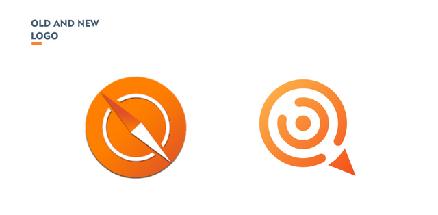
Previously, this project already had a logo, but the previous logo seemed to be irrelevant to the project because the previous logo looked like a compass. That's why I offered to create a new logo for this project, and the project owner accepted it.
Issue Link
Pull request Link
Android Repository Link
Details
Quest is a simple app that helps you keep track of your to-do items, inspired by questing interfaces in video games. Quests are infinitely nestable using a subquesting system. Your list is also fully accessible from the notifications area, and backed up to a text file so you can make larger edits with your favorite text or JSON editor. Google Play Link
Logo Result
Benefits / Improvements
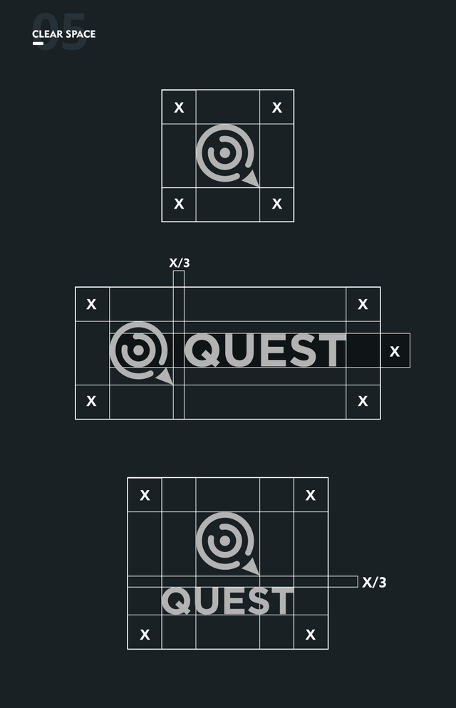
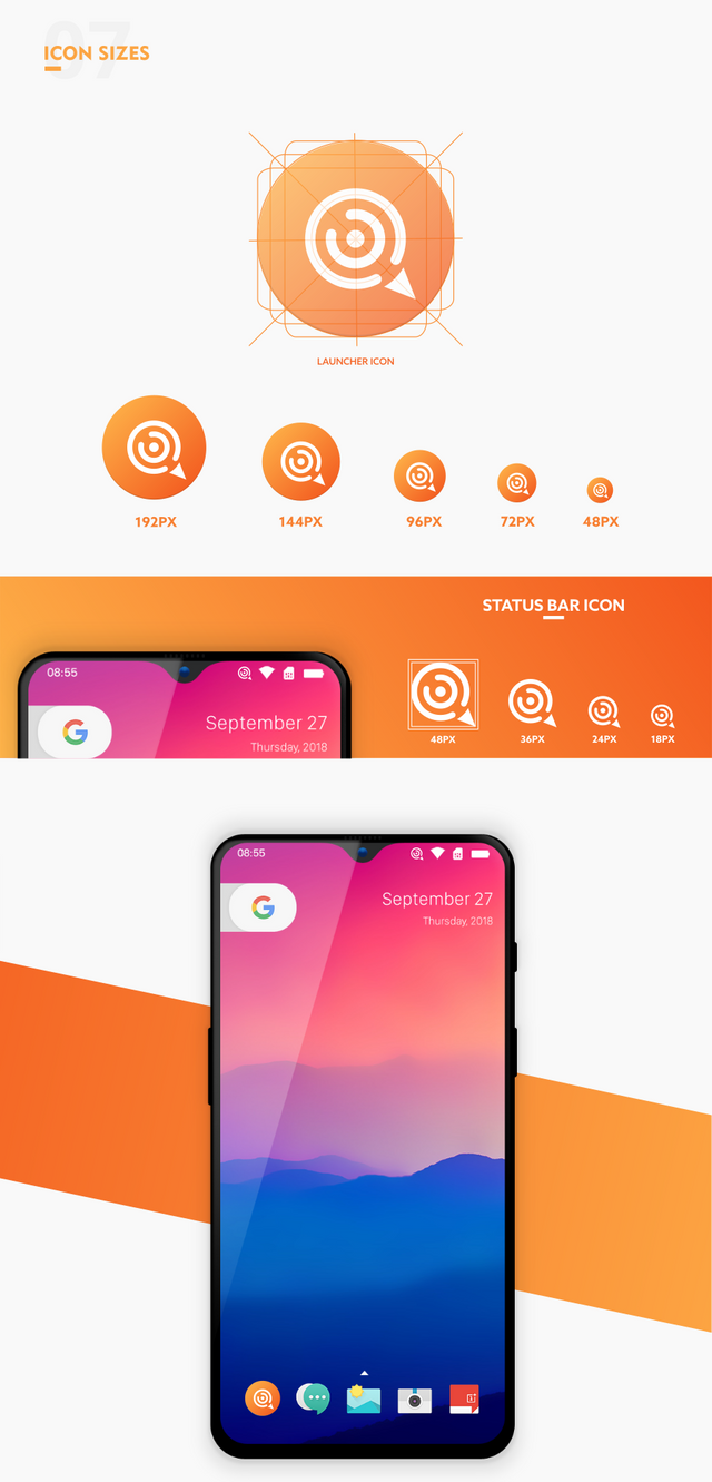
In the new logo, I applied a concept that was simple, relevant, modern and elegant.
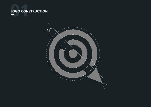
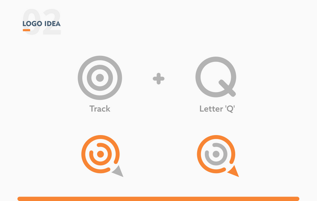
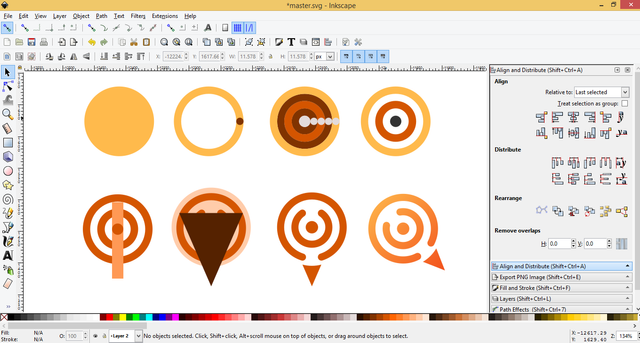
Where I combine the two elements on the logo, namely the track icon and the letter Q.
The track icon is inspired by the function of this app, where this app can help keep track of to-do items.
While the letter 'Q' comes from the name of the app, which is 'Quest'.
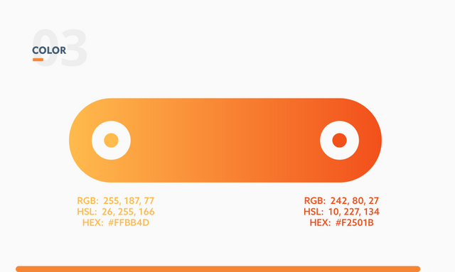
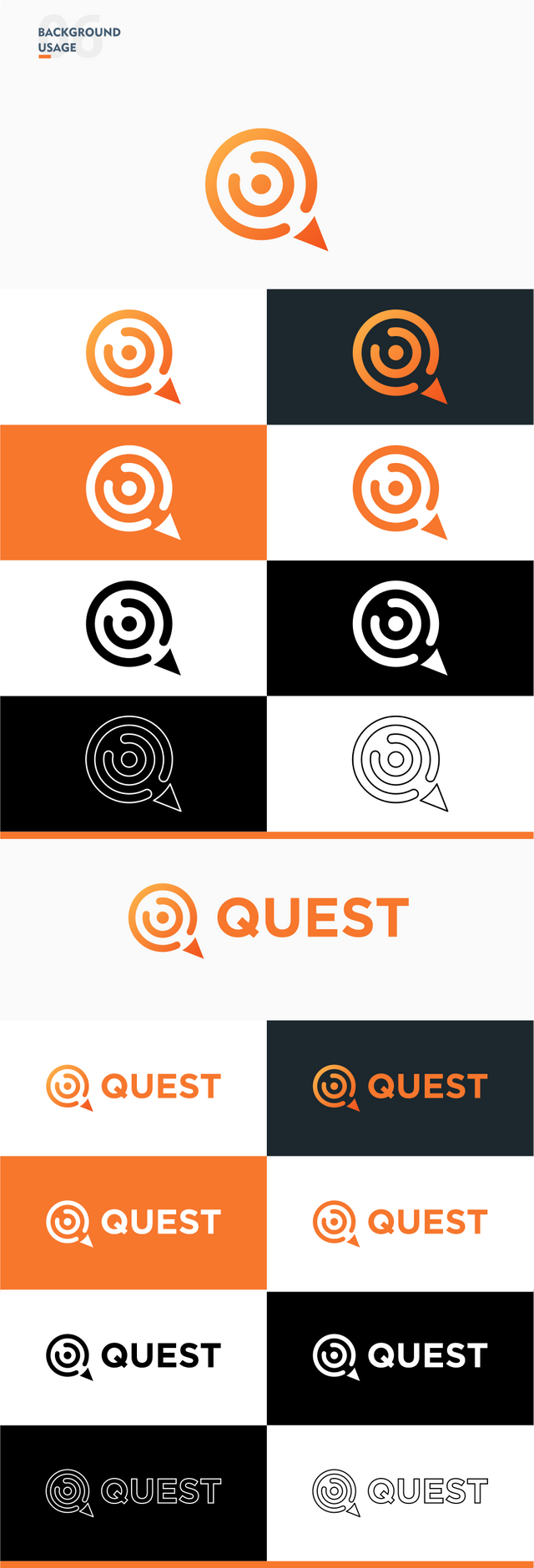
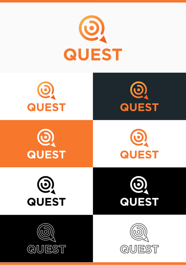
The color used in the logo is the gradient color so that it shows a modern impression. This color is based on the theme of this app and the color with the previous logo.
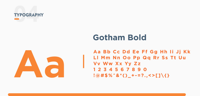
The font used is Gotham Bold. This font has characteristics that are elegant, fresh and established. So that it matches the logo.
The launcher icon is designed according to material design guidelines while the status bar icon is designed according to the Android developer guide
Proof of authorship
Tools
Inkscape (Logo Design), Adobe Illustrator CS6 ( Export to other vectors format) and Adobe Photoshop CS3 (Export logo & icon to PSD format)
Original files
Drive link
Font Link
Mockup Link
Proof of Work Done

This work is licensed under a Creative Commons Attribution 4.0 International License.

There is a question I ask myself quite often. How do you pick the projects you want to contribute to? Although the project developer accepted your offer, you obviously showed that you have little knowledge what the project was about, yet you claimed the current logo/icon was irrelevant for the project.
On the other hand, your whole idea is based on the initial letter of the app name. In my humble opinion, your idea, or at least your presentation of your idea, does not bring anything new. I say that because I can see the elements in both of the versions. Moreover, I don't quite understand your idea of "track".
But not to criticise only, I like the colours you picked.
Hi @espoem, thank you in advance, I prefer to contribute to an Android-based project because I have previously created an Android app and that is familiar to me.
Therefore I am looking for an Android-based project, then I look at the project's logo / icon design, if the project icon still uses the android studio default icon (Android icon) or doesn't have a logo, then I offer to design a logo for the project .
If the project has a logo but does not look good, there are flaws or are not relevant to the project, then I also offer the project owner to create a new logo. Usually, the project owner asks me to send a new logo proposal. I did not force the project owner to accept a new logo proposal from me, I only offered. If the project owner refuses or doesn't like it, I will close the issue on the project. And look for other projects.
In the proposal above, the previous logo looks like a compass, in my opinion, this is less related to the project. Because the project is a project that keeps track of our to-do list. While the new logo looks relevant because the elements that are owned by the new logo are related to the project.
Thank you for your criticism, in the future I must improve the design of my logo, so that I have a new idea and not just based on the initial letters of the app's name.
About 'Track', if you've seen a map app. When you want to track your position directly, usually your position will be indicated by a point where the side will continue to expand. This is what means by 'Track'. Sorry if this is a little confusing.
Hey, thanks for the reply. As you state in your last part:
You associate "track" with a location and movement. That's why I was wondering in what aspects your idea was different than the original one, which has the same association.
Yes, you are right. In my mind, when I hear the word "Track" I imagine the location and movement. So I applied it to the logo.
Hi @zularizal!
Your post was upvoted by @steem-ua, new Steem dApp, using UserAuthority for algorithmic post curation!
Your post is eligible for our upvote, thanks to our collaboration with @utopian-io!
Feel free to join our @steem-ua Discord server
Hey, @zularizal!
Thanks for contributing on Utopian.
We’re already looking forward to your next contribution!
Get higher incentives and support Utopian.io!
Simply set @utopian.pay as a 5% (or higher) payout beneficiary on your contribution post (via SteemPlus or Steeditor).
Want to chat? Join us on Discord https://discord.gg/h52nFrV.
Vote for Utopian Witness!
Congratulations @zularizal! You received a personal award!
Happy Birthday! - You are on the Steem blockchain for 1 year!
Click here to view your Board
Hi, we are holding a close logo design contest with grand prize of 50 STEEM and each participant will get instant 1 STEEM as gift.
If you are interested please come and join us in our private Discord channel: https://discord.gg/N5JVChk