Logo For CuteKitchen
Repository
https://github.com/akersten/cute-kitchen
Previously this project did not have a logo, so I offered to create a logo and icon for the project owner. Here is my conversation with the project owner.
Details
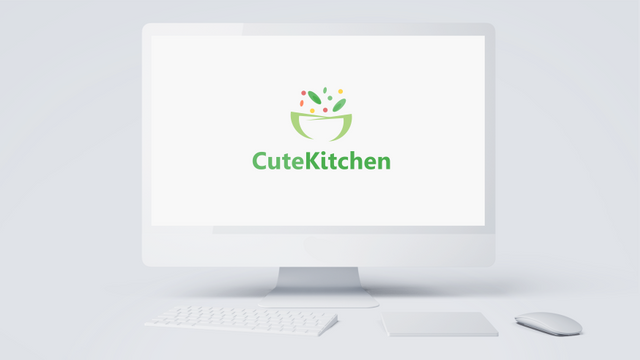
CuteKitchen is a web app to organize grocery lists and recipes.
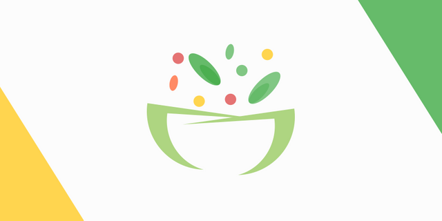
Logo Result
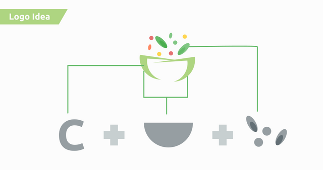
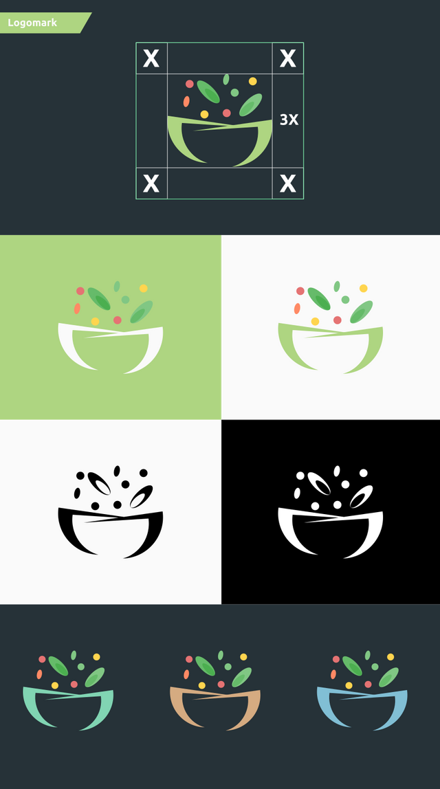
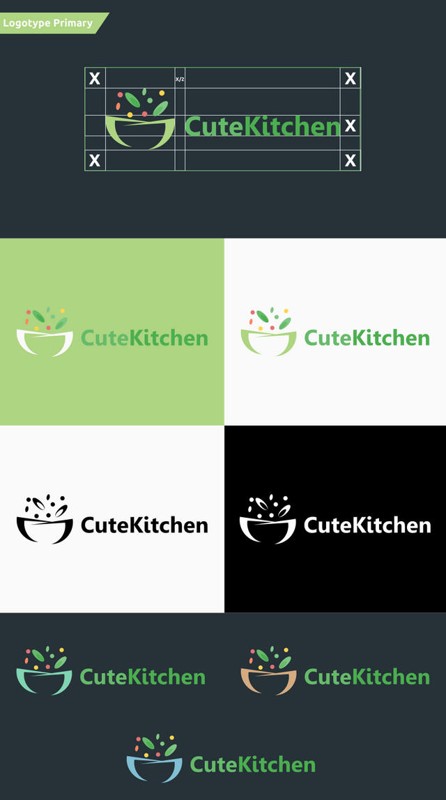
In this logo I am inspired by the letter C from the initial "CuteKitchen", a pan and vegetables.
Benefits / Improvements
Previously this project did not have a logo, so I offered a new logo for this project.
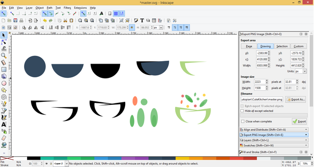
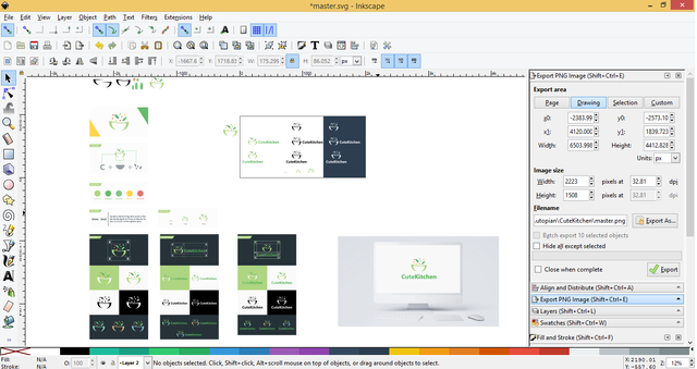
I gave some sample logos that I have designed for the project owner. After the project owner chooses the logo. Then the project owner merged the logo into the repository.
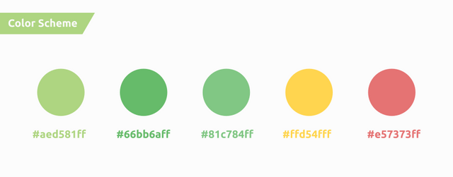
In this logo, I provide an interesting concept. I have combined several elements related to the kitchen and cooking in this logo. Then I give a 'cute' color to this logo.
Proof of authorship
Tools
Inkscape and Adobe Illustrator CS6
Original files
Drive Link
Font Link
Mockup Link
Proof of Work Done

This work is licensed under a Creative Commons Attribution 4.0 International License.
Wow, logo really looks cute. Presentation itself is also pretty neat. However I'm missing real life application as in mockup, it looks good in full size on a big screen but how about in the real app. I checked the repository and I'm unable to find the installation/usage guide so I can't be sure if this logo is going to be placed on dark or light background. So I can't say if it's going to be look good as in your presentation. So it's always better to have a real life mockups in presentations. And picking the right projects is also essential.
In your conversation with project owner, he specifically asked for you to put files into static/img/logos folder. I don't see any reason to create another folder named "Logo" in the base directory.
https://github.com/akersten/cute-kitchen/issues/1#issuecomment-401249929
When it comes to application of your idea, you presented the bowl as C letter but it looks more like a D letter and it also be seen as an M letter. Overall shape is good, logo really looking cute due to it's colors or sprinkle like vegetables but that letter C idea could be implemented in a better way if it was the main goal.
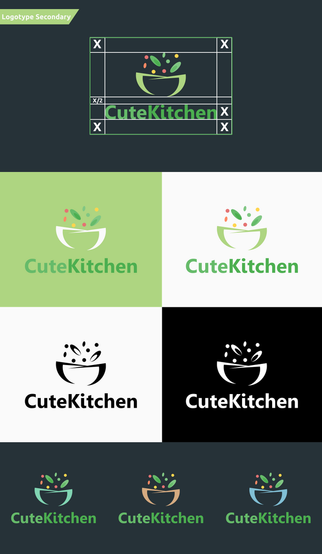
Presenting logomark in many variations is good however doing the same thing to logotype version (Logotype Secondary) is looks redundant. I felt like staring at the same thing twice.
Overall I like the presentation and the logo very much, you can be more specific about the design process when you explain the benefits/improvements. It would be more interesting to read where you get the idea, what changes did you apply in the process, why to pick these colors instead of how did you approach to project owner. For example you might explain why did you pick the green for the logotype while you have red, orange and yellow colors in your design.
Your contribution has been evaluated according to Utopian policies and guidelines, as well as a predefined set of questions pertaining to the category.
To view those questions and the relevant answers related to your post, click here.
Need help? Write a ticket on https://support.utopian.io/.
Chat with us on Discord.
[utopian-moderator]
Thank you for your review, @oups!
So far this week you've reviewed 4 contributions. Keep up the good work!
Thanks for your review oups
Hi @zularizal! We are @steem-ua, a new Steem dApp, computing UserAuthority for all accounts on Steem. We are currently in test mode upvoting quality Utopian-io contributions! Nice work!
Hey @zularizal
Thanks for contributing on Utopian.
We’re already looking forward to your next contribution!
Want to chat? Join us on Discord https://discord.gg/h52nFrV.
Vote for Utopian Witness!