fixing bug of navbar kompetisi.id in mobile version
The Issue
In mobile version, navbar show search button in wrong position, and not clickable. The search icon posititon in mobile version should be in top right corner, and when clicked, navbar will replace by full width input text which the user use to search.
Solution
Based on design bellow, i do some code changes.
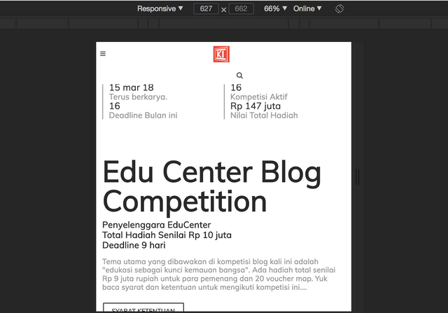
Navbar on mobile
Navbar on mobile clicked
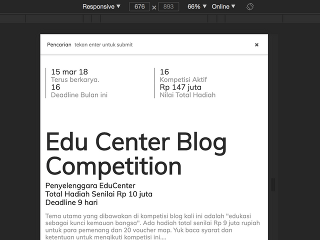
The search icon is uses correct style, so i not change anything in that section. I Added css class .hide-mobile which has excited to the logo, so logo will disappear in mobile version.
The last step is to replace the hamburger button with the logo, to fit the desired design above. That way, the search menu can be clicked and used smoothly.
Links
Posted on Utopian.io - Rewarding Open Source Contributors
Your contribution cannot be approved because it is a very small contribution in terms of code. Please try to add more features or more bug fixes in your contribution.
You can contact us on Discord.
[utopian-moderator]
very useful comments, I will be better in the future