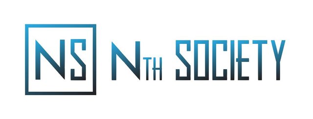
Nth Society Logo Design
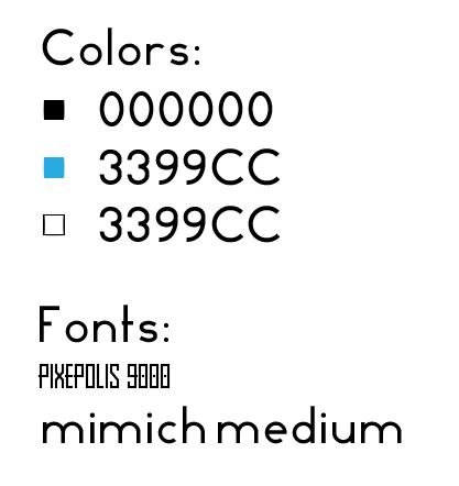
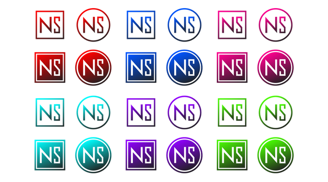
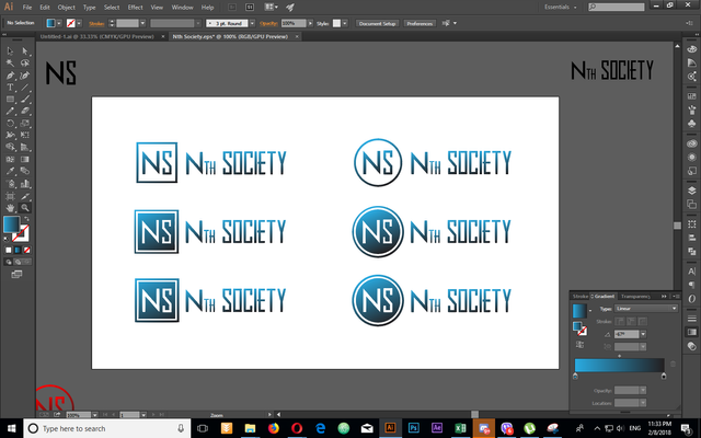
Colors and fonts used for the final logo
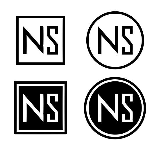
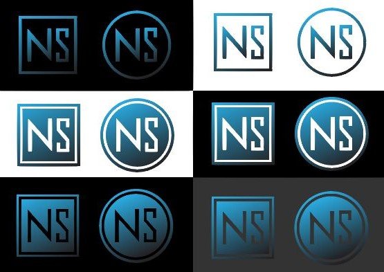
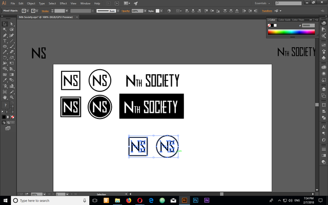
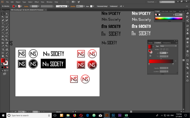
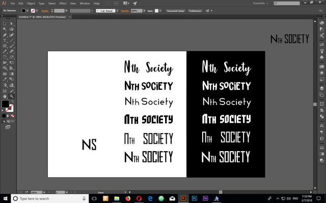
Black and white versions
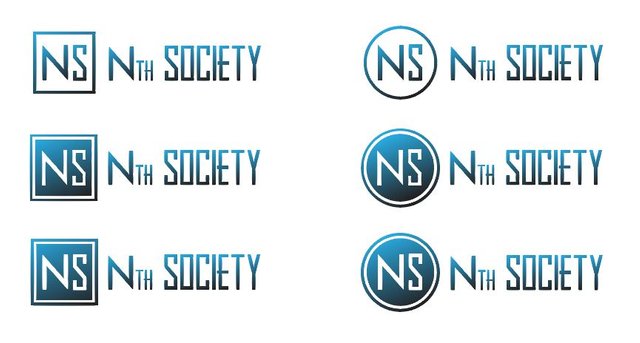
On different backgrounds
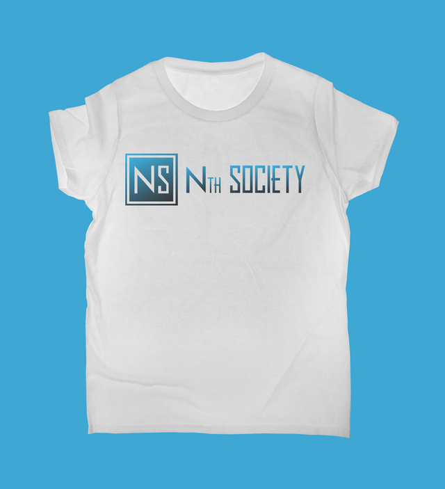
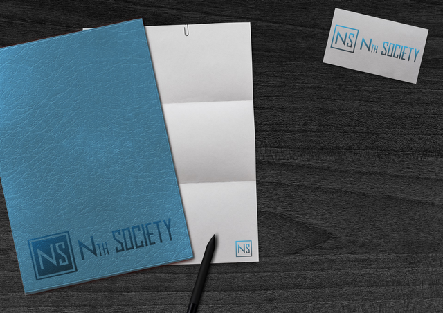
Mockups
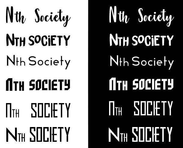
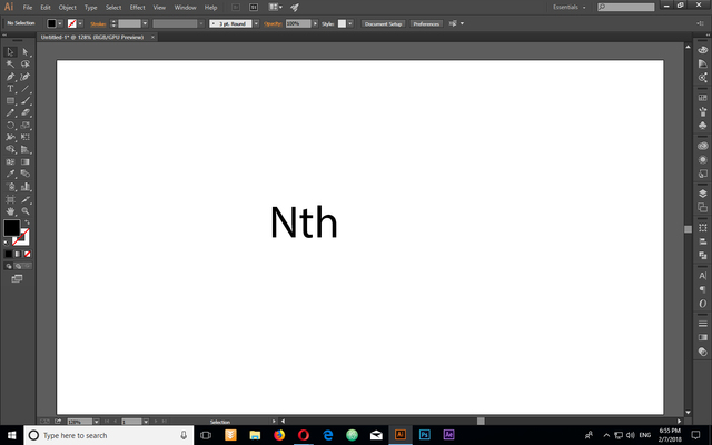
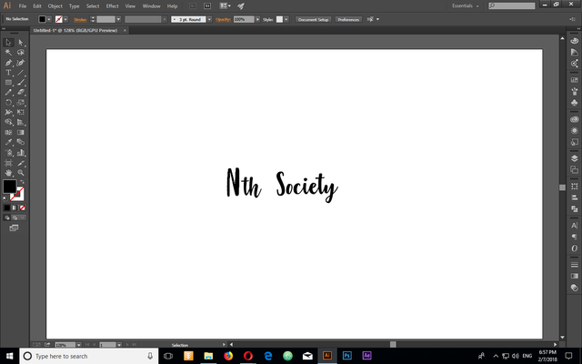
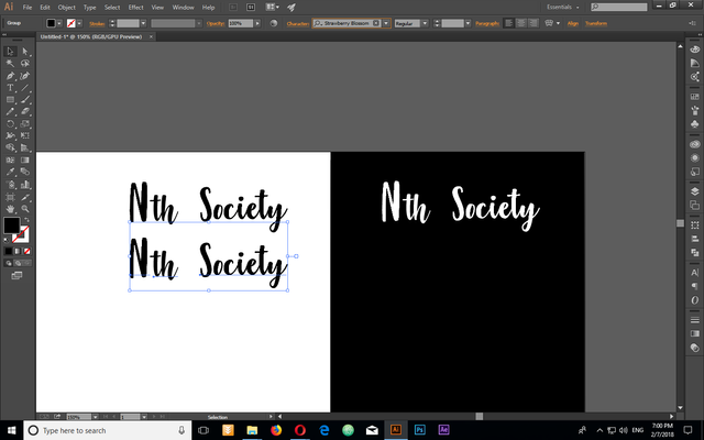
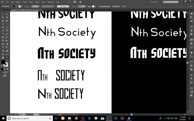
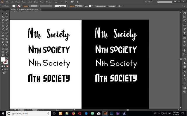
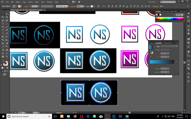
Fonts and colors i tried out:
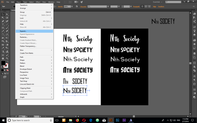
Proof of creation
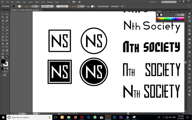
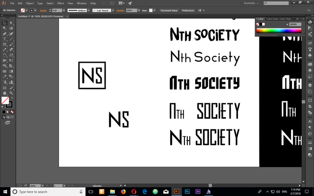
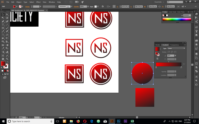
Details
I created a minimalistic typographic logo with focus on the first letters of the words. It's simple, to the point and fulfills the request to fit well both in circle and a square. I've shown some different types and colors but in the end i chose blue, because it's a color associated with business, order, society and democratic community.
Benefits / Improvements
It's simple with no loss in detail when scaled. It has 12 different versions that can be used in different situations.
Tools
AI CC
AP CC
Original files
https://drive.google.com/drive/folders/1bz7Jtm_sMunsEAXJD_vlP_JUor6L7szv?usp=sharing
Images
Pixabay
Thank you for reading through my post, i hope you find it useful.
Think Big!
xTrex
Posted on Utopian.io - Rewarding Open Source Contributors
Awesome, thank you
Thanks, i appreciate it.
@xtrex, Contribution to open source project, I like you and upvote.
Thank you. Do you like my design?
I reckon you have chosen wisely.
While red is my favorite color, I see why blue is more appropriate. A lot of folks are put off by red.
Well done.
Thanks!
cool design @xtrex, came here by @personz re-steem
Your contribution cannot be approved because it does not follow the Utopian Rules.
You can contact us on Discord.
[utopian-moderator]
1 - The logo is not overused - it's a simple, brand new typography logo, that uses different fonts and the two shapes that were in the request.
2 - The request for the logo is generic? - the task request said to use circle and square, i would not have used them otherwise.
3 - Not a benefit? How can you say that, when the task creator wrote in the comments the logo is awesome?
What am i expected to do, when the task requests a circle and a square, use a pyramid? You are being unreasonable, for the Nth time. What are you going to say next time, that i used a color that is overused in other logos?
Every project owner said. Awesome logo in every contributions. But, we need more creativity in utopian. not all entries get approval on utopian.
keep in mind you are draining that creativity and rejecting creative entries. Don't wonder why you are lacking in creativity when generic entries have success and when people work hours on end and they get rejected.
Also your rules are handicapping creativity as well, when you have to go through so many useless hurdles just to get a contribution accepted, "make 40 variations, do this, do that, you are missing this format, missing that useless addition" that can be done in 5 seconds if there is a need for it.
I agree there are many crap contributions, but you aren't really helping your contributors make a difference when you kill their contributions and then wander of so we have to chase 10 people over the chat.
Usually if you are complaining or expecting something differently you are probably a part of the problem. Me being content with moderation is in the past, I have half of my contributions rejected, half for being "late" which is bullshit because a contribution is a contribution, the other half I can say is rejected because of bad moderation, just passing by pissing on the entry and off they go never to return with more than a one liner at best.
Yes text is generic, yes outlines are overused, yes gradients are gradients.
and yes I have a few problems with utopian for the month of contributions I have made, it's not personal with you, it's a lot of bullshit I ain't about to keep pent up. I'm really on the line of starting to hate the moderation and the arbitrary reasons I got fucked for.
I do agree that things have to be top notch and they are still growing and building, so therefore now is the right time to take the input and make a great platform, but just like my contribution acceptance rate I give you a 50/50 for the platform. There is a massive boost to quality and at the same time, it's a bunch of pointless waste of time and spam for rewards for most people here... mods included.
Honest opinion
But yours get approved even though they are not as complete as this one. You are being unreasonable.
What that mean
But yours get approved even though they are not as complete as this oneThank you for the contribution. It has been approved. I recommend that you make some bright improvement on your next contribution. Stay away from generic and overused logos.
You can contact us on Discord.
[utopian-moderator]
Hey @xtrex I am @utopian-io. I have just upvoted you!
Achievements
Community-Driven Witness!
I am the first and only Steem Community-Driven Witness. Participate on Discord. Lets GROW TOGETHER!
Up-vote this comment to grow my power and help Open Source contributions like this one. Want to chat? Join me on Discord https://discord.gg/Pc8HG9x