Creating the Philippines Steem Stats Logos
Hello a few days ago I have shared of the launching of the Philippines Steem Stats Project on Utopian.io. Time to get the project moving! So today I will be contributing the logos of the web application. Logo is very important to any website even a company, because it describes the company is all about. The branding the logo is very important.
Getting Started
I am not a very skilled person when it comes to graphics, I know a little about Photoshop and the likes but creating my own logo is a great way to enhance my skills.
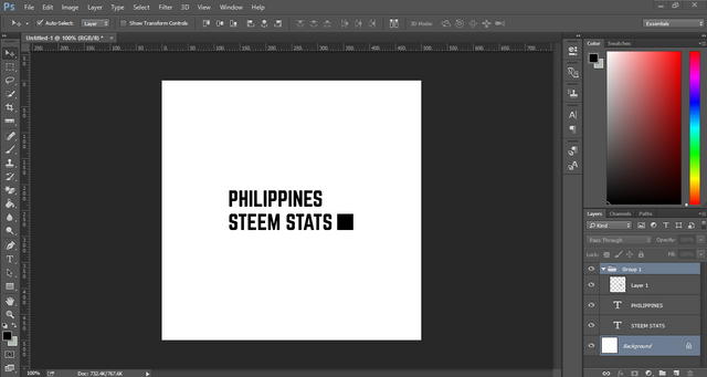
Using Photoshop to make a logo
I first the created a base logo first just black and white and then move from there. I then came up with this. Minimalistic and Clean, but too plain to be honest.

Incorporating Philippines
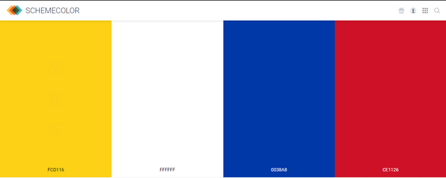
As we all know the project is all about the Steemit users from the Philippines, and showing some of the data about them. You can also do it for your own country go ahead and fork the repository. I thought how can I incorporate the idea of the Philippines with the logos? The first thing comes to mind is the Philippine Flag. So I then searched the colors of the Philippine flag, and found it here. Credits to Keshav for compiling it there.
So I then went ahead to make the Logos with 4 variations of the colors. Here are the results:
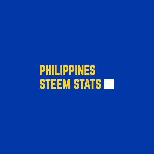
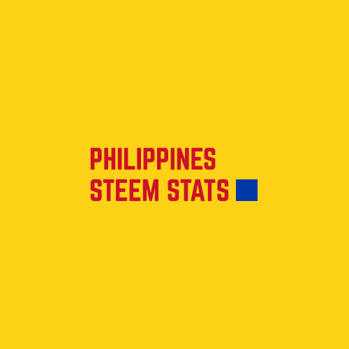
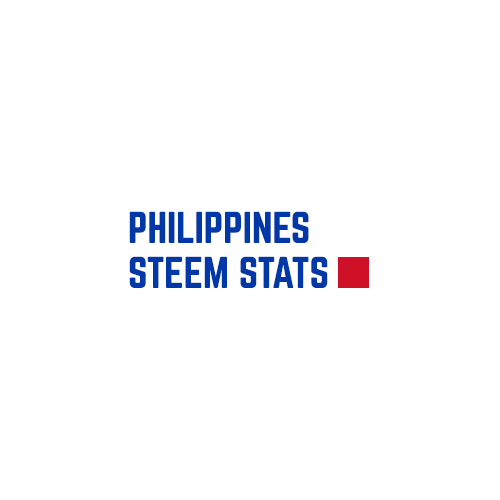

I really like this last one and I prefer to have this branding and logo for the web application?
So what do you think? What is the best logo to be used? Drop a comment down below to make your say.
Image Credits:
http://www.schemecolor.com/philippines-flag-colors.php
Design Links:
Google Drive: PSD and Soft Copies
Posted on Utopian.io - Rewarding Open Source Contributors
You are very lucky if you are not so into graphics and could achieve this design. Is nice, clean and pro.
Let me be clear, having photoshop installed and being able to add text and color doesn't make anyone a designer. The same as having a piano doesn't make a pianist. There's need of lots of practice, talent, research, learning... And talent, oh, and talent.
But once in a while there's people with very good eye for aesthetics, compositition, fonts, color and balance... Who can do a very good job, skipping all the blood that most designers leave at their desks by working for many many hours of their lives to be better.
Congratulations! And my vote goes for the last one, allthough, there's actully just one logo up there with color variations ;)
Maybe just from luck? well having been a developer for how many years now maybe I just adapted it when I was slicing up countless designs. But yes it takes years and dedication to perfect a craft, and there are more talented people. We all have are owns talent, no one is untalented. Steemit is the perfect way to share our talents, improve, or even discover it. I must say Steemit is the best platform out there.
Haha yes, I could only create one design of the logo and just interchange the colors. Thank you for the wonderful comment :)
Believe me, I know many developers with lots of years of experience who can't pick a font right.
What I meant was you are lucky to have both talents!!!
Until now I had just met one dev who could make a nice front end and a powerfull backend, now I know two :D
I also know many designer who can't achieve something like you did xD even with the years of "experience"...
Also for this kind of things I think the utopian-io bot needs human involved, your design deserves more than 3% upvote; I have seen contributions with much more and also terrible design!!!:s My latest contribution got 3% too u.u
Posting it via steemit would have gotten 0% xD looking at the bright side... But at the end of the day, that's unfair, don't you think?
Oh I see, glad to hear that haha. Thank you for appreciating my work. Well let us wait for now @elear said they will review the recent votes again.
The bot is still on experimental and development stage, so they are I think still working on it, and finding the right mix.
Oh good! Maybe we will get our upvotes fixed! Yay!
My idea was, if the moderator is an expert designer, he can approve and get some kind of "awesomness bar" haha to pick how awesome the design is, and and give a bit more strenght or decrease it, to tje upvote of the bot. I don't add it as suggestion bc I told elear via discord already and he wants to keep it humanless it seems.
Yes one of my contributions was fixed up earlier with a greater upvote. That is actually a good idea, ah I see. I also agree on the humanless approach to counter bias. Lets just wait I know they can come up with a solution :)
your method was OK but i like to watch in Video next time that will be more better ... days passing people getting smarter!! thanks
Well thanks, doing a video will be really hard as will require some editing, maybe next time haha.
the last one. red white yellow
I like that one too, 1 vote for red, white, yellow :)
I think first logo is best. Because it looks so nice(Red, White and Yellow) Combination.
Once again my friend @nirob, thanks for the suggestion then 2 votes for red, white, and yellow.
Hey @vallesleoruther I am @utopian-io. I have just super-voted you at 13% Power!
Suggestions https://utopian.io/rules
Achievements
Up-vote this comment to grow my power and help Open Source contributions like this one. Want to chat? Join me on Discord https://discord.gg/Pc8HG9x
Thank you for the contribution. It has been approved.
[utopian-moderator]