5 additional improvement suggestions for Utopian.io: Bug hunting
Having used utopian.io for a while now, I noticed some additional things that can be done to improve the website
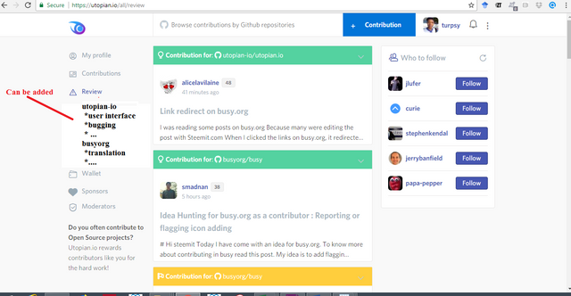
(1). There are a lot of people on utopian-io that will want to review posts in different categories. I suggest different categories should be added.
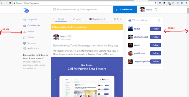
(2) The spacing on the display of the website is too much i think this needs to be fixed as well.
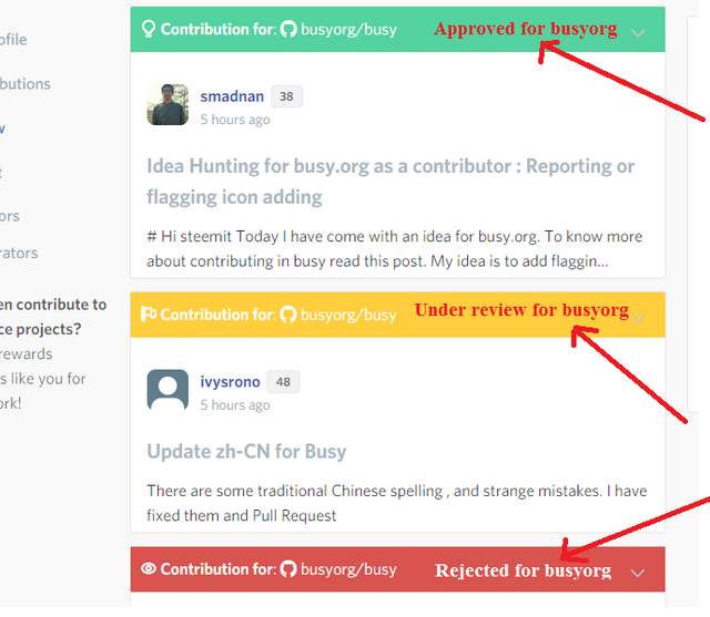
(3). I think their should be identification of Approved,Under review, Rejected on the different posts
(4). The table tab and alignment tabs should be added as well.
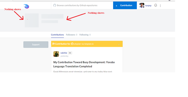
(5). When you click on an author's profile, it brings a space for some information and the information never shows. I think this should be removed or fixed.
Note: I am using a google chrome browser on windows 8.1 using a Wifi connection.
Conclusion:
I believe if all of these are fixed, Utopian.io will be better the more.
Open Source Contribution posted via https://utopian.io


@utopian-io has just super-voted this contribution at 100% Power.
@turpsy thanks for using https://utopian.io to contribute to the Open Source projects..
Voting this comment will help @utopian-io growing its power so to incentivise more contributions to Open Source projects.
good one there @turpsy
thanks @mcsamm
nice weekend
you too. Enjoy.
why should be removed
"why"? I dont get that. Please expantiate
great information and talking in crypto-news. I like this .
thanks for sharing.
Hey thanks for the reminder about this, I need to check this out. Have you demo'd the new design for Busy for org yet? If so, what do you like more (Busy/Utopia) and what do you think gives it the advantage.
You welcome friend. I think utopian is still improving. It will be better over time.
Good work !!!
I think we will only need Approved by and Under Review, but not the Rejected by feature since rejected posts never get on the Utopian Feed. Quick Thought :)
Great Findings!!