Make table look good on mobile devices
I am looking for a developer or suggestions on how to make the result table on my website http://steem-buddy.com mobile friendly.
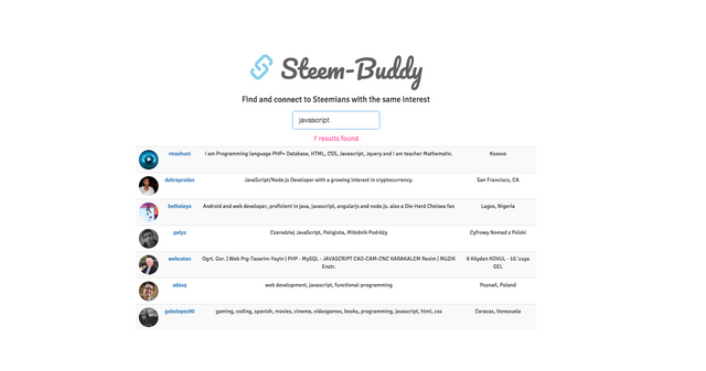
The site is responsive using bootstrap but when it comes to mobile size than I get the ugly scroll bar to navigate through the table.

Ideally It would be good to cut down some information at mobile size so that only the username and profile description is visible. I have tried to fix it myself with css media queries but didn't manage to solve it.
If you have any suggestions or want to contribute directly to Steem-Buddy than I please let me know in the comments or contact me on Steemit chat / Utopian Discord. Thank you.
Posted on Utopian.io - Rewarding Open Source Contributors
i can help you man
i m front end devloper love to follw you man
Thank you! If you could help me to make the result table look good on mobile devices that would be awesome!
how can i help can you share html of your page
Sure, the code is open source and on github. https://github.com/TAMustafa/steembuddy-VUE/blob/master/index.html
wait let me solve this ....hope so u will help me to grow here on steemit as return favor
sure bro i will help you
I can not help you, I can write a good story or poetry, but I will ask some friends for this @tarekadam
Your contribution cannot be approved because it does not follow the Utopian Rules.
You can contact us on Discord.
[utopian-moderator]
Thank you for clarifying!
steemains are always ready for help i love that :D