Task-request: Improve UI of the steemblr dashboard and post component
Repository
https://github.com/snwolak/steemblr
Details
Steemblr is open source microblogging platform powered by steem blockchain . It allows user to post and explore content which is smaller than a traditional blog.
This task request asks for improvement of existing UI of the steemblr web app. I would like to improve colors schemes, dated design and typography.
Your design project should contain dark and light variations.
You can download steemblr logo here.
Components
- Dashboard is section where users is redirected after logging in, it is basic view where user will se new and relative to him content. Proposed improvement should be for 1920x1080 resolution.
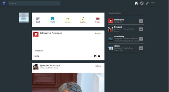
Full resolution - Responsive view of the dashboard section
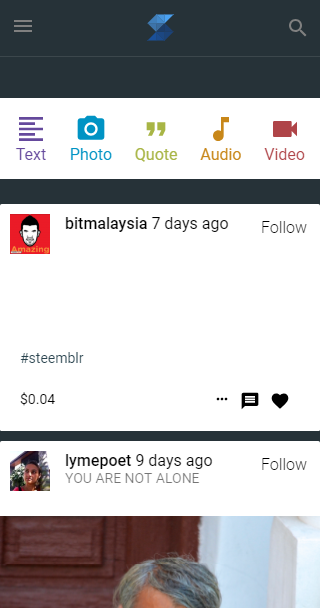
- Post component, here I would like to improve typography and adjust design to your dashboard design proposal.

Deadline
August 26, 2018
Communication
You can find me as @snwolak on steemblr and utopian discord channel
This task request is now open.
Your contribution has been evaluated according to Utopian policies and guidelines, as well as a predefined set of questions pertaining to the category.
Need help? Write a ticket on https://support.utopian.io/.
Chat with us on Discord.
[utopian-moderator]
Thanks everyone for your proposals, I would like to choose @outwork to finish the task.
Thank you for choosing my design. This was a really fun task request so far!
Congratulations @outwork for being pick by the PO. Sorry @snwolak, because my bad internet connection I couldn't be in touch. I'm still having problems. Anyways, thanks for consider my work.
Thank you for your review, @andrejcibik!
So far this week you've reviewed 1 contributions. Keep up the good work!
Hey @snwolak
Thanks for contributing on Utopian.
We’re already looking forward to your next task request!
Want to chat? Join us on Discord https://discord.gg/h52nFrV.
Vote for Utopian Witness!
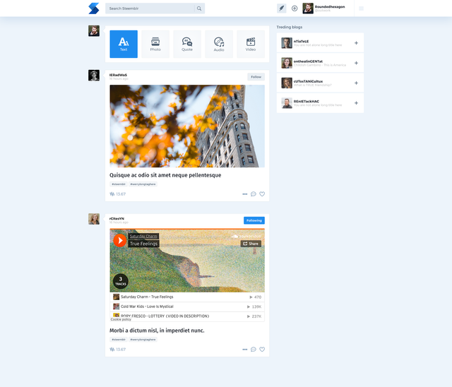
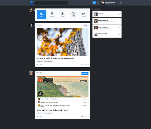
Hi @snwolak . This is my entry for your TR. Please let me know if I need to make any changes, i am ready tom complete them.
Light version:
Dark version:
Light version - mobile:
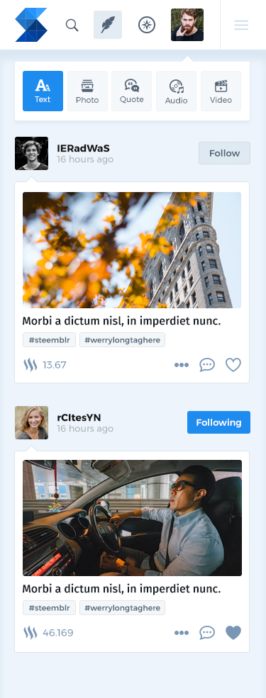
Dark version - mobile:
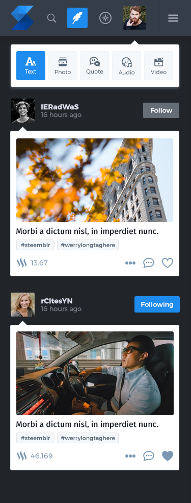
Post formatted:
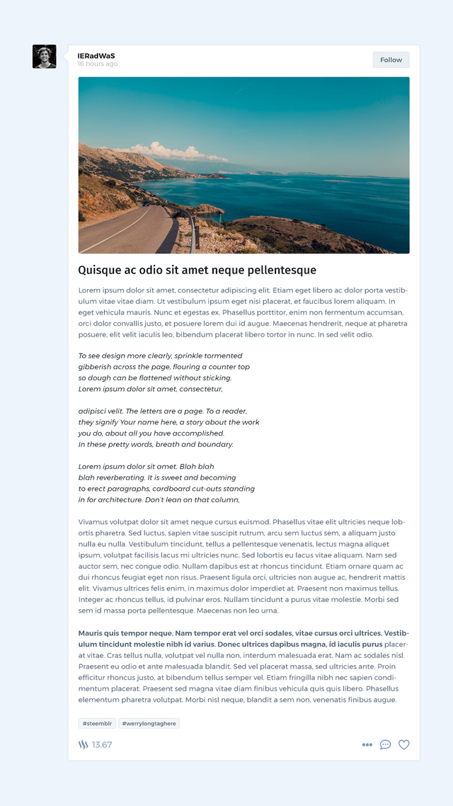
I have started working on new Steemblr UI. Looks like an interesting project!
Hello @snwolak this is my work in progress. Please give me your opinion to adapt my proposal to your needs.
Open the image in a new tab for better view
Hello @camiloferrua thanks for entering the task request.
Here's my opinion:
there's too much white space in 'add new post' icon bar,
also icons are aligned to the left of the text and it doesn't look good,
there has to be tags in the post,
in the header I want just steemblr Logo not both logo and app name,
your proposal feels a bit too bulky right now,
colors you choosed looks pretty good,
Best regards.
Thanks for your feedback @snwolak, I'll talk to you trough discord to define the modifications.
Hello @snwolak, Since I wrote to you the other day, I haven't had Internet service. I made the changes you asked for, here's what I've advanced.
I also made a Log In Page
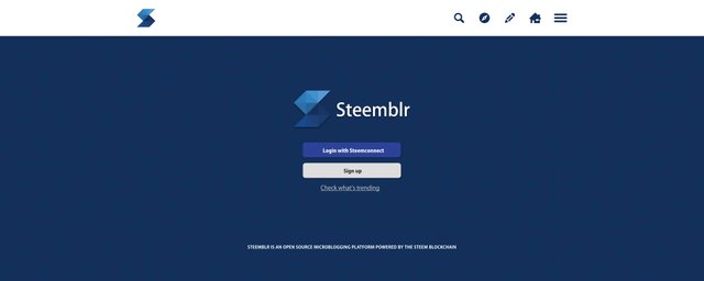
Congratulations! This post has been upvoted from the communal account, @minnowsupport, by snwolak from the Minnow Support Project. It's a witness project run by aggroed, ausbitbank, teamsteem, someguy123, neoxian, followbtcnews, and netuoso. The goal is to help Steemit grow by supporting Minnows. Please find us at the Peace, Abundance, and Liberty Network (PALnet) Discord Channel. It's a completely public and open space to all members of the Steemit community who voluntarily choose to be there.
If you would like to delegate to the Minnow Support Project you can do so by clicking on the following links: 50SP, 100SP, 250SP, 500SP, 1000SP, 5000SP.
Be sure to leave at least 50SP undelegated on your account.