Fixed responsive break-out points issue and refactored css files to use one set of media vars
Hello, In this development contribution I will report a issue I fixed for the awesome Busy.org website.

The issue was that at the responsive break-out points (768px and 998px) there were 3 states instead of two.
This happened because there were 2 sets of media vars and they both used the same px values. But the first set used min-width and the second used max-width to handle different responsive states. Yet one set should have had the value one pixel lower than the other in order to avoid this issue.
Needless to say, I saw that this issue was easily fixable and I made a PR with changing the values of one set of the media vars to properly match the other. Thus fixing the issue.
Here is how the media vars looked, for a quick review:

After my initial commit to fix the issue @Sekhmet mentioned that there should probably be just one set of media vars and not two. In order to avoid confusion and to avoid introducing possible future UI bugs.
The other members agreed. The problem was the both sets of the media vars we're used in other LESS files, so it was not just a matter of deleting 2 media vars. The files in which they we're used needed to be modified to use the remaining ones while the layout should remain exactly as before.
After a while I modified all related files and deleted one set of the media vars. I tested locally that all pages relevant to the changed files looked identical to the main busy site. I made the commit and waited for others to test my changes.
I was happy to see that the there we're no inconsistencies found in the layout. Also, @fabien suggested a small padding change for the site's layout relevant only after 998px but not for large screens.
To fix this I added a needed, in my opinion, additional media var @large that is relevant on screens larger than 1200px and uses the same logic as the remaining vars. And I made the padding fix between @medium and @large dimentions.
The logic of the design(css) on busy is now mobile-first only.
Which means that the first CSS rules are actually defined for small screen (all screens in case there are no other media vars involved). To better explain this, let us have this example code:
.box {
     margin-left: 0px;

    @media @small {
        margin-left: 5px;
    }

    @media @medium {
        margin-left: 10px;
    }

    @media @large {
        margin-left: 15px;
    }
}
In the above code the .box will have left margin:
0pxbetween0and767px(default)5pxbetween768pxand997px10pxbetween998px and1199px`15pxfrom1200pxupwards
Pull request: https://github.com/busyorg/busy/pull/1077
Issue it fixes: https://github.com/busyorg/busy/issues/1029
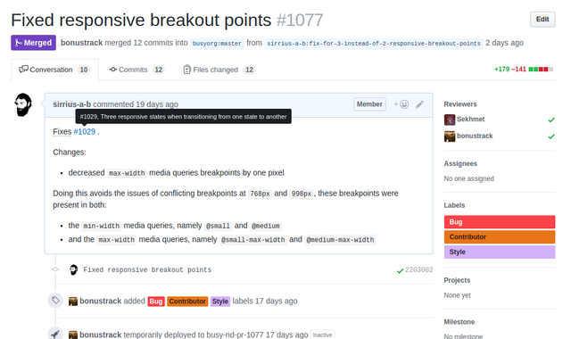
Also here is a screenshot of the merged pull request:
Posted on Utopian.io - Rewarding Open Source Contributors

Thank you for the contribution. It has been approved.
You can contact us on Discord.
[utopian-moderator]
Hey @sirrius I am @utopian-io. I have just upvoted you!
Achievements
Community-Driven Witness!
I am the first and only Steem Community-Driven Witness. Participate on Discord. Lets GROW TOGETHER!
Up-vote this comment to grow my power and help Open Source contributions like this one. Want to chat? Join me on Discord https://discord.gg/Pc8HG9x