Fashlogue Frontend development: Building a reuseable Modal component using React Portals.
Repository
https://github.com/fashlogue/fashlogue.com
Pull Requests
https://github.com/fashlogue/fashlogue.com/pull/3
What is Fashlogue?
Fashlogue is a digital catalogue, which has a user and designer model, its value proposition is relating users with designers in an interactive manner. It focuses on displaying post and catalogue of each designer, users will interact with the product on the feeds, following designers, getting notifications and in turn designers get reviews from them such as ratings, likes, comments.
Fashlogue focuses on displaying post and catalogue of each designer, helping them gain popularity in the system and giving them easy access to the best designers in the users perspective.
Explaining the PR.
In this PR, we harness the power of React styled components and redux to build reusable Modal and Tab Components using Architectural patterns like the render props and react.children.props pattern.
Building reuseable modals in react has always been technical issue. The package React Modal was used to initiate a portal.
Illustration.
What are React Portals?
React portal as the name implys create a node outside the normal react DOM tree, of which the display and positioning can be manipulated. Portals provide a first-class way to render children into a DOM node that exists outside the DOM hierarchy of the parent component.
ReactDOM.createPortal(child, container)
The first argument (child) is any renderable React child, such as an element, string, or fragment. The second argument (container) is a DOM element.
Building the Modal Container.
React Modal package was used to create the portal for the modal, a default state of modalIsOpen set to false and a closeModal method which set the state back to false when the modal is open. The componentWillRecieveProps life cycle was used to also toggle the state once the modalContainer receives a prop change on the state object.
{
  constructor(props) {
    super(props);
    this.state = {
      modalIsOpen: false
    };
    this.closeModal = this.closeModal.bind(this)
  }

  componentWillReceiveProps(nextProps) {
    console.log(nextProps)
    if (nextProps !== this.props) {
      this.setState({
        modalIsOpen: nextProps.modalProps.open
      })
    }
  }

  /**
   * @method closeModal - close the opened modal
   *
   * @return {Void}
   *
   */
  closeModal() {
    this.setState({ modalIsOpen: false })
  }
Style the modal portal.
The React modal component accepts a style props that gives an access to style the created portal component. Our plan is to centralize the component on the screen.
const customStyles = {
  content : {
    top                   : '50%',
    left                  : '50%',
    right                 : 'auto',
    bottom                : 'auto',
    marginRight           : '-50%',
    transform             : 'translate(-50%, -50%)'
  }
};
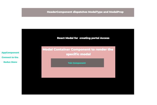
To get the modal to be displayed correctly, we have to create different type of modals that are to be rendered depending on the particular modaltype that was dispatched. These modals will be passed the the modalContainer which is house by the portal Provider(react modal package).
Connecting the modal container to the redux store and dispatching actions for a particular modal.
A modal reducer was created to monitor the state of our modal, the reducer accepts two properties on its initial state ;
- ModalProp: Which is an empty object to define the modalProps, when a showModal action is dispatched.
- ModalType: The particle modal we want to dispatch e.g tab, prompt, alert etc.
import {SHOW_MODAL, HIDE_MODAL } from './constants';

const initialState = {
  modalType: null,
  modalProps: {}
}

export default (state = initialState, action) => {
  switch (action.type) {
    case SHOW_MODAL:
      return {
        modalProps: action.modalProps,
        modalType: action.modalType,
        type: action.type
      }
    case HIDE_MODAL:
      return initialState
    default:
      return state
  }
}
Modal actions
The actions needed are those to hide and show modal based on the modalprops and modalType
import { SHOW_MODAL, HIDE_MODAL } from './constants';

/**
 * @method showModal - invoke the modal to show on the dom
 *
 * @param {Object} modalProps - the props for the modal.
 *
 * @param {String} modalType - the particlular type of modal e.g tabModal, confirmModal etc.
 *
 * @return {Object}
 */
export const showModal = ({ modalProps, modalType }) => dispatch => {
    dispatch({
      type: SHOW_MODAL,
      modalProps,
      modalType
    });
  }

/**
 * @method hideModal - hide the visible modal
 *
 *  @return {Object}
 */
export const hideModal = () => dispatch => {
  dispatch({
    type: HIDE_MODAL
  });
}
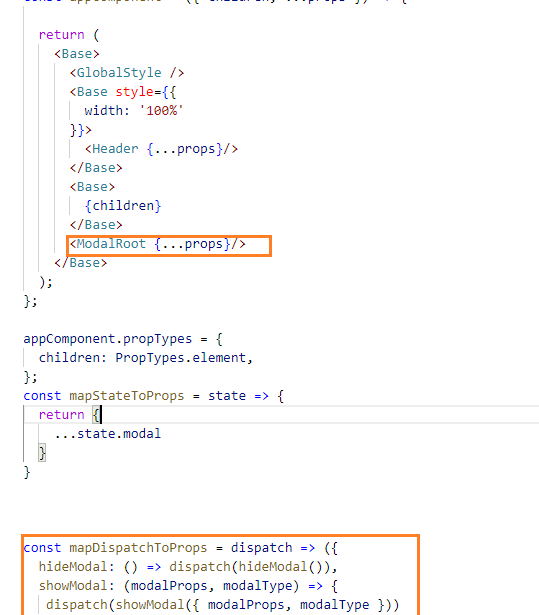
The modalContainer is the added to the appContainer and connected to the redux store to dispatch actions for the modal.
Creating a Tab Modal
In this case, the first type of modal we would be creating is the tab modal. Here the children.props pattern was used to know which tab was clicked. We start by creating a TabContainer component that contains a tabComponent which is functional component that accepts the following props:
- activeTab
- label
- onClick
import React from 'react';
import { theme } from '../../config';
import {Box} from 'rebass'

const tabStyles = {
    display: 'inline-block',
    listStyle: 'none',
    marginBottom: '-1px',
    borderButtom: `1px solid ${theme.colors.appgreen}`,
    color: theme.colors.darkestgray,
    cursor: 'pointer'
}

/**
 * @method tabComponent - create a tab component
 *
 * @param {React.ReactNode} - activeTab - the active tab that was clicked
 *
 * @param {React.ReactNode} - label - the label for the active tab.
 *
 * @param {function} - onClick - this lidtens for the tab that was clicked
 *
 * @return {React.ReactNode}
 */
const tabComponent = ({activeTab, label, onClick})=> {

    const activeStyle = activeTab === label ? {borderBottom: `2px solid ${theme.colors.instagramBlue}`, color: theme.colors.fashpink} : {borderBottom: 'none'};
    return (
        <Box mx='auto' p={3} style={{...tabStyles, ...activeStyle}} onClick={e=> onClick(label)}>
            {label}
        </Box>
    )
}

export default tabComponent;
So we import the created tabComponent into the TabContainer and pass the need props. In the render method we defined the follow;
- children - the children of the TabContainer
- activeTab: the Active tab on the state in the constructor method.
We iterate through the children and get label and pass it as a prop to the TabComponent. the Onclick props is passed the method to toggle the activeTab on the state.
To render a different tab content for each tab that was clicked, you return undefined if the activeTab not equal to the child.props.label.
{ children.map(child => {
                    if(child.props.label !== activeTab) return undefined;
                    return child.props.children
                })
 render() {

        const {children} = this.props;
        const {activeTab} = this.state;
        return(
            <Flex width={1} flexDirection="column">
            <Flex justifyContent="flex-start">
                {children.map((child=> {

                    const {label} = child.props

                    return (
                        <Tab
                            activeTab={activeTab}
                            key={label}
                            label={label}
                            onClick={this.onClickTabItem}
                        />
                    )
                }))

                }
            </Flex>
            <Flex px={3} py={4}>
                { children.map(child => {
                    if(child.props.label !== activeTab) return undefined;
                    return child.props.children
                })

                }
            </Flex>
        </Flex>
        )
    }
Let add a new modal called TabModal to the modal component, the tab modal accepts props and render the content using the render props pattern to add the content and the label that was dispatch on the initiation of a tab modal.
/**
 * @method tabModal - create a tab type modal.
 *
 * @param {Object} props -- react props.
 *
 * @return {React.ReactNode}
 */

const tabModal = (props) => {
  return (
    <Flex flexDirection='column' styles={{...tabContentStyles}} width={600}>
      <Box>
        <Text style={{cursor: 'pointer', hover: {color: 'green'} }} onClick={e=> props.closeModal()} textAlign='right' color='blue'>close</Text>
      </Box>
      <Box>
        <Tab>
          {props.render().map((content, index)=> {
            return (
              <div key={index} label={content.label}>
                  {content.elem}
               </div>
            )
          })}
        </Tab>
      </Box>
    </Flex>
  )
}

export default tabModal
Dispatching action for a tab Modal
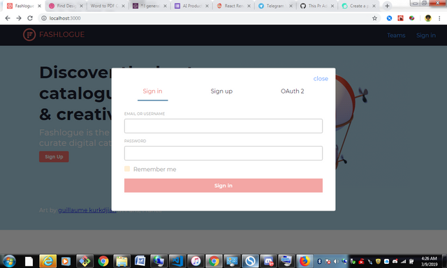
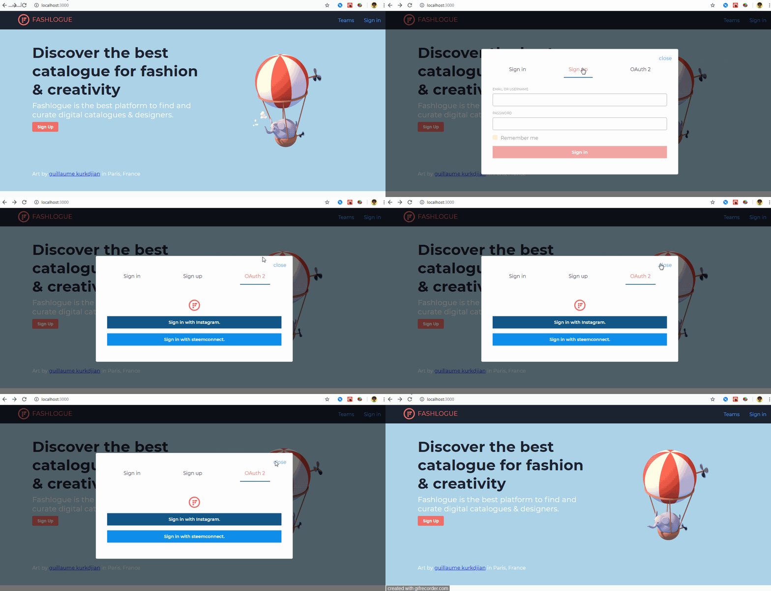
In the header component, we dispatch an action that diaplay a tab modal containing the auth form for signing up and logging into the application.
<Box mr={4}>
            <Link onClick={ ()=> props.showModal({
                                                open: true,
                                                title: 'Tab Modal',
                                                message: 'tab Modal',
                                                confirmAction: props.hideModal,
                                                closeModal: props.hideModal,
                                                render: ()=>{return([{label: 'Sign in', elem: <SignInForm/>}, {label: 'Sign up', elem: <SignInForm/>}, {label: 'OAuth 2', elem: <OAuth/>} ])}
                                                }, 'tab')}>Sign in
            </Link>
          </Box>
Above, we are simply adding properties to our modalProps. In the Render function of the modalProps we return an array of objects that contain labels and the content for each tab, which was used in the tab modal as the render props pattern to display its content.
Note: it was possible to dispatch the showModal actions since the dispatch props was passed into the header component from the appComponent which was inturn connected to the redux store.
Road map.
Users is given the choice to post catalogue to the steem block chain or via the community.
Post concurrently show up on Instagram if the user accessed the application via instagram.
Authentications such as steem connect Oauth2, Instagram Oauth2 , and regular authentications would be enabled on the platform.
Resource.
GIthub Account
https://github.com/ogbiyoyosky/
How to Contribute?
Please get in touch with the project owner.
Discord channel: https://discord.gg/jhruTY


Thank you for your contribution.
The Modal dialog looks nice, could you make the dialog also movable/resizable?
I understand most of the code are UI related and maybe it is difficult to unit test, however, you could use the mocking e.g. sino.js to have a few tests on the basic functionality.
The code looks nice. +1
Your contribution has been evaluated according to Utopian policies and guidelines, as well as a predefined set of questions pertaining to the category.
To view those questions and the relevant answers related to your post, click here.
Need help? Chat with us on Discord.
[utopian-moderator]
Thank you for your review, @justyy! Keep up the good work!
Hi @sirfreeman!
Your post was upvoted by @steem-ua, new Steem dApp, using UserAuthority for algorithmic post curation!
Your post is eligible for our upvote, thanks to our collaboration with @utopian-io!
Feel free to join our @steem-ua Discord server
Hey, @sirfreeman!
Thanks for contributing on Utopian.
We’re already looking forward to your next contribution!
Get higher incentives and support Utopian.io!
Simply set @utopian.pay as a 5% (or higher) payout beneficiary on your contribution post (via SteemPlus or Steeditor).
Want to chat? Join us on Discord https://discord.gg/h52nFrV.
Vote for Utopian Witness!
Congratulations @sirfreeman! You received a personal award!
You can view your badges on your Steem Board and compare to others on the Steem Ranking
Vote for @Steemitboard as a witness to get one more award and increased upvotes!