My Logo for Unison File Synchronizer
Details
I present my version of the logo for open source project Unison File Synchronizer.
Description:
Unison is a file-synchronization tool for OSX, Unix, and Windows. It allows two replicas of a collection of files and directories to be stored on different hosts (or different disks on the same host), modified separately, and then brought up to date by propagating the changes in each replica to the other.
Icon 192x192:

Icon 144x144:

Icon 80x80:

Benefits / Improvements
This is the original logo of Unison File Synchronizer:

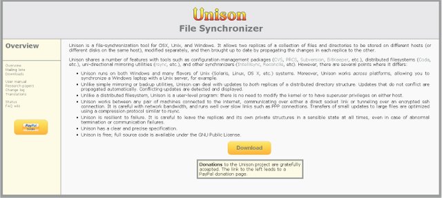
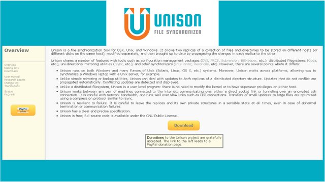
I decided not to change the concept of the logo, but to give it a new modern look in the style of flat design.
My logo is in use:

Tools
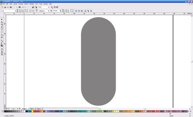
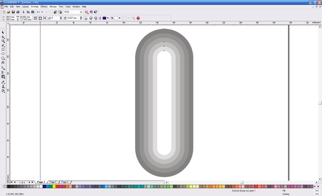
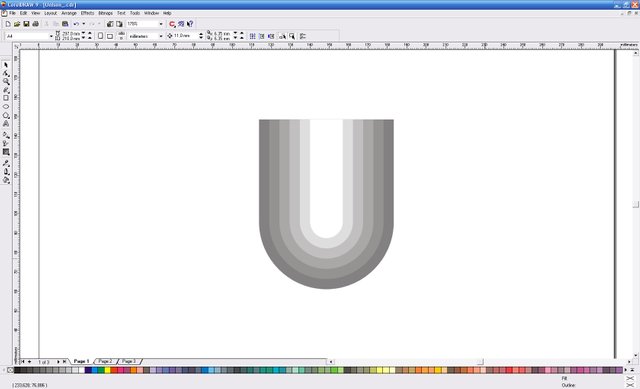
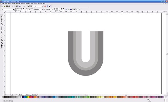
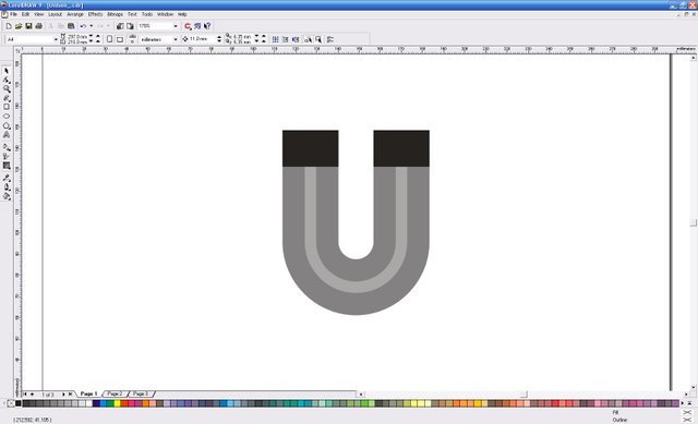
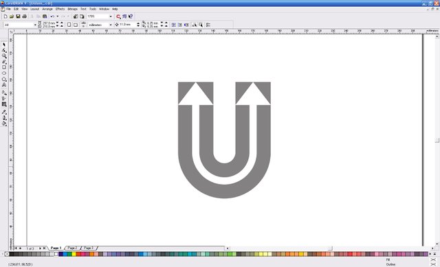
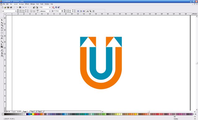
Below I will show you the stages of creating my logo in vector graphics (Corel Draw 9 version):
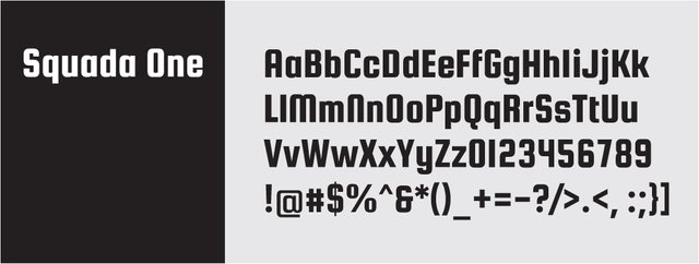
Free font Squada One from Google Font:
Original files
You can download original files EPS, PDF, JPG and PNG in ZIP archive from the link
Posted on Utopian.io - Rewarding Open Source Contributors
Nice work!
Many thanks!
Thank you for the contribution. It has been approved.
You can contact us on Discord.
[utopian-moderator]
Many thanks!
I'm a designer, not a writer - I'm a man of few words and used to get by with a minimum of words. I thought that this proposal would be enough - "I decided not to change the concept of the logo, but to give it a new modern look in the style of flat design". I think it's more like rebranding, as big companies do - they rarely change the logo radically, and they do it gradually, so I did it here too - the old concept was not bad, but it required a fresh graphical solution. That's what I wrote. I thought that this phrase is enough.
You can explain it as you explained it in your comment above. Keep up the good work :)
Thanks!
contribute vote here, "sharing is good"
Many thanks!
Hey @serkorkin I am @utopian-io. I have just upvoted you!
Achievements
Community-Driven Witness!
I am the first and only Steem Community-Driven Witness. Participate on Discord. Lets GROW TOGETHER!
Up-vote this comment to grow my power and help Open Source contributions like this one. Want to chat? Join me on Discord https://discord.gg/Pc8HG9x
I really like the idea, but the top corners feel a little harsh ( maybe you could round then just a bit?) and these colors don't work well together (at least for me).
Thanks for the comment. About the stiffness - this is my design style. Colors are deliberately chosen for contrasting - I almost always use red and orange colors in logos - they make the logo more visible.
I like the colors on their own, but they don't work together, they seem to be ... fighting. (I'm not sure how to describe it). For me, that makes it unpleasant to look at, which is never a good thing for a logo.
I think that a bump of flowers creates a movement inside the logo, which can be very good for a static logo.