Learn Python Series (#10) - Matplotlib Part 1
Learn Python Series (#10) - Matplotlib Part 1
What Will I Learn?
- You will learn how to import Matplotlib,
- what Matplotlib can do in its basic form,
- how to plot line charts, pie charts and bar charts,
- how to decorate your plots with custom axes settings,
- how to subplot.
Requirements
- A working modern computer running macOS, Windows or Ubuntu
- An installed Python 3(.6) distribution, such as (for example) the Anaconda Distribution
- The ambition to learn Python programming
- An installed version of Matplotlib in your Python (virtual) environment. In case you are using Anaconda, Matplotlib is installed by default. If it's not installed, just do so via
pip install matplotlibfrom the command line.
Difficulty
Intermediate
Curriculum (of the Learn Python Series):
- Learn Python Series - Intro
- Learn Python Series (#2) - Handling Strings Part 1
- Learn Python Series (#3) - Handling Strings Part 2
- Learn Python Series (#4) - Round-Up #1
- Learn Python Series (#5) - Handling Lists Part 1
- Learn Python Series (#6) - Handling Lists Part 2
- Learn Python Series (#7) - Handling Dictionaries
- Learn Python Series (#8) - Handling Tuples
- Learn Python Series (#9) - Using Import
Learn Python Series (#10) - Matplotlib Part 1
Introducing Matplotlib
An essential component of learning Python coding, is studying its plotting library Matplotlib. It allows you to plot a lot of different charts, such as bar chats, (scatter) plots, histograms, spectra and many more, and it oftentimes only requires a few lines of code (in its basic form). But you could also change the way your plots look, by for example adding subplots, configuring colors, line styles, fonts, properties and labels of axes, et cetera. The generated charts can be exported as an image, but you could also use them just for temporary visualization, e.g. to check if the data you're working with seems correct.
Matplotlib Basics
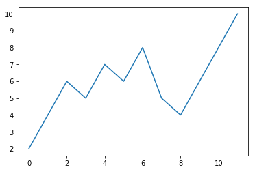
Let's begin by importing the Matplotlib package and its pyplot module. We'll define a Python list of dummy data, and plot it. Like so:
import matplotlib.pyplot as plt
data = [2,4,6,5,7,6,8,5,4,6,8,10] # some dummy data stored in a list

plt.plot(data)                    # let's call the pyplot method `plot()`,
                                  # and pass `data` as its argument
plt.show()                        # plot the figure with the `show()` method
Decorating your plots
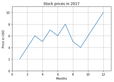
Great, we just plotted our first Matplotlib plot line chart, showing the 12 data points stored in the data Python list. But what's what? How can we provide some more info to this chart, for example how to add a chart title, and label the X- and Y-axis labels, and maybe add a grid, so people can properly understand what's being visualized in the graph? How come the Y-values begin at 2, and why do the months begin with 0 ending at 11?
Of course, Matplotlib provides easy-to-use functions for that as well:
import matplotlib.pyplot as plt
data = [2,4,6,5,7,6,8,5,4,6,8,10]
months = range(1, len(data)+1)    # begin X (months) at 1 instead of 0

plt.plot(months,data)             # pass both X and Y list values to the plot
plt.title('Stock prices in 2017') # use the `title()` function and pass a string
plt.xlabel('Months')              # use the `xlabel()` function and pass a string
plt.ylabel('Price in USD')        # use the `ylabel()` function and pass a string
plt.axis([0,13,0,11])             # specify viewport with values [xmin,xmax,ymin,ymax]
plt.grid()                        # use the `grid()` function to turn on the axes grid
plt.show()
Plotting multiple charts in one figure
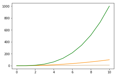
It's also possible to plot multiple (line) charts in one figure, by simply calling plot() multiple times, each time passing in a different sequence, like so:
import matplotlib.pyplot as plt

# Just a function to generate example number sequences with
def pow_seq(nums=10, pow=1):
    nums = range(nums)
    seq = []
    for i in nums:
        seq.append(i**pow)
    return seq

# Let's generate 3 number sequences
y1 = pow_seq(11,1) # y1 = [0, 1, 2, 3, 4, 5, 6, 7, 8, 9, 10]
y2 = pow_seq(11,2) # y2 = [0, 1, 4, 9, 16, 25, 36, 49, 64, 81, 100]
y3 = pow_seq(11,3) # y3 = [0, 1, 8, 27, 64, 125, 216, 343, 512, 729, 1000]

plt.plot(y1, color='tan')        # plot the y1 sequence, with color='tan'
plt.plot(y2, color='darkorange') # plot the y2 sequence, with color='darkorange'
plt.plot(y3, color='green')      # plot the y3 sequence, with color='green'
plt.show()
Using subplot() for multiple plotting areas in one figure
In the example above, we plotted three line curves in the same one figure. If you'd like to plot each line curve in its own figure (container), we need to first create a figure(), and create three plotting areas using subplot() where each line curve is plotted inside its own plotting area, and then show the entire figure containing the three individual charts.
This is done as follows:
plt.figure(1, figsize=(15,3))    # first create 1 figure,
                                 # the figsize argument is a tuple of (width, height)

plt.subplot(1,3,1)               # numrows=1, numcols=3, fignum=1
plt.xlabel('x')
plt.ylabel('y')
plt.title(r'$f(x) = x$')
plt.plot(y1, color='tan')        # plot the y1 sequence

plt.subplot(1,3,2)               # numrows=1, numcols=3, fignum=2
plt.xlabel('x')
plt.ylabel('y')
plt.title(r'$f(x) = x^2$')       # scientific "TeX" notation for superscript
plt.plot(y2, color='darkorange') # plot the y2 sequence

plt.subplot(1,3,3)               # numrows=1, numcols=3, fignum=3
plt.xlabel('x')
plt.ylabel('y')
plt.title(r'$f(x) = x^3$')
plt.plot(y3, color='green')      # plot the y3 sequence

plt.show()

Plotting other types of graphs
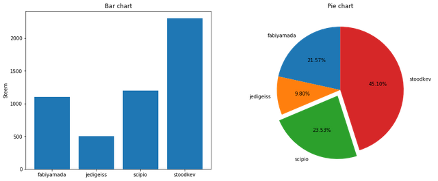
So far, we've only plotted line charts. But of course the Matplotlib package is capable of plotting many more types of graphs as well. Since we've covered quite a lot to comprehend in this episode already, let's complete it by showing how to plot two more chart types: bar charts and pie charts.
# import the `pyplot` module and alias it as `plt`,
# as we learned about in the previous "Import" episode.
import matplotlib.pyplot as plt

fig = plt.figure(1, figsize=(15,6))

# bar chart example
accounts = ['fabiyamada', 'jedigeiss', 'scipio', 'stoodkev']
steem = [1100, 500, 1200, 2300]

plt.subplot(1,2,1)
plt.title('Bar chart')
plt.ylabel('Steem')
plt.bar(accounts, steem)

# pie chart example
labels = 'fabiyamada', 'jedigeiss', 'scipio', 'stoodkev'
perc = [steem[0]/sum(steem), # calculate percentages from the amount of steem
        steem[1]/sum(steem),
        steem[2]/sum(steem),
        steem[3]/sum(steem)]
explode = (0, 0, 0.1, 0)     # "explode" the 3rd slice ('Scipio')

plt.subplot(1,2,2)
plt.title('Pie chart')
plt.axis('equal')            # Make sure the pie is drawn as a circle, X and Y axes equally sized
plt.pie(perc, labels=labels, autopct='%1.2f%%',
        startangle=90, explode=explode)

plt.show()
What's covered in the next Matplotlib tutorial episodes?
Although we've learned a lot about how to use the Matplotlib library in this Part 1 episode, we've just barely scratched the surface of what can be done using Matplotlib. Much more can be done regarding the plotting of charts. But Matplotlib is also able to, for example, plot images (photos) and also vectorized paths (like is done in illutration programs such as Inkscape or Illustrator. (But keep in mind Matplotlib is not intended to function as a full-blown image editor like Photoshop, nor design tool such as Illustrator. It has however very convenient to quickly plot image modifications caused by your own Python image manipulation code.) In order to achieve the latter, we will discuss (in later Learn Python Series episodes) how to use another very useful (yet complex!) "external" mathematical Python package called "NumPy", which by the way Matplotlib uses "under the hood" to convert lists to so-called "N-Dimensional arrays". See you in the next episodes!
Thank you for your time!
Posted on Utopian.io - Rewarding Open Source Contributors
This was technical :P And it took a while to wrap my head around it. But tnx for sharing @scipio
Hey @scipio I am @utopian-io. I have just upvoted you!
Achievements
Community-Driven Witness!
I am the first and only Steem Community-Driven Witness. Participate on Discord. Lets GROW TOGETHER!
Up-vote this comment to grow my power and help Open Source contributions like this one. Want to chat? Join me on Discord https://discord.gg/Pc8HG9x
Started on your python series. Thanks for the post.
I've always used matplotlib for university, but recently I've been using Bokeh (I've seen that @emrebeyler uses Pygal, and I've heard of Plotly), so I was wondering if you have any experience with these, and if so, which one do you prefer?