How to Switch from List View to 'Article' View | Differences and Pros

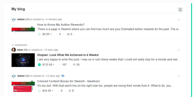
That is what List View looks like on our blogs. It's how Steemit looks like from the 'start'.
We have the Profile Photo, User's reputation count, the main tag used, when it was posted:

It also indicates if it's a resteemed post:

Then we have the small thumbnail to the left side, which has a fixes aspect ratio and your image will be cropped if it exceeds it:

Then we have the Title, first words in the blog post, $ in rewards, number of upvotes, and number of comments:

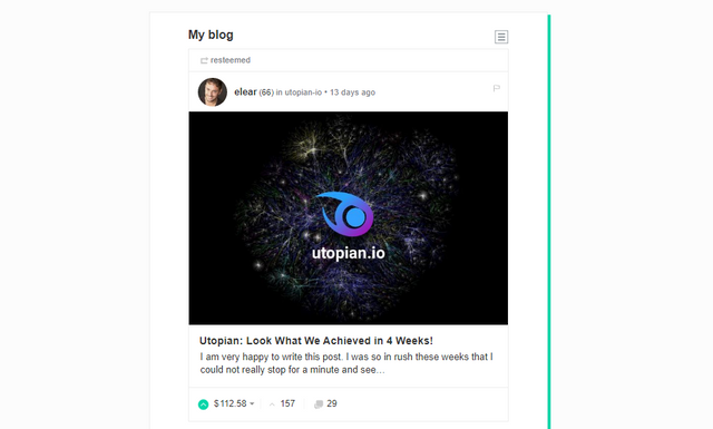
Now, here's what "Article" view looks likes on our blog pages:

We have a slightly bigger Profile Photo, User's reputation count, the main tag used, when it was posted:

The thumbnail is now a bigger photo with its full aspect ratio:

The title and description became a bit bigger:

After that we have $ in rewards, number of upvotes, and number of comments:

How to go to Article View?
You simply have to press this button on the upper right corner of the content box in your blog:

How to go to back to List View?
You simply have to press this button on the upper right corner of the content box in your blog:

The good in List View?
This view is best if you want to see more posts on your screen. Since everything is smaller, they're more compressed and puts a good use to your screen's real estate.
The good in Article View?
This view is best if you want to have a more immersive experience in browsing. Since everything is larger, it's easier to the eyes and you get more info from the photos especially they're no longer cropped.
Posted on Utopian.io - Rewarding Open Source Contributors
Thank you for the contribution. It has been approved.
[utopian-moderator]
Hey @reiban I am @utopian-io. I have just super-voted you at 9% Power!
Suggestions https://utopian.io/rules
Achievements
Up-vote this comment to grow my power and help Open Source contributions like this one. Want to chat? Join me on Discord https://discord.gg/Pc8HG9x