New Logo Proposal for Chronobreak

Chronobreak is aOpen-source Pomodoro timer made in Electron that extra faithfully replicates the original technique. . Chronobreak is definitely a very good application. It looks right, it's very user-friendly. I found this application when exploring electron js , so i decided to make a new design to this app. I made with the new style & modern. And i think it looks much better and more luxurious compared with the original.

Benefits
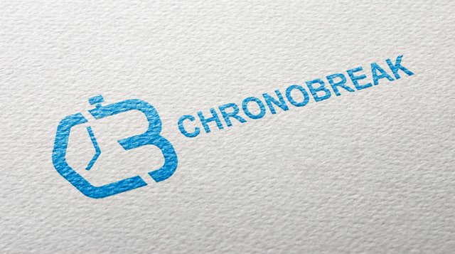
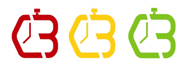
I'm a little confused when I first saw the original logo of this chronobreak. his logo is not clear, and at all meaningless. I see it just like a cartoon photo that is pasted. so I decided to create a more meaningful logo concept for chronobreak with the initial logo c and b and added with some beautiful touches from the clock and stopwatch make this logo more elegant

Tools

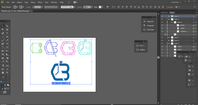
PROOF OF WORK

FILE
All vector and editable files is HERE. You can download it.
- Mockup Source :
Source
Posted on Utopian.io - Rewarding Open Source Contributors
Thank you for the contribution. It has been approved.
You can contact us on Discord.
[utopian-moderator]
Thanks sir @radudangratian
Hey @radudangratian, I just gave you a tip for your hard work on moderation. Upvote this comment to support the utopian moderators and increase your future rewards!
Your work is amazing! I really do agree that the original one can confuse a lot of people lol Thank you for sharing!
Thanks a lot brother. Im happy if you know what i Medan haha
Your contribution is good, I like it.
Thx buddy
Hey @redmusic I am @utopian-io. I have just upvoted you!
Achievements
Community-Driven Witness!
I am the first and only Steem Community-Driven Witness. Participate on Discord. Lets GROW TOGETHER!
Up-vote this comment to grow my power and help Open Source contributions like this one. Want to chat? Join me on Discord https://discord.gg/Pc8HG9x