Random Game logo design

Repository
https://github.com/aihe/random-game
Details
RandomGame is a web site that allows you to play games by selecting random games. it also allows you to create your own game list and You can delete these games at any time. I wanted to design a logo that complies with the software name for this comprehensive application.

README FILE
WEB SITE

Improvements
RandomGame is an application that allows you to play random games. So, I designed a 'random icon'. I added the gamepad in this 'random icon'. I placed the buttons on the left and right sides to provide an aesthetic look. Finally, I opted for a white color to be compatible with the website. ( at the request of the project owner )
Benefits and idea
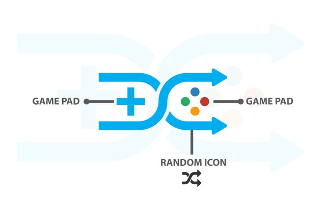
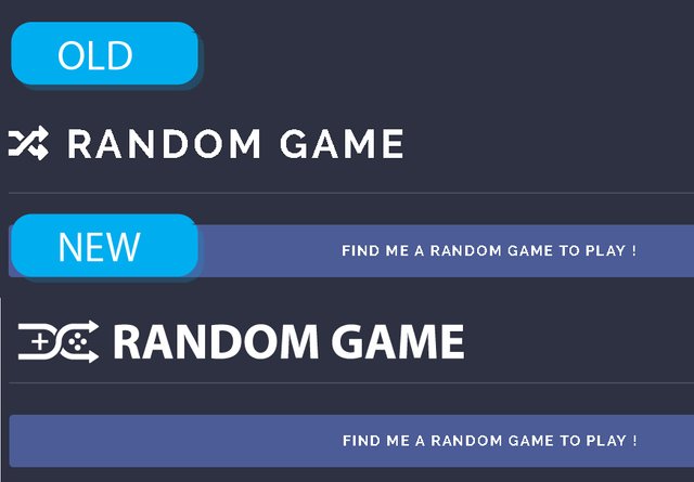
- more functional than the old logo
- represent the function of the website.
- website compatible colors. ( white color looks very good in dark colors.)
- simple , minimalist
Proof of authorship
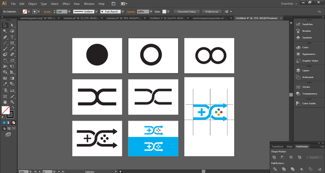
Tools
Adobe Illustrator CS6.
Original Files
Proof of Work Done

This work is licensed under a Creative Commons Attribution 4.0 International License
Hi @realinfo, thank you for your contribution.
I really like the idea of combining random symbol and gamepad, it fits the project really well, even the project owner love it. the shape of the random symbol is good an balanced. However if the project owner decided to use the logomark as a favicon for the website the logomark will appear smaller than it should be. It is because the dimension of the logomark is not close to 1:1. This problem is easy to fix tho you just need tweek the random symbol a little bit make the arrow shorter and make the whole logomark as close to 1:1 dimension as possible.
The top part of your presentation is really good, as it is very clean and well organized, things to note, there is no need to show the same logo variations over and over particularly under the color info it's feels kinda redundant. Also the color information that you show here is way to small and hard to read.
The bottom part of your presentation is a little bit messy. for example the proof of work, instead of just showing one screenshoot of a construction of the logo, you can show few more screenshots of the process of you making the logo. I've seen some contributors record their procces and show it in their presentation in form of a gif. maybe you can try it, as you know better presentation equal better reward.
Showing CC license image is not a mandatory, if you chose to do so make isur the image is not too big and take too much space on your presentation.
Your contribution has been evaluated according to Utopian policies and guidelines, as well as a predefined set of questions pertaining to the category.
To view those questions and the relevant answers related to your post, click here.
Need help? Write a ticket on https://support.utopian.io/.
Chat with us on Discord.
[utopian-moderator]
Thank you for your review, @nilfanif!
So far this week you've reviewed 5 contributions. Keep up the good work!
Hey, @realinfo!
Thanks for contributing on Utopian.
We’re already looking forward to your next contribution!
Get higher incentives and support Utopian.io!
Simply set @utopian.pay as a 5% (or higher) payout beneficiary on your contribution post (via SteemPlus or Steeditor).
Want to chat? Join us on Discord https://discord.gg/h52nFrV.
Vote for Utopian Witness!
Hi @realinfo!
Your post was upvoted by @steem-ua, new Steem dApp, using UserAuthority for algorithmic post curation!
Your post is eligible for our upvote, thanks to our collaboration with @utopian-io!
Feel free to join our @steem-ua Discord server