Icon Pack for SteemAccess
Details
It is the second contribution to this project. In my first contribution, I created the project logo and after that, the Project Owner wondered if I wanted to make the icon set for this project. After I accepted, there followed a discussion in which I found out about the necessary icons and how they should be. There followed the execution period in which I closely connected with the project owner and I showed him every step.
Benefits/Improvements
Because I also made the logo I managed to keep the same style, giving the page a homogeneous look.
Another benefit was that the icons were made after the description and needs of the Project Owner.
As an improvement to the project, it is now that the main page is complete, and as I said above, it is in the same style as the logo.
Proof of autorship
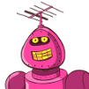
Every icon was made by me from scratch. Below, I'll attach a screenshot to the execution steps.
Tools
Throughout the execution process I used the Adobe Illustrator program. The program is one that exports vectorial works. During the creation I was helped by the existing tools in the software.
Original Files
Below I will attach multiple versions of color and size, as well as the font and download link to editable files.
I mention that everything that appears in the presentation is done by me from scratch.
](https://res.cloudinary.com/hpiynhbhq/image/upload/v1521637811/rsjp4izpr6rp2fji43ir.png)
This work is licensed under a Creative Commons Attribution 4.0 International License.
Hey @moonrise here :)
Thanks again for the awesome icons ! They look really great :)
I am in steady contact with @radudangratian and it is really easy to communicate with him. He has no problem with changing things, until you like them !
I also hired him on a private project of mine (Which tells a lot about his work)
Thank you for the kind words! It was a really pleasure to make the 3rd contribution for you. SwiftyConnect, SteemAcces and now the icon pack for Steem Acces. And the collaboration with you, on your private project, like I said to you in private, means a lot to me.
This is a great job you have here. Just keepit up and continue to grow in your area of specialization. I hope to see other great job of yours in the near future.
Motivational post for many this is truly awesome you are doing amazing things.
Congratulations! Your post has been selected as a daily Steemit truffle! It is listed on rank 8 of all contributions awarded today. You can find the TOP DAILY TRUFFLE PICKS HERE.
I upvoted your contribution because to my mind your post is at least 24 SBD worth and should receive 57 votes. It's now up to the lovely Steemit community to make this come true.
I am
TrufflePig, an Artificial Intelligence Bot that helps minnows and content curators using Machine Learning. If you are curious how I select content, you can find an explanation here!Have a nice day and sincerely yours,
TrufflePigHey @radudangratian ,
Thank you for the contribution. I do not know if he wanted this but in my opinion icons have to be in harmony. I mean that, line thicknesses and proportions should be the same. These are most important things in Icon Pack Design.
As you can see below, I put the same rectangle on each icons. All of them has different proportions. Also, thicknesses are different.
However, you provided all requirement files for Project Owner and he is using your design already. Your contribution has been evaluated according to Utopian rules and guidelines, as well as a predefined set of questions pertaining to the category.
To view those questions and the relevant answers related to your post,Click here
Need help? Write a ticket on https://support.utopian.io/.
Chat with us on Discord.
[utopian-moderator]
With all the respect I have for the moderators, I think that this time there have been a few mistakes that can not be overlooked.
First of all, it is my 2nd contribution to this project, the third for this project owner and more than that, he chose me to work with him on his private projects. As he pointed out, if I was not "professional", he definitely did not choose to work with me outside the Utopian.
In the second row, there are 8 different icons with different design. You can not go over seeing this, saying it's only 1 design. I agree that the icons do not fit in well-known patterns. I never followed and I did not intend to fit in a certain pattern. Nothing is perfect and I'm convinced that anything can have a better version. I think that if we all fit in the same pattern, the world will generally be too monotonous. Apart from the examples offered by the moderator as "mistakes", I think with all the strength that what we have created does not contain major problems.
In conclusion, I say that I have never entered a public argument with a moderator, because I was one and utter respect for what they are doing for this wonderful community. But when I feel unmoved, I'm ready to take a step forward to tell my dissatisfaction.
I do not think I have the absolute truth and I do not want to be right if I do not deserve it. All I ask is that when a contribution is moderate to moderate carefully and be done correctly.
Thanks in advance and I hope I did not disturb anyone by this comment!
I think all points are valid and constructive. I dont know in what size are these cions going to be used, so its hard to judge the level of detail, but when it comes to unified look, they deffinitely dont look like one pack. Some are more complex, some use full shapes, lines have different thickness.
Hey @radudangratian
Thanks for contributing on Utopian.
We’re already looking forward to your next contribution!
Contributing on Utopian
Learn how to contribute on our website or by watching this tutorial on Youtube.
Want to chat? Join us on Discord https://discord.gg/h52nFrV.
Vote for Utopian Witness!