Chart JS Tutorial #1.0 - Bar Chart

source
What Will I Learn?
- What is Chart.js
- How to import Chart.js into a project
- How to make a bar chart using Chart.js
Requirements
- Knowledge in HTML
- Knowledge in Javascript
- Knowledge in JQuery
Difficulty
Intermediate
Tutorial Contents
- Introduction
- Importing Chart.js to a html project
- Creating a bar chart using Chart.js
Introduction
Chart.js is an open source project that allows developers to make simple yet flexible charts. It uses the HTML 5 <canvas> tag as its container. Chart.js offers a wide variety of flexibility which makes it one of the go-to plugins when generating charts.
Importing Chart.js
Before we can start using Chart.js we need a few things to get started. First, we need to make a simple html program with a <canvas> inside the body.
<!DOCTYPE html>
<html>
  <head>
    <title>Chart JS</title>
  </head>
  <body>
    <canvas id="myChart"></canvas>
  </body>
</html>
As stated above the <canvas> tag is the container used to draw the chart. This is a requirement when using Chart.js. We've given the canvas an id and named it myChart just so we could easily use the element when we start drawing the chart.
Next thing we need to do is grab a copy of Chart.js and import it in our existing project. There are a number of ways to do this, one would be installing it through node to acquire a local copy, but for simplicity we will be using a CDN.
CDN: https://cdnjs.cloudflare.com/ajax/libs/Chart.js/2.7.2/Chart.min.js
Once you have a copy of the CDN, we proceed to import it in our HTML file.
<script type="text/javascript" src="https://cdnjs.cloudflare.com/ajax/libs/Chart.js/2.7.2/Chart.min.js"></script>
Creation of bar chart
What we'll first do is make a simple bar chart then we'll show off the flexibility of Chart.js.
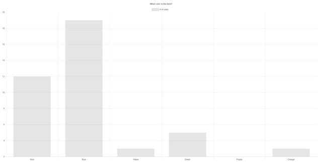
The chart above is generated by the Javascript code below. We will be disecting the code to get a better understanding on how it works.
var ctx = document.getElementById("myChart");
var myChart = new Chart(ctx, {
    type: 'bar',
    data: {
        labels: ["Red", "Blue", "Yellow", "Green", "Purple", "Orange"],
        datasets: [{
            label: '# of votes',
            data: [12, 19, 3, 5, 2, 3],
        }]
    },
    options: {
        title: {
            display: true,
            text: "What color is the best?"
        }
    }
});
First, we need to place our canvas in a variable so we can later tell which canvas to use when generating the chart. Since we assigned our canvas with an id named myChart we can just use that, and that's what the first line does.
var ctx = document.getElementById("myChart");
Next, is where we start generating the Bar Chart itself. To do this, we need to instantiate a new chart, this is done by using the new Chart() class, the Chart() class takes in two parameters the first is the canvas where the chart will be placed and the second is an object with the chart properties. Chart properties or chart definitions is the details about the chart which will be used to determine the type, labels and data about the chart.
In our case since we will be making a bar chart we set our type to bar.
var ctx = document.getElementById("myChart");
var myChart = new Chart(ctx, {
    type: 'bar'
});
When we run this code we get this as the output.
This is as expected since we still do not have any data to populate our bar chart. This is where the data property comes in. This is where you put the, as the name suggest, data of your chart.
var ctx = document.getElementById("myChart");
var myChart = new Chart(ctx, {
    type: 'bar',
    data: {
        labels: ["Red", "Blue", "Yellow", "Green", "Purple", "Orange"],
        datasets: [{
            label: '# of votes',
            data: [12, 19, 3, 5, 2, 3],
        }]
    }
});
The labels inside the data property is where you can set the names of your bars in your chart.
labels: ["Red", "Blue", "Yellow", "Green", "Purple", "Orange"]
Next is the datasets, this is where you place the data of each bar in the chart.
datasets: [{
            label: '# of votes',
            data: [12, 19, 3, 5, 2, 3],
        }]
The label inside the datasets object is the label that is shown inside the tooltip when you hover over a certain bar. Since by default the tooltip is set to true it is recommended to set a label for it. I will be showing you a way to hide it later on. The data is where you put the values in for your bar chart.
When you run the code above you would get.
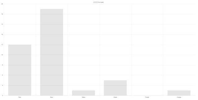
There we have it, a simple bar chart made purely with Chart.js.
However, it looks too plain for a bar chart about colors. So we will now be showing off some of the flexibility of Chart.js by adding a few options.
First we will be adding a title on the Chart this is done by adding options after the data like so:
var ctx = document.getElementById("myChart");
var myChart = new Chart(ctx, {
    type: 'bar',
    data: {
        labels: ["Red", "Blue", "Yellow", "Green", "Purple", "Orange"],
        datasets: [{
            label: '# of votes',
            data: [12, 19, 3, 5, 2, 3],
        }]
    },
    options: {
        title: {
            display: true,
            text: "What color is the best?"
        }
    }
});
As you can see inside the options property is a title property which we set the text to "What color is the best?" and display set to true. When the code is ran it would look like this.

We now have a title on top of our chart. Next, as I've said above we will hide the tooltip on hover, this can easily be done by setting the display of the legend as false in options. This is a good technique because although the label doesn't show on the canvas, it still shows when you hover over a bar.
options: {
        title: {
          display: true,
          text: "What color is the best?"
        },
        legend: {
          display: false
        }
Lastly, since it's a color chart it would be nice to set the color of each bar based on the color in the label, Chart.js allows us to do this by the backgroundColor property inside the datasets object. The backgroundColor property accepts either a single color which will color all your bars or an array of colors for every bar. You can use rgb, rgba or color names (assuming it's a known color) when setting the colors.
var ctx = document.getElementById("myChart");
var myChart = new Chart(ctx, {
  type: 'bar',
  data: {
    labels: ["Red", "Blue", "Yellow", "Green", "Purple", "Orange"],
    datasets: [{
      label: ' # of votes',
      data: [12, 19, 3, 5, 2, 3],
      backgroundColor: [
        'rgba(255, 99, 132, 0.2)',
        'rgba(54, 162, 235, 0.2)',
        'rgba(255, 206, 86, 0.2)',
        'rgba(75, 192, 192, 0.2)',
        'rgba(153, 102, 255, 0.2)',
        'rgba(255, 159, 64, 0.2)'
      ]
    }]
  },
  options: {
    title: {
      display: true,
      text: "What color is the best?"
    },
    legend: {
      display: false
    },
    scales: {
      yAxes: [{
        ticks: {
          beginAtZero: true
        }
      }]
    }
  }
});
When you run this code, you will see our final product.
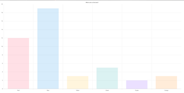
The full demo can be found here
Curriculum
This is the first tutorial for this curriculum.
Posted on Utopian.io - Rewarding Open Source Contributors
Thank you for the contribution. It has been approved.
As this contribution is far more detailed than the previous, old tutorial, I will accept this - it's a far more valuable resource for someone looking to make just a bar chart.
That being said, I'd advise against making an detailed tutorial on each type of charts, as once you learn one of them, it's very easy to transition with the use of the tutorial presented to you by our moderator.
You can contact us on Discord.
[utopian-moderator]
I understand, thanks for reconsidering
Hey @jestemkioskiem, I just gave you a tip for your hard work on moderation. Upvote this comment to support the utopian moderators and increase your future rewards!
Your contribution cannot be approved because it does not follow the Utopian Rules.
You can contact us on Discord.
[utopian-moderator]
Hey @portugalcoin thanks for looking into it.. I saw the similar link you showed me, but that tutorial covers all the chart roughly while I covered bar chart in more detail, doesn't that mean it's a better tutorial? Thanks. Will contact you on dicord too.
Hey @programmingllama I am @utopian-io. I have just upvoted you!
Achievements
Community-Driven Witness!
I am the first and only Steem Community-Driven Witness. Participate on Discord. Lets GROW TOGETHER!
Up-vote this comment to grow my power and help Open Source contributions like this one. Want to chat? Join me on Discord https://discord.gg/Pc8HG9x