knacksteem.org dashboard - New UI Design
Repository
Linked Task Request
[Task-Request] Inviting UI/UX designer to construct a perfect UI for knacksteem.org by @knowledges
Details
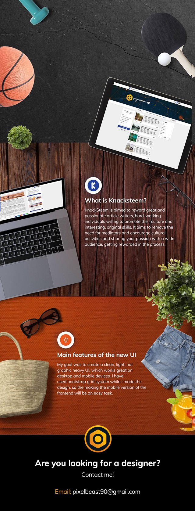
KnackSteem is aimed to reward great and passionate article writers, hard-working individuals willing to promote their culture and interesting, original skills. It aims to remove the need for mediators and encourage cultural activities and sharing your passion with a wide audience, getting rewarded in the process.
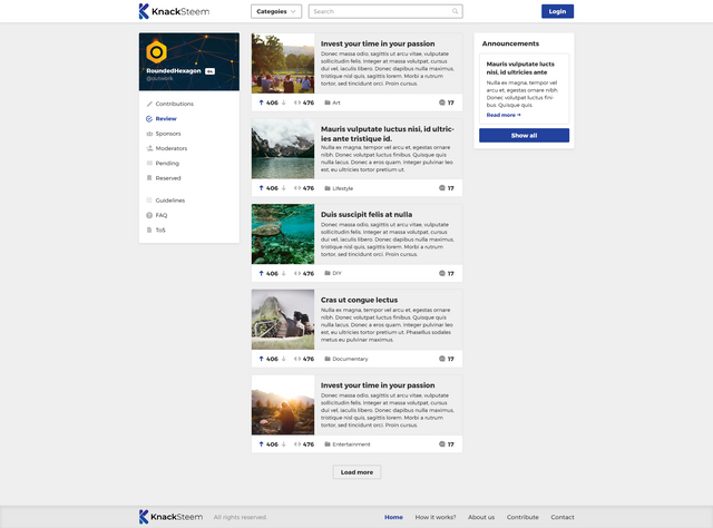
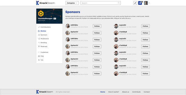
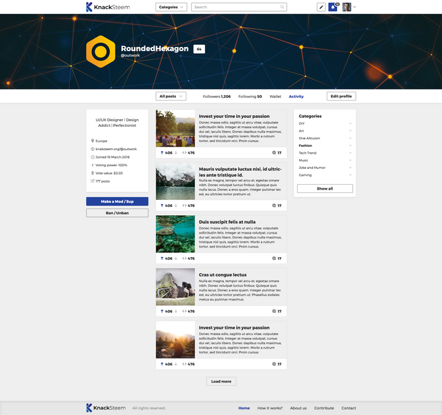
My task was to redesign knacksteem.org dashboard pages and create a few new ones. The old knacksteem UI was really simple and barebone and its colour palette was not represented knacksteem's colour palette. There was also a few typography issues.
Benefits / Improvements
Creating the dashboard design for Knacksteem was really challenging. Actually making dashboard designs is one of the most trickiest graphics tasks: finding the perfect balance between typography, content/whitespace ratio, colours. My goal was to create a clean, light, not graphic heavy UI, which works great on desktop and mobile devices. I have used bootstrap grid system while I made the design, so the making the mobile version of the frontend will be an easy task.
Knacksteem branding colors are blue, white and grey. This colors are reused on the dashboard design. Used blue colour to accentuate, also different shades of grey for good typography. Used regular and bold versions of Montserrat font, which gives great balance between headers and paragraph texts, also it is lightweight, perfect for fast loading UIs.
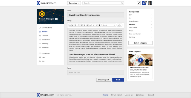
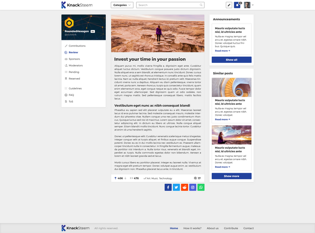
In total it was created 7 screen designs: Front page, post screen, post edit/publish screen, user profile page, sponsors, moderators, followers/following.
Screenshots
Proof of authorship
Tools
I have used Photoshop for creating the UI.
Original files
This work is licensed under Creative Commons Attribution 4.0 International License
Proof of Work Done
This awesome mockups are made using https://artboard.studio/

Thank you for your contribution,
I really like the simlicity and readability of your design. Its easy to read and navigate.
Only thing I dont like is using grey not only on background, but important elements as well, this makes them blend to background and reducing readability a little.
I would advise giving them white background:
Your contribution has been evaluated according to Utopian policies and guidelines, as well as a predefined set of questions pertaining to the category.
To view those questions and the relevant answers related to your post, click here.
Need help? Write a ticket on https://support.utopian.io/.
Chat with us on Discord.
[utopian-moderator]
Thank you for your review, @andrejcibik!
So far this week you've reviewed 6 contributions. Keep up the good work!
Thank you for your feedback, really appreciate it. I have to agree: it makes the readability slightly worst. The reason why i used grey it is easier to the eye: most of the people hate pure white and pure black, because it hurts their eye.
Hey, @outwork!
Thanks for contributing on Utopian.
We’re already looking forward to your next contribution!
Get higher incentives and support Utopian.io!
Simply set @utopian.pay as a 5% (or higher) payout beneficiary on your contribution post (via SteemPlus or Steeditor).
Want to chat? Join us on Discord https://discord.gg/h52nFrV.
Vote for Utopian Witness!
Nice JOB. I really like yhe way u show the banner profile. I hope the developer will keep it up like the design.
Thank you! Really appreciated. Hopefully yes, that is one of my favorites sections too.
In summary, you are amazing :D
Haha, thank you :D