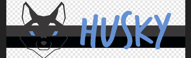
It's hard to evaluate this design due to project owner's requests. He didn't want to relate it to robotics or lasers but now it looks like a logo for child-games. A husky head like an illustration and a brush like handwritten type font.
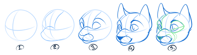
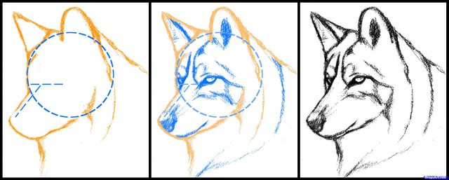
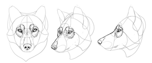
First of all your design sketch process looks like reversed. Like it's done first and you take the parts away in every step. I don't think this is how to draw anything.
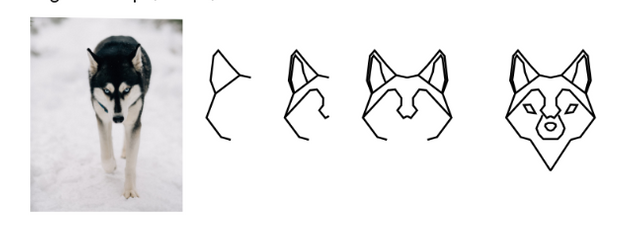
Here is a quick google search result, how to draw animal heads with a little knowledge on anatomy.
This is how it would look on dark backgrounds, due to its transparency.
Lastly it's always better to have a real life mock-up, it looks good on a full screen but how about when you squish it into to navbar for example. This would also help you to see if it your design really works or not, you can notice if that transparency would affect the end result or not.
Your contribution has been evaluated according to Utopian policies and guidelines, as well as a predefined set of questions pertaining to the category.
To view those questions and the relevant answers related to your post, click here.
Need help? Write a ticket on https://support.utopian.io/.
Chat with us on Discord.
[utopian-moderator]
Thank you for your review, @oups!
So far this week you've reviewed 2 contributions. Keep up the good work!