Hey, zularizal.
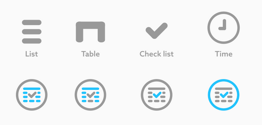
In your presentation you are saying, "Time and Table are inspired by the name of the app." However neither time nor table is clearly seen as the prior objective. Lıst and checkmark icons are obvious but I can't say the same for table icon nor the time icon.
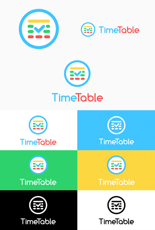
And for displaying the alternatives, do you think this is the best way to show it, I think you can simplify it by displaying 3 version ( only logo, logo horizontal and logo vertical ) then apply color alternatives to one of them. This way you can avoid redundant repetition.
Just an example to show what I'm trying to tell;
Your contribution has been evaluated according to Utopian policies and guidelines, as well as a predefined set of questions pertaining to the category.
To view those questions and the relevant answers related to your post, click here.
Need help? Write a ticket on https://support.utopian.io/.
Chat with us on Discord.
[utopian-moderator]
Thank you for your review, @oups! Keep up the good work!