You are viewing a single comment's thread from:
RE: Logotype Design Proposal por Musify
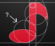
You have two baselines and two x-lines for your font, there are two missing circles in your f, there are no lines for angle cuts.. I thought you just overlayed a font to just make it look like geometric.
Also it's hard to see it as a sound wave since they have many alternative visualizations.

I got it! I got it! I didn't realize about those errors! Thanks again bro